Web Designer - Tim Van Damme
The Web Design Industry is a rapidly growing and ever evolving one. It takes a great deal of skill, versatility and originality to be able to become a prominent figure in such a dynamic field. Yet there are people who have managed exactly this. For Week 2 of my research I have decided to research such a person.
As a part of this process I looked into many different designers to decide which I would actually research. This list consisted of the following people:
- Dan Cederholm
- Jeffrey Zeldman
- Tim Van Damme
- Mark Boulton
- Andy Clarke
- Elliot Jay Stocks
- Dave Shea
- Jason Santa Maria
- Shaun Inman
- Cameron Moll
- Jon Hicks
- Lee Munroe
I looked briefly at each of the people on the above list and eliminated the people with site designs I wasn't especially keen upon. This eliminated 4 of the 12 people. I then looked at the work that each of the remaining designers had produced, which helped cut the list down to 3 designers. Following up from this I looked at the blogs of the remaining 3 designers, to see who was posting material that proved to be interesting to me. This narrowed the list down to 2 designers. After this I decided that, of the 2 designers left (Tim Van Damme and Elliot Jay Stocks) that Tim Van Damme was the designer that I would write about.
Who is he?

Tim Van Damme is a 24 year old designer from Belgium. He's been involved in the design industry since 2005. He's primarily self-taught, as he explains in an interview with the writers of Web Standardistas. Their question to him is "Where did you learn your craft?"
I'm self-taught. I've learnt a lot from books I've bought that were recommended by others. I've also learnt a great deal by dissecting other people's work, and experimenting in Photoshop or with HTML and CSS.
At school there was only one class I can remember where I actually learned something useful. It was given by a great designer who introduced me to typography, colour principles and the basics of layout.
Christopher Murphy and Nicklas Persson. (2009). A Dozen Questions for Mr Van Damme | Web Standardistas · Web Standards Design . Available: http://www.webstandardistas.com/2009/06/a-dozen-questions-for-mr-van-damme.php. Last accessed 5 October 2009.
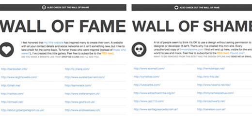
Tim Van Damme runs his own Web Design Company as well as his own blog under the name of MaxVoltar. Both of these are removed from his own web site, which is designed using a Business Card style. He is responsible for the re-emergence of this site style, and even seems to go to the effort of keeping track of sites that have made use of this design in new and interesting ways. He also has a section of his site that lists those sites which have, unfortunately, been significantly less inspired by his work.
Whilst this is his most widely recognised, and emulated/copied, piece of work it is far from his only influential pieces of web design. Other examples of beautiful web design are the the atebits and the 24ways web sites. His designs frequently push the boundaries of web design.
Tools of the Trade
Tim Van Damme's toolkit consists of Apple Macs and various apps available for the platform. Many of these are well known as high-level industry software packages, and include applications such as Billings, Espresso, LittleSnapper and Tweetie.
His Sites
Tim Van Damme has multiple sites that he makes use of to display various aspects of himself. These pages consist of his home page (http://timvandamme.com/), his freelance design firm Made By Elephant
(http://madebyelephant.com/) and his online blog, under the alias MaxVoltar (http://maxvoltar.com/).
Tim Van Damme's Home Page
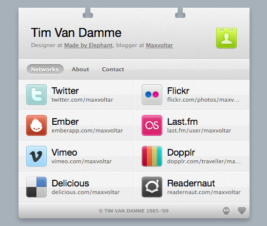
As already mentioned earlier, Tim Van Damme's home page makes use of a business card design, a look that hass re-ignited people's interest in the business card web design.
The design is broken down into 3 sections. The first section, that the user sees when the page loads provides links to the various forms of social media that he makes use of. The second section deals with providing information about himself and where he can be found, providing information about his other two sites, his freelance design studio and his design blog. The third and final section of the site provides contact details for getting in touch with him, for either personal or work purposes.
One highly important piece of website design when using any form of javascript, is that the site must remain functional without the javascript. This is the case with Tim Van Damme's site. Without javascript his site degrades gracefully, with all sections showing in a well ordered and laid out fashion.
Design Aspects of the Site
The site uses a very simple styling, without going overboard in any design element. In additon to the simple content design it makes use of some simple, yet effective, jquery javascript to control aspects of the web site design.
Made By Elephant
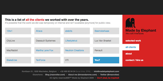
Made By Elephant is Tim Van Damme's freelancing design company. As with his own site, he has gone for a simple and stylish site, using a black, red and white design. It breaks away from the normal conventions of sites slightly in that, whilst it is centrally positioned, it looks as if it's aligned to the right hand side of the page. The effect provides for a nice change from the norm of web designs, a trend of Tim Van Damme's work.
As with his home page he has made use of a single page design, with all content contained within tabbed areas that are accessed via javascript. Unlike his own home page, this site does not degrade so gracefully, a common downside to javascript controlled websites.
MaxVoltar
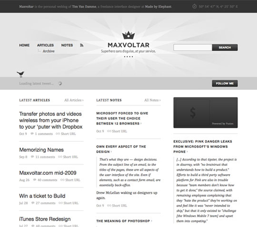
MaxVoltar is the name that Tim Van Damme uses for his blogging. This site makes use of a Content Management System to control the data that is displayed on his site. The design is laid out to be similar in appearance to a printed design, similar to a newspaper layout.
The site takes a break from the norm for Tim Van Damme's sites, in that it makes use of a monochromatic colour scheme. It's easy on the eye and provides plenty of space for the content displayed, providing plenty of white space so that users aren't overwhelmed.
One aspect that I love from this site is that it's not designed to contain only his blog posts, but also serves as a platform that can be used to promote content posted by other people. Fully two thirds of the main content of the site is populated by content from, and links to, other articles. In a field as dynamic as the design one, it makes for a nice change to see people promoting content made by other users. It's one aspect of the design industry that I've always liked to see. Whilst the people you see online are people you compete with, they will also quite regularly be people that you will get along with remarkably well.
Overall Impressions
Overall I love the work of Tim Van Damme. Looking at his work has proven to be an insightful experience for me, and I have already adapted some of the aspects of his design into my own learning log designs and found some of his javascript to be most interesting. Researching this web designer has been truly beneficial to me.
Further Reading
In case you are interested in finding out a bit more about Tim beyond what I'd written here, such as seeing his comical side, the following are the resources I looked at whilst putting this report together:
- Tim Van Damme. (2009). Tim Van Damme. Available: http://timvandamme.com/. Last accessed 6 October 2009.
- Tim Van Damme. (2009). Made By Elephant. Available: http://madebyelephant.com/. Last accessed 6 October 2009.
- MaxVoltar. (2009). MaxVoltar. Available: http://maxvoltar.com/. Last accessed 6 October 2009.
- Christopher Murphy and Nicklas Persson. (2009). A Dozen Questions for Mr Van Damme | Web Standardistas · Web Standards Design . Available: http://www.webstandardistas.com/2009/06/a-dozen-questions-for-mr-van-damme.php. Last accessed 5 October 2009.
- The Web Squeeze. (2009). Tools of the Trade - Tim Van Damme. Available: http://www.thewebsqueeze.com/web-design-interviews/tools-of-the-trade-tim-van-damme.html. Last accessed 6 October 2009.