Over on my Creative Experimentation Log I have been discussing the process that I followed in the theory stage of my learning log design. Showing some of the sketches I drew in the design process. Not everything that I did in preparation for the site design truly belongs there, as there was a reasonable amount of research put into looking at already existing websites, seeing what others had done, analysing it as well as looking for inspiration. Over the course of the next several weeks I shall go over some of the sites I looked at, taking the occasional break to look at other topics I have decided to research.
JustWill
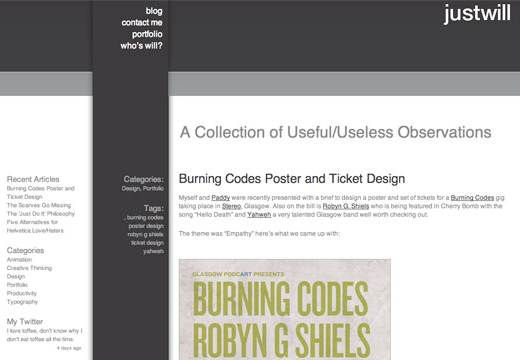
Will McNeilly is a former student of the Interactive Multimedia Design course, that I had the good fortune to meet last year whilst on placement as part of my Foundation Degree Course. I found him to be a rather impressive designer, which is why I have decided to look at his web design as a part of my research.
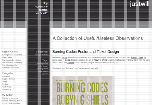
Will's site makes use of a very minimalistic design, leaving the vast majority of the content to be displayed entirely using text, supported with a very limited amount of imagery in the site's design. Looking at the site it would appear that the majority of the graphics are simply flat colour, but this isn't quite true. Upon closer inspection there is a slight change in colour on the horizontal elements, indicative of a very slight gradient. In addition to this, the lighter grey divider also makes use of a 1 pixel divider to enhance the look of the site, helping define areas more clearly.
The same is also true of the footer of his site, it makes use of similar elements to help define certain areas of the site.
The only other defined area of the site design is the large column that fills the height of the site, from the header right down to the footer of the site. It is rather well done so as to allow him to display content relevant to his blog posts whilst keeping it separate so that people can see that it is related but not a part of what they are reading. It also helps to identify a separate element for him to provide a form of site navigation for people to use.
I really like how his site looks and works, though I'm hesitant about the approach taken with his navigation, as the links (and, indeed, the headers) for the navigation appear in the same colour and size as the regular text on the site, which I think may not be the most ideal of situations.
On additional flaw that I have noticed in his site, one that I know Will has found to be frustrating, is that the vertical bar down the site is slightly off near his header. It's literally a matter of pixels, but it remains noticeable, and something that can be quite frustrating to fix.
Conclustions on JustWill
Overall I really like the look of Will's site. I like the defined areas for content and the majority of the way in which it is presented. I do believe that with a bit of attention to some aspects of the site that it could be improved upon though.
References
Will McNeilly. (2008). JustWill - The Design Blog of Will McNeilly. Available: http://www.willmcneilly.com. Last accessed 29 September 2009.
Web Designer Showdown
This week I had to conduct research into a web designer. I touched briefly upon the process used to help me decide upon who I would do my in depth research into. Here I intend to go into it in a bit more depth.
The Possililities for Research
As mentioned in the original research report there were a total of twelve different designers that I could choose from. Over the course of a day I whittled this list from twelve down to the final designer, the one I would research. The following is a list of all twelve:
Dan Cederholm
Jeffrey Zeldman
Tim Van Damme
Mark Boulton
Andy Clarke
Elliot Jay Stocks
Dave Shea
Jason Santa Maria
Shaun Inman
Cameron Moll
Jon Hicks
Lee Munroe
Stage 1 - Websites
The first thing I looked at when I was deciding upon which designer I was interested in researching was their web sites. Of the twelve designers I could choose this helped me eliminate four of them for various reasons. Some were because I genuinely didn't like the look and feel, others were because, whilst I could see a nice design, I didn't like the colour scheme used. It didn't do a great deal to help me decide upon an individual designer as the level of work of all of these people is of a very high calibre. It did, however, provide me with a shorter list of people to look at when it came to the next step in the following stages. At this point the list is down to the following eight designers:
Dan Cederholm
Tim Van Damme
Mark Boulton
Andy Clarke
Elliot Jay Stocks
Dave Shea
Shaun Inman
Jon Hicks
Stage 2 - Portfolio of Work
At this stage I decided to look directly at the portfolios of the designers, at the work that they had produced, in an effort to see which of them produced work that I was interested in. This stage helped me eliminate five of the eight designers that I was still looking at. This was, in part, due to my specific interest in web design, some of the designers portfolios consisted primarily of icons which, whilst very well designed, didn't suit the portfolio I was looking for. Some designers had a great deal of work but only some of it interested me. At the end of this stage I was down to the following three designers:
Dan Cederholm
Tim Van Damme
Elliot Jay Stocks
Stage 3 - Blog Content
At this stage I was down to three designers so, rather than be as general as I have been over the previous two stages, I thought it would be appropriate to go into a bit more depth with my analysis at this stage. As with the previous stages I was looking for content that appealed to me directly. So, without further ado...
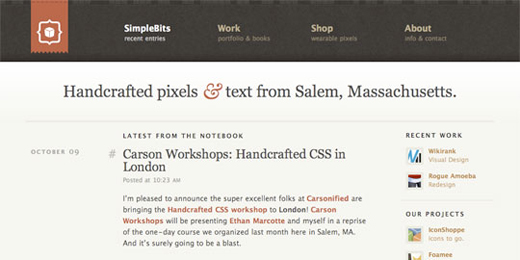
Dan Cererholm's Blog
Dan Cederholm's Blog covers a vast amount of topics and also (this is something I hadn't at first realised when researching this particular designer) provides links to content posted by other web users.
Whilst the vast majority of the content displayed within his blog is relevant, there are moments where unrelated content crops up, which irks me slightly. Some things are best left to less permanent media, such at Twitter, in my opinion. At this point I took Dan off my list of people I may research.
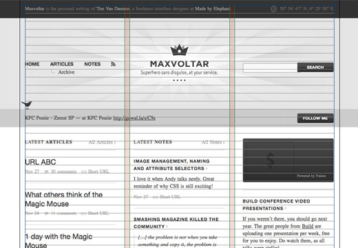
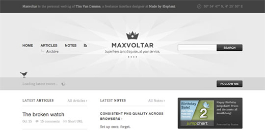
MaxVoltar's (Tim Van Damme's) Blog
MaxVoltar's Blog is one that I immediately liked. Even before the content I loved the layout. I'm not that great when it comes to colourful designs, everything I produce ends up monochromatic. This blog, however, pulls the colour scheme off in a much more elegant manner than anything I've achieved.
One of the first things that I noticed about the latout of the content was that there were two rather well definied areas. One entitled "Articles" and another, much larger, entitled "Notes". It surprised me, somewhat, to discover that the notes section actually links to content posted by people on other web sites. It struck me as a rather unique thing to see online these days and was something that I really liked seeing, as I mentioned in my final report. This is why I decided to keep Tim Van Damme on my list of people I may research.
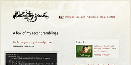
Elliot Jay Stocks's Blog
Elliot's Blog design was one that I really liked. It contained a nice amount of designery entries as well as more code orientated pieces. It even had an element of humour in there that seemed to fit perfectly into the site. When I was looking at his content I liked what I was seeing, and at points even found myself wishing I'd stumbled upon some of his wordpress articles last year when I was on placement as part of my Foundation Degree Course last year.
I wasn't an overly big fan of the layout of the blog and things seemed a bit too spaced out for my own preferances, but I still found the overall site and content to draw me in. So much so that, in the end, I kept him on my list of people I would be interested in researching.
Decision Time
After three stages of working through the aspects of the various designer's online presences, I had narrowed things down to two designers. Which one would I choose? At this point I wasn't sure what to do next to decide between the two. At this point it came to my attention that a friend of mine, and fellow student, Simon Fraser had already decided to research Elliot Jay Stocks for his learning log. After hearing this I decided that I would research Tim Van Damme so that none of our content could accidentally or intentionally end up in the other's work.
Small Note
Note: When looking through this log entry you may notice some discrepancies between the date that it was posted and the dates in some of the images. This is due, in part, my deciding to update some of the images for this writeup but is also due in part to the piece itself being written slightly late. As such some of the dates in the images are more recent than the report is. Also, I'm fairly sure Jason Santa Maria's site was a dark design when I was researching Developers
References
Dan Cederholm. (2009). SimpleBits. Available: http://simplebits.com/. Last accessed 01 October 2009.
Jeffrey Zeldman. (2009). Jeffrey Zeldman Presents The Daily Report. Available: http://www.zeldman.com/. Last accessed 01 October 2009.
Tim Van Damme. (2009). Tim Van Damme. Available: http://timvandamme.com/. Last accessed 01 October 2009.
Tim Van Damme. (2009). Made by Elephant - We craft Interfaces. Available: http://madebyelephant.com/. Last accessed 01 October 2009.
Tim Van Damme. (2009). Maxvoltar. Available: http://maxvoltar.com/. Last accessed 01 October 2009.
Mark Boulton. (2009). Mark Boulton Design | Beautiful, simple design for today's web. Available: http://www.markboultondesign.com/. Last accessed 01 October 2009.
Andy Clarke. (2009). Fantastic website design in Flintshire, North Wales from Stuff and Nonsense. Available: http://www.stuffandnonsense.co.uk/. Last accessed 01 October 2009.
Elliot Jay Stocks. (2009). Elliot Jay Stocks » Home. Available: http://elliotjaystocks.com/. Last accessed 01 October 2009.
Dave Shea. (2009). mezzoblue § Home. Available: http://www.mezzoblue.com/. Last accessed 01 October 2009.
Jason Santa Maria. (2009). Jason Santa Maria. Available: http://jasonsantamaria.com/. Last accessed 01 October 2009.
Shaun Inman. (2009). Shaun Inman // Compact. Available: http://shauninman.com/pact/. Last accessed 01 October 2009.
Cameron Moll. (2009). Authentic Boredom ~ Delivered weekly by Cameron Moll. Available: http://www.cameronmoll.com/. Last accessed 01 October 2009.
Jon Hicks. (2009). hicksdesign: design for print and new-fangled media. Available: http://www.hicksdesign.co.uk/. Last accessed 01 October 2009.
Lee Munroe. (2009). Freelance Web Design Belfast Northern Ireland - Lee Munroe. Available: http://www.leemunroe.com/. Last accessed 01 October 2009.
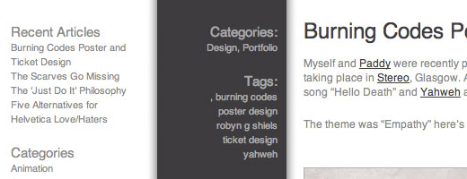
A Close-up on Web Page Elements - Part 2
As I mentioned in Week 1 I looked at a myriad of websites when trying to put together a design for my Learning Log. Whilst in the end I ended up scrapping the design I had worked towards for the current, ever-changing, one the research conducted is still a useful resource that I, and indeed others, could find useful in the future.
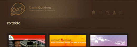
Daniel Gutiérrez - Diseñador Gráfico
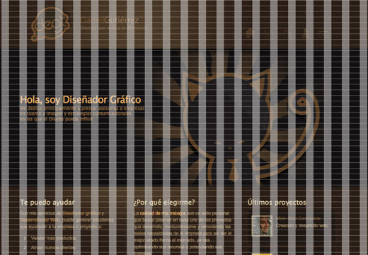
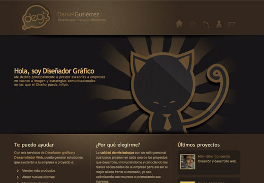
Daniel Gutiérrez is a Chilean web designer that I stumbled upon approximately six months ago, and I can't help but like his site's design. That in and of itself has always struck me as odd, as I'm not a big fan of dark sites these days, yet I love this particular design. The more I look at it the more I notice little details that really help define the shape of the content, that help draw the design together.
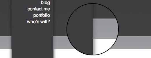
The First thing I noticed is the manner in which certain elements of the site are seperated from one another, as if there are various layers to the site, placed one on top of the other. This is particluarly evident with the site header, with the dark central element that I can't help think could quite easily be covered by the elements before and after being pushed together, something that actually happens on other pages of his site:
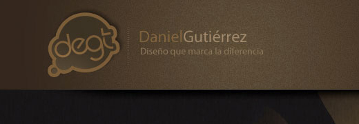
Other elements of the site that help to pull the design together and that display the attention to detail come in the finer details of site's elements, first noticable in his header, using effects to bring attention to his logo, by using an effect to make it look like it's under a spotlight.
The same effect is used on the far side of the header block on the homepage, helping to keep the look of the site consistent.
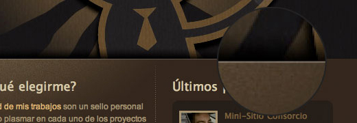
Another element that is used in this page, one that I pointed out when looking at the JustWill site two weeks ago, is that the site makes use of very slight borders to some of the edges, helping to define the shape of elements, creating a clean border between them and the adjacent elements of the web site.
One aspect of the site that I really like with the design of the site is that some of the definitions are barely visible within the website. Towards the bottom of his site the scheme is decidedly darker. What I didn't notice at first was the really dark elements hidden in the footer area. I didn't even notice them at first until I was zoomed in on elements on photoshop to get closeups for the images you've seen above.
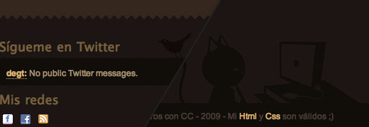
Then I began to notice the extra detail hidden in the background of the footer and, upon looking at the site again I was amazed that I had ever missed them. The two that I really love are the Twitter and Contact Me section details.
Finally, the last thing that truly stands out for me with this site design is how well the text fits into the design. Not just with the layout but also with the colour scheme used. The links are a subtly different colour so that they stand out without being garish or clashing with the overall design of the site.
Conclusions
Sites like this are sites that I find to be highly interesting to look at, and serve as a constant reminder that there is a great deal of design skill and knowledge that I quite simply do not currently posses. It's part of why I find myself drawn to such designs, as they inspire me and push me to improve my own design concepts and skills, to constantly re-evaluate what I think I know and to push beyond what I have already learnt.
References
Daniel Gutiérrez. (2009). Daniel Gutiérrez - Diseñador gráfico. Available: http://www.degt.cl/. Last accessed 6 October 2009.
Web Standards & Web Standardistas
As part of designing a web site there are two aspects to it. The most visible of these is the design aspect of a web site. The graphics and the layout of the different elements of a site is the first, and typically only, thing that a site's user will ever encounter. There is a second aspect and without it the design would never be usable or even visible to the users. I speak of course, of the HTML coding behind the site.
I've personally been coding web sites for longer than I would care to recall. Over the time between then and now I have learnt a great deal regarding the various aspects of HTML coding. One of the most I have encountered comes in the form of Web Standards.
What ARE Web Standards?
Web Standards are a set of rules have been thought out and designed so that they deliver the greatest benefits to the largest number of users of the web whilst also ensuring the long-term viability of documents published online. Essentially this means that, as with car radios or light bulbs, there are a set of rules that web sites must follow to ensure that they are displayed properly in the browser. Not doing so may cause problems, to the point that making a mistake can often be the cause of multiple errors with a site's design. They're easy to abide by and help to eliminate errors in sites, so there's really no reason not to follow them.
Web Standardistas
HTML and CSS Web Standards Solutions: A Web Standardistas' Approach is a book that I have had to read as part of this unit. Before reading it I really didn't expect to learn anything much from the book, so I was pleasantly surprised. It reminded me of some very useful pieces of HTML code that I had managed to forget about, such as the <cite></cite> tag, particularly useful when quoting people for reports.
It's reintroduced me to things that I had, somehow, managed to forget as well as introduced me to a few new pieces of information, as well as the odd CSS hack to break certain versions of the browsers known as Internet Explorer in order to make them actually work. I foresee myself putting much of this newfound knowledge to good use over the following weeks.
References
Christopher Murphy & Nicklas Persson (2008). HTML and CSS Web Standards Solutions: A Web Standardistas' Approach. : FRIENDS OF ED.
Personalities and Monograms
This week our Lecture session was rather involving, and required a lot more looking at ourselves and trying to get a better understanding of who we are and what makes us the people we are, by looking at our own personalities. It also requires us to research, experiment and design monograms, producing a monogram with our initials as the final piece. As there are two elements to this I'm going to break it down into two sections, starting with Personality.
Personality
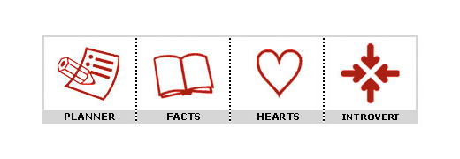
During the lecture itself the students, and indeed lecturers, took a quiz to identify their personalities according to the Dr. Phil's Personality test. I came out of the quiz with a total of 49 which classes me as the following:
Others see you as fresh, lively, charming, amusing, practical and always interesting; someone who's constantly in the center of attention, but sufficiently well-balanced not to let it go to their head. They also see you as kind, considerate, and understanding; someone who'll always cheer them up and help them out
What do I think of my Results?
I would agree with some of what the above suggests about me, but really found myself disagreeing with the majority of what was said. During the lecture we were also linked to the BBC's Science & Nature "What Am I Like?" questionnaire and we were recommended to post the results on our Research Log. Below you can find mine.
Your answers suggest you are a Nurturer
The four aspects that make up this personality type are:
Summary of Nurturers
Care for the important people in their lives
Strive for harmony and avoid confrontation
Think of themselves as gentle, conscientious, and mature
May have trouble making decisions that could hurt others
More about Nurturers
Nurturers are quiet people who believe in order and diligently look after the people they care about. They focus on the needs of others and establish routines to help them meet their commitments.
Nurturers are the most likely group to say they prefer a job where the same thing happens every day, according to a UK survey.
Nurturers remember details that are important to them, such as their friends' birthdays and anniversaries. People with this personality type value others' feelings and may challenge behaviour they think is insensitive.
In situations where they can't use their talents or are unappreciated, Nurturers may feel bitter and seek support by complaining to their colleagues. Under extreme stress, Nurturers may become preoccupied with the worst possible outcome and believe that they are heading for disaster.
Because they are so caring and loyal, Nurturers run the risk of being taken advantage of.
Nurturer Careers
Nurturers are often drawn to jobs that allow them to help others.
It's important to remember that no survey can predict personality type with 100 percent accuracy. Experts say that we should use personality type to better understand ourselves and others, but shouldn't feel restricted by our results.
What do I think of my Results?
Overall I find these results to be a much better representation of the person I think that I and others perceive me to be. The questions seemed to be more in depth and provide a better insight than was provided by Dr. Phil's quiz.
Monograms
Monograms are logos created by overlapping a minimum of two or more letters to create a single entity. They are often created by combining the initials of an individual or company. A cypher, often referred to as a monogram, is a series of uncombined initials.
Monograms - A History
Monograms are a very old method of placing importance upon something, from ownership to currency to use as a personal signature. The word monogram hails back to it's Greek origins, as explained in the following excerpt from The Columbia Encyclopedia:
monogram [Gr.,=single letter], symbol of a name or names, consisting typically of a letter or several letters worked together. A famous monogram is that of Christ, consisting of X (chi) and P (rho), the first two letters of Christ in Greek. The monogram has been commonly used by artists (e.g., Dürer), monarchs (e.g., E.R. for Elizabeth II), companies, societies, and others. Bridal monograms and monograms on clothing, silverware, jewelry, seals, and letterheads are common.
Paul Lagasse (Editor), Lora Goldman (Editor), Archie Hobson (Editor), Susan R. Norton (Editor), Columbia University (Corporate Author) (2000). The Columbia Encyclopedia, Sixth Edition. 6th ed. Gale Group.
The monogram is the oldest form of identification in the world that is still used and recognised today. Their roots are in a very basic form of currency, where clay coins were marked with the monogram of a region's ruler. Later monograms became the mark of valuable property, such as gold, silver or weapons, armour and household items. Many Coats of Arms are based around monograms.
OK, so where can I find examples of monograms?
Monograms are all around us. Artists often use them instead of a signature, cleverly worked into their art, used as company logos or used as an elaborate signature.
Monograms are usually made up of initials overlapping one another, but as evidenced in "Graphic Design That Works: Secrets for Successful Brochure, Identity, Logo and Promotional Design" this is not always the case. The following is an except that covers the creation of the current IBM logo, which is three letters unified by the graphical style applied to them:
Debuting in 1956 and designed by Paul Rand, the original IBM monogram featured three solid letterforms set in a modified version of City Medium, a geometrically constructed slab-serif typeface created in 1930 by the German designer Georg Trump. In 1962. however. Rand embarked on a redesign. feeling the monogram in solid form exuded an aura of heaviness that didn't reflect the company's progressive aspirations. As a remedy. Rand added stripes to the logo to unify its three letterforms and give it a high-tech feel by evoking the scan lines on video terminals. The mark's simple, flexible style has allowed it to remain virtually unchanged for nearly forty years and to move with ease from print to fax to broadcast to the Web.
Rockport Publishing (2004). Graphic Design That Works: Secrets for Successful Brochure, Identity, Logo and Promotional Design. Rockport Publishers Inc. 24.
So a monogram can be made up of letters unified either by contact or by a unifying graphics effect being applied. Are there any rules? Technically, yes there are:
Monograms of the 19th century had the three initials side by side with no overlap. The first and last name initials were a smaller font size than the middle initial. The overlap and initial size rules changed in more contemporary times to reflect a large last name initial and overlapping that created a symbol. The last name initial is also commonly found between the first and middle name initials.
If you are searching for a gift for a newlywed couple, such as monogrammed bathrobes or towels, the standard is to put the man's first name initial to the left of the last name initial and the woman's first initial on the right side. An exception to this would be linens, which is usually considered to be in the interest of the bride. If you are purchasing linens as a gift, have the monogram reflect the brides initial first.
They aren't set in stone though and, as such, can be bent or even ignored. Rules cover how letters should be laid out and what letters can be used, and how they can be used. The rules allow for a mirroring or flipping of letters, allowing for quite a bit of flexibility in how letters are displayed. It obviously won't work for every letter though, as a b would look like a d, or a q would look like a p, and some letters look the same regardless. Overall, however, it allows for a great deal more creativity when it comes to the creation of a monogram.
Paul Lagasse (Editor), Lora Goldman (Editor), Archie Hobson (Editor), Susan R. Norton (Editor), Columbia University (Corporate Author) (2000). The Columbia Encyclopedia, Sixth Edition. 6th ed. Gale Group.
Rockport Publishing (2004). Graphic Design That Works: Secrets for Successful Brochure, Identity, Logo and Promotional Design. Rockport Publishers Inc. 24.
Monograms, Logos and Icons in the Airlines
Rather than go with a more typical approach to my research this week, that of sticking to a particular theme of looking at a specific industry sector, I thought that I would expand my horizons slightly for this week's research. So, for this week, I am going to look at the branding used by the various airlines and see what insight I can gain from the monographic, typographic and iconographic pieces that the various airlines use.
Monographic (and Cypher) Logos
Each of the above brands makes use of a monogram, or cypher, somewhere within their logo. This is often alongside other graphical elements, as in the case of Northwest Airlines, or American Airlines, all of which help to identify the airline, to help their branding stand out to potential customers.
This isn't true with every airline displayed though. Airlines such as British Midlands and All Nippon Airways stick almost entirely to their cyphers, as they are that well known in their areas of travel that words aren't necessary to help identify them to people... their branding is that well known.
Typographic Logos
The logos above all have one thing in common, their names are all clearly visible to the eye. Many of the logos have other graphical elements that make up part of their logo designs, but the prominent element is the name of the company. Some airlines using a typographic logo also make use of other graphical elements in the design, such as logos with companies such as Lufthanasa or Air Canada, or a large block colour to highlight the brand name itself, such as with Swiss.
Logos
Not many airlines really make use of logos and none make use of them entirely. The examples above all make use of the airline's name alongside the logo. Whilst some, such as Aer Lingus and US Airways, have a highly prominent logo, they still put their brand name underneath the logo.
Conclusions
It seems, to me, that no airline has really got the strength of brand needed to allow them to use their logo as the sole method of promoting themselves, and that they still need the other ways of helping their brand stand out.
HTML5
There are many different forms of web site markups. Ranging from HTML 4, to XHTML 1.1, to XHTML 2, through to HTML5. Wait. Why's XHTML 2 struck through? In July, the XHTML 2 working group announced that it would no longer be working to complete the spec on HTML 2 and would instead be focusing more on the HTML5 spec.
OK, tell me more about HTML5
HTML5 will allow for two approaches to be taken towards it. The first is more inline with the HTML spec, allowing for capitalised tags and all things associated with HTML 4. The second, however, is essentially XHTML and is, in fact, referred to already as XHTML 5. It follows all the rules of traditional XHTML, and requiring being served as application/xml or application/xhtml+xml (which isn't currently supported in IE).
What else does HTML5 bring to the table?
HTML 5 allows for all the same code that designers are used to seeing, with a few tweaks to some, as well as adding a few new tags into the mix as well. Let's take a look at some of the notable changes, shall we?
DOCTYPE (XHTML)
<!DOCTYPE html PUBLIC "-//W3C//DTD XHTML 1.0 Strict//EN" "http://www.w3.org/TR/xhtml1/DTD/xhtml1-strict.dtd">
DOCTYPE (HTML 5)
<!DOCTYPE html>
As you can see, the HTML5 version of a DOCTYPE declaration is a lot more simplistic than the original XHTML version. A lot of the other new elements provide simple, semantic, methods of presenting data in a web page. Remy Sharp explains them in his article, HTML5 Today!, explains them as the following:
Block Elements
article represents a component of a page that consists of a self-contained composition in a document, page, application, or site that is intended to be independently distributable or reusable. This could be a forum post, newspaper article, a user comment, or any other independent item or content.
aside is used to represent a section of content that is related to the content around the aside element, eg a pull quote or a sidebar.
footer is the footer of a section. This is not restricted to one use at the bottom of the page. You can also use the footer to mark up the footer of a blog post in addition to the footer of the entire document.
header represents a group of navigational aids, and is used to construct the document outline. You are also not restricted to using header only once; you could use this to mark up the author's name and the time of a comment placed on a blog post, for example.
nav is used to wrap major navigation blocks, such as table of contents, pagination links and breadcrumbs. Note that the nav element should be used for links that navigate around the site, ie inappropriate for a list of sponsor links.
section is a generic document or application section. However, this isn't a replacement for the div element. A section is only appropriate if the element's contents would be listed explicitly in the document's outline.
Inline Elements
details is used to include additional info that the user can obtain on demand. An open attribute on the element determines whether its contents can be seen, and it can be toggled by the user or by JavaScript.
figure is used to annotate illustrations, photos, listings etc that, if moved away from the primary content, would not affect the flow of the document.
mark highlights a run of text, eg to mark the terms the user was searching for.
time is intended to encode modern dates and times in a machine-readable way. The datetime attribute on this element gives the machine readable time, whereas the contents is human readable.
In addition to the above, certain details are no longer required for existing elements. For elements such as style and script default to being CSS and JavaScript respectictively, which helps cut down on the size of the web site.
Making it all Work
So what does it take to make HTML5 work? The answer is surprisingly little. All the major browsers, with the exception of Internet Explorer. All other browers will accept "made up" elements and will style them based upon contents of a stylesheet. Internet Explorer can be co-erced into working in a similar fashion with a piece of JavaScript, to tell it that the elements actually do exist and that they can be styled. An example of the code that can be used to do this is below, provided by Remy Sharp:
					// For discussion and comments, see: http://remysharp.com/2009/01/07/html5-enabling-script/
					(function(){if(!/*@cc_on!@*/0)return;var e = "abbr,article,aside,audio,canvas,datalist,details,eventsource,figure,footer,header,hgroup,mark,menu,meter,nav,output,progress,section,time,video".split(','),i=e.length;while(i--){document.createElement(e[i])}})()
One other matter needs attention. To make certain elements render properly an additional line of CSS is required, to make certain elements display properly.
I like how HTML5 is shaping up as a specification. I've actually experimented with it already, and I'm quite interested in developing futher projects using it as the basis of the site design. Combined with CSS 3 I think it could be used to produce some very appealing designs.
Branding is important, not just for big businesses and corporations, but for individuals and freelancers as well. It is also often overlooked, probably because people don't recognise the large benefits that it can provide.
When people mention branding, the first image it will typically conjur up is that of logos or graphical representation of a business. In reality, branding is a great deal more broad that that. It encompasses the entirety of an identiy. whilst a logo is an important part of any brand, there are other areas to take under consideration too, such as the design of any online presence, the way that content is displayed, business cards and into other areas, such as any printed media used, be it promotional flyers or invoicing paperwork.
What's the importance of a Brand?
A brand helps to make you stand out. When you see certain logos they immediately bring images into your head. The same can be said of certain colours, they can help identify a company in a certain industry. Examples of this would be in the soda industry with red, CoCa Cola or Dr Pepper would spring to mind, or green bringing 7up or Mountain Dew to mind.
A properly identified brand will have printed media that would immediately put their company in mind, even without their logo on the paper. As such it can be very important for an individual to brand themselves, as it is even more difficult to keep their identity in the public eye. Tied into this is the need to make their brand stand out, as that will help make them more memorable.
Creating your Brand
The logo is the most vital part of any brand, it's the graphic that will be used throughout your brand and as such needs a great deal of attention to ensure that it portrays the right message about yourself. Everything else that makes up the branding should be designed to work around the logo that you decide upon.
Once you have your logo, it is time to decide upon the design of other areas, such as your website, business card and any other materials you wish to produce. They should all relate back to the logo design and use similar colours in a way that will produce a cohesive appearance.
After this it's a case of deciding upon how to market yourself to people. You may find it handy to work out an approach to market yourself in person, but ultimately it is up to you to decide upon the best way to sell yourself.
Conclusions
Creating a brand for yourself isn't a simple thing to accomplish. It shouldn't be rushed as, ideally, the brand you create shouldn't need to be replaced, merely updated.
When i first started my Research Log I was committed to trying to analyze site designs as often as I could. This is primarily because my own knowledge of design is much more limited than my knowledge of code. This isn't to say that my coding knowledge is perfect, merely that it is far more advanced than my knowledge of design.
To this end I have tried to look at various website design techniques and learn from them. With all of the other aspects of research I have had to conduct, however, this important element of research has fallen by the wayside. To resolve this I am looking at a design that I find quite appealing, but that also makes use of the HTML5 coding standard that I have a growing interest in.
This week, for my research, I will be taking a look at the portfolio site of the Portuguese Web Engineer and Architect José Mota. I have chosen his site as it is both visually appealing to me and makes use of the upcoming HTML5 Coding Specification. As both aspects, code and design, of his site appeal to me, I think that there will be a lot of his site that I will be able to look at and talk about, which will in turn provide me with plenty of learning opportunities with both design and coding knowledge and help me develop a better understanding of both.
Jose Mota
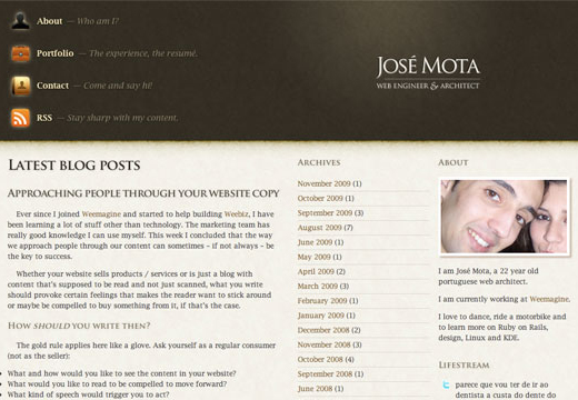
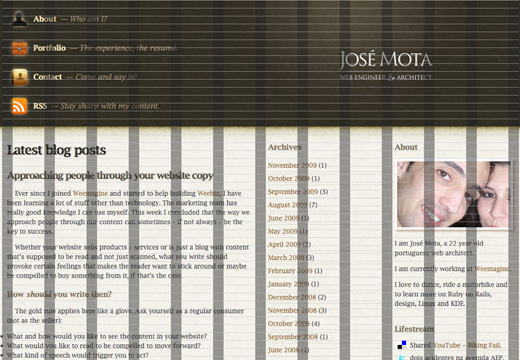
As mentioned already, José Mota is a Portuguese Web Engineer and Architect. His site is one of a great deal of sites that are being developed using HTML5, but is one of the very few that I have found that was actually visually appealing. His site has a very elegant, yet simple, design. This provides less distraction for users to the site, but doesn't mean that the design aspect of the site has to be ignored.
Analysing the Site
The graphical aspects of the site are very minimalistic whilst maintaining an elegance about them. The graphical elements don't detract from the site's design, and don't pull attention away from the content presented upon the site. Instead they subtly enhance the layout and help pull the user's attention to the content he has presented to them.
Analysing the Header
An example of an element of his design that helps highlight aspects of his site is the way that his logo is highlighted. The rest of his header makes use of a very dark background, with the only area that changes being behind the logo itself. This helps to draw attention to the logo, which acts as the only way to get back to the home page of his site, something I'm not sold on being the best of ideas.
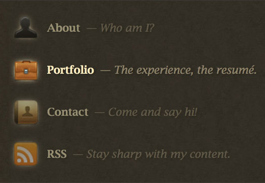
Here you can see the dark background that fills the rest of the header section of the site. To help draw the eye to the navigation José makes use of contrast, in this case between the navigation elements and the background of he header element. As I've mentioned over in my Creative Experimentation for the week I'm not the biggest fan of vertical navigation. I do, however, like the look of it in this instance. Typically vertical navigation is placed in a sidebar or column, which ultimately takes away from the space that can be dedicated to actual content. This example of vertical navigation doesn't do that. There is, however, one element of his navigation that I both like and dislike.
You might think that it's odd that there is something that I both like and dislike about a design element. Maybe it is odd, or maybe the word dislike isn't the best fitting of words. I like the approach taken, but find that the idea isn't implemented as I would like. All of the navigation elements are dimmed because the user hovers their mouse over a single element, whilst the one that is being hovered over becomes even brighter.
It struck me as odd that the other elements were faded out just to further highlight the one element that the user is looking at, and that feeling has never changed. Personally I'd only have the effect increase the brightness of the hovered over link, possibly having the dulled down effect applied to all the links when the page loads to provide the emphasis upon them when the mouse is hovered over them.
HTML for the Header
As mentioned already, José makes use of HTML5 in the design of his site. This allows him to make use of a slightly different layout of code. An example of this is the site header:
					<header><div>
						<h1><a href='/'>José Mota - Web engineer & architect</a></h1>
						<nav>
							<ul>

								<li id='n-about'><a href='/about'>About</a> - Who am I?</li>
								<li id='n-portfolio'><a href='/portfolio'>Portfolio</a> - The experience, the resumé.</li>
								<li id='n-contact'><a href='/contact'>Contact</a> - Come and say hi!</li>

								<li id='n-rss'><a href='http://feeds.feedburner.com/josemotanetblog'>RSS</a> - Stay sharp with my content.</li>
							</ul>
						</nav>
					</div></header>
You can see that many of the tags that we are used to in XHTML are there, but that there is another thrown in too, the <header> tag. This allows users to create elements that are to be defined as the beginning of something, in this case the beginning of the web site. There are still a few problems with new elements such as this, namely that it can be very problematic to centre their position on the screen.
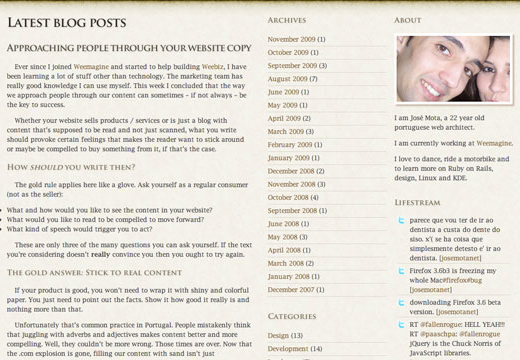
Analysing the Content
The body of the site forms a nice transition from the dark, attention grabbing, header into a much easier on the eye three columned layout for the content of the site. I find dark websites very difficult to read unless they are very carefully designed, so this transition appeals to me.
The three columned layout also allows for multiple different pieces of information to be displayed. This is useful as it helps provide a dedicated area for content to be displayed in, outlined by the extra columns. You can see in the image above how this is achieved with the archives and categories being listed next to the site's content.
On the whole I also like the layout of his text and his typography. The one thing that I dislike about it is the way that his lists are implemented with the bullet points appearing outside of the flow of his design. I do really like the way that he has made use of his headings, making use of small caps to help them stand out.
One last aspect that I really like about the layout of his site's content is the image he uses to finish off each of his blog posts, the very calligraphic looking clover image. I find that it provides a very elegant way to highlight the end of an article without being too eye-catching.
HTML for the Content
The actual HTML code for this section of the page is, understandably, rather long. As such I'm not going to copy the entire code here, but will instead display a cut down version of it.
					<section id='main'>
						<h1>Latest blog posts</h1>
						<article>
							<h2><a href="http://jose-mota.net/2009/11/approaching-people-through-your-website-copy/" rel="bookmark" title="Permanent Link to Approaching people through your website copy">Approaching people through your website copy</a></h2>
							<p>Ever since I joined <a href="http://www.weebiz.com/members/weemaginecom">Weemagine</a> and started to help building <a href="http://weebiz.com">Weebiz</a>, I have been learning a lot of stuff other than technology. The marketing team has really good knowledge I can use myself. This week I concluded that the way we approach people through our content can sometimes - if not always - be the key to success.</p>
							<p>Whether your website sells products / services or is just a blog with content that's supposed to be read and not just scanned, what you write should provoke certain feelings that makes the reader want to stick around or maybe be compelled to buy something from it, if that's the case.</p>
						</article>
						<div class='blog-nav'>
							<p class='newer'></span>
							<p class='older'><a href="http://jose-mota.net/page/2/" >Older Entries</a></span>
						</div>
					</section>
					<aside id='mid'>
						<div class="widget">
							<h3>Archives</h3>
							<ul>
								<li>
									<a href='http://jose-mota.net/2009/11/' title='November 2009'>November 2009</a> (1)
								</li>
							</ul>
						</div>
						<div class="widget">
							<h3>Categories</h3>
							<ul>
								<li class="cat-item cat-item-3">
									<a href="http://jose-mota.net/category/design/" title="View all posts filed under Design">Design</a> (13)
								</li>
							</ul>
						</div>
						<div class="widget">
							<h3>Recent Comments</h3>
							<ul id="recentcomments">
								<li class="recentcomments">Marco Pinheiro on <a href="http://jose-mota.net/2009/09/fail-a-moda-do-porto/comment-page-1/#comment-80">Fail  à moda do Porto</a></li>
							</ul>
						</div>
					</aside>
					<aside id='far'>
						<div class="widget">
							<h3>About</h3>
							<div class="textwidget">
								<p><img id='aboutpic' src='/wp-content/uploads/2009/07/about.jpg' alt='José Mota' /></p>
								<p>I am José Mota, a 22 year old portuguese web architect.</p>
								<p>I am currently working at <a href='http://www.weebiz.com'>Weemagine</a>.</p>
								<p>I love to dance, ride a motorbike and to learn more on Ruby on Rails, design, Linux and KDE.</p>
							</div>
						</div>
						<div class="widget">
							<h3>Lifestream</h3>
							<ul class="lifestream">
								<li class="lifestream_feedid_2 lifestream_feed_twitter" style="background-image: url('http://jose-mota.net/wp-content/plugins/lifestream/icons/default/twitter.png');">
									<div class="lifestream_text">
										<div class="lifestream_label"><a href="http://clientsfromhell.tumblr.com">http://clientsfromhell.tumblr.com</a> - omg, those are ridiculous :P [<a href="http://twitter.com/josemotanet/statuses/5944776577">josemotanet</a>]
										</div>
									</div>
								</li>
							</ul>
						</div>
					</aside>
Even with the code severely cut down, it's still a rather long piece of code. I've also had to clean up a lot of the code with regards to layout, a fault I will place with Wordpress rather than the designer's coding, though that too is a possibility. It's perfectly fine as far as the coding aspect of things goes, but the actual layout left a lot to be desired. If you want to check it out for yourself, feel free to check the references section for a link to the site.
This section of the site introduces us to a great many more of the new HTML5 elements, in this case we have <section>, <article> and <aside>.Each of these provides new semantic ways to mark up areas of the code. A <section> is used to define an area of the page in which content will all be related. In this page it is used to create an area for multiple blog posts which are, in this case, marked with the <article> tag. This tag is intended for use for content that is repeated throughout an area, such as blog posts.
Finally, for this area of the site, there is the <aside> tag. This allows for the designer to define areas that are removed from the main content. It can be used for a myriad of different purposes, many of which are displayed on this particular site.
Analysing the Footer
José has a very minimalistic deisng for his footer, which essentially reiterates what his header says. It is entirely text based, however, with a simple graphical element in the centre. There isn't really much to say about it beyond this.
This final section of the HTML code introduces one final HTML5 tag, the <footer> element. Similar the <header> tag, this is used to mark the end of something, in this case the site.
References
José Mota. (2009). José Mota. Available: http://jose-mota.net/. Last accessed 21 November 2009.
Grid Layouts and their use on the web
This week I will be one step closer to having a completed redesign of my portfolio. All that will remain is the actual coding of the design. Before I get ahead of myself though, there is one thing I must complete first, wireframing and compositions of what the site will look like.
So before I dive into that aspect of my design, I think it would be wise if I did some form of research into elements that will need to factor into my design's composition. Some very important elements that are worth mentioning were brought up in the lecture presented by Tim and Ian this week.
DES311 Lecture
This week's lecture was very insightful for me, covering some very important elements of designing for the web. There are many factors that need to be taken into consideration when designing for the web that aren't present anywhere else. The first of these is that you don't have any control over the way that your site will be viewed. You site can be viewed in a Windows OS, an Apple OS, any of the flavours of Linux and on multiple smartphones. Each of these will display things differently, use different resolutions and can be using different resolutions, all of which can have an impact upon the way your site is viewed.
Imagine, if you will, that a designer produced a site that was 1200 pixels wide. Now imagine what it would look like to a user with a screen resolution of 1024x768 pixels. This isn't all that unrealistic of occurances, the following provides some statistics on screen resolutions in use currently:
Current Screen Resolution Statistics (W3C Schools) from January 2009
Higher than 1024x768
57%
1024x768
36%
800x600
4%
640x480
0%
Unknown
3%
As you can see, there are no known screen resolutions so it would seem logical to work towards fitting that width, correct? Not quite. There is one thing that needs to be considered on top of this when dealing with browsers. Scrollbars. Assuming that there is going to be even a reasonable amount of content displayed upon your website then you are going to have a scrollbar down the side of your page that you will need to consider the width of it in your design. 40 pixels will cover all but the most bizarre browser's scrollbars. This leaves us with 984 pixels to play with. Which leads, quite nicely, onto my next point.
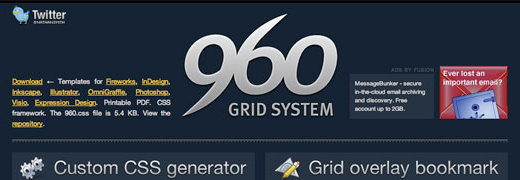
The 960 Grid System
Why 960 pixels? It's actually due to basic mathematics. A width of 960 pixels allows for a vast amount of scope for a vast amount of flexibility, being divisible in quantities of up to 12, 16 or even 24 columns, allowing for a flexible area in which to create a unique website, but doing so using a structured layout.
Why is it so important?
More and more, the media of web design is getting to the point where things need to be perfect, to the pixel. Whilst this isn't necessarily possible, due to the issues mentioned earlier, the closer to that goal you are, the higher quality it will be. Quite often you will hear of people crafting sites rather than building them. This seems to be the direction in which web design is headed, and should be something that you bear in mind when designing a website.
Examples of the Grid System in use
Examples of sites using Grid Systems are all over the place. In fact, the 960 Grid System website provides examples of various sites that make use of the grid system. I'd like to highlight it a little bit further though, and look at some more sites, names from the list of people we could research, taking a look at the sites that I have personally analysed as well as a few new sites that I frequent. To begin with, let us look at the sites I've researched over my time on this course.
JustWill
You can see that Will's site fits the width of a 960 pixel site quite well, but doesn't seem to follow a structured layout inside of this. I know he hadn't discovered the grid system at this point and has plans to redesign his site though, so I won't give him too much grief over it.
Daniel Gutierrez - Disenador grafico
I've used a 20 column layout to try and demonstrate a grid pattern for this site, but it is still only a very loose fit. I think that the site looks really nice and clean though, and helps to highlight that not everything needs to use a grid, but that it can be very helpful to do so.
Jose Mota
Of all the sites I've researched as part of my Learning Log this site highlights how well a grid system can work the best. The site is laid out so that no element is too overpowering and that each piece is afforded a respectable amount of space. This helps the readability of the site, as it shortens the line width of the main content of the site, making it less likely that the user will lose their place when reading the site.
MaxVoltar's (Tim Van Damme's) Blog
Maxvoltar's site makes use of a very simple 3 column design for it's main layout, which carries over into the rest of his pages. A simple grid pattern that is excellently executed providing an elegant design for his blog.
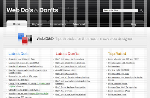
Web Do's & Don'ts
I don't really have a whole lot to say about this site, it's pretty much a textbook example of the usage of a 12 column grid pattern.
Is it the be all and end all of Design then?
Grid Systems are the means to an end. They are a set of guidelines to help with the design of a website. Guidelines can, however, be bent, broken or even ignored. Elliot Jay Stocks mentions this, to a degree, in an article published in .net magazine, in his article entitled "How to create your best layouts".
Grids are perfect for aligning elements on a page and creating a logical, aesthetically pleasing flow. But if adhered to unquestioningly, they can at times pose the threat of overly 'safe' designs. Interesting design is about creating the grid but also knowing when to break it.
Actually, though, the term 'break' is a little misleading, because what appears to be broken can - in fact, should - be a considered part of the grid itself.
Elliot then goes on to discuss how you need to pay attention to the finer details of elements when you start to nudge them around inside the grid system. Making sure that the elements are still aligning with the other elements of the site, where appropriate, to ensure that the site has a consistent look to it.
Conclusions
I find that grid systems can be very useful in terms of making a web site look cohesive in appearance, but that one shouldn't be bound by the nature of using one. As Elliot Jay Stocks says you need to know both when to use the grid and when to break away from it.
Bryan Veloso. (2008). 960 Grid System. Available: http://960.gs/. Last accessed 29 November 2009.
Will McNeilly. (2008). JustWill - The Design Blog of Will McNeilly. Available: http://www.willmcneilly.com. Last accessed 29 November 2009.
Daniel Gutierrez. (2009). Daniel Gutierrez - Disenador grafico. Available: http://www.degt.cl/. Last accessed 29 November 2009.
José Mota. (2009). José Mota. Available: http://jose-mota.net/. Last accessed 29 November 2009.
Tim Van Damme. (2009). Maxvoltar. Available: http://maxvoltar.com/. Last accessed 29 November 2009.
Web Do's & Donts. (2009). Web Do's & Dont's. Available: http://webdosanddonts.com/. Last accessed 29 November 2009.
Elliot Jay Stocks. (2009). How to create your best layouts. .net magazine. 194, 38-42.
Research Diary Week 11 - Learning HTML5
This week I've spent a great amount of time working on meeting my various deadlines, so I've not had a whole lot of time to really conduct any research with regards to my Design Work. Instead I will be taking inspiration from an exchange of tweets that took place between myself and a fellow student of the course, Mark Gillespie, which resulted in this tweet. With very little else that I have had time to talk about I thought I would take the opportunity to provide resources to my fellow students who are interested in learning HTML5.
I put quite a lot of thought into my decision to develop my site using HTML5 and it was only after a great deal of research and resource hunting that I made the decision to make use of the technology. The following is a break down of the resources I found most useful with, of course, links to them all.
Smashing Magazine have ran a couple of articles covering the various aspects of HTML5, as well as many other articles on design. This one served as a fantastic introduction for me to the various aspects of the HTML5 specification. For anyone looking to start development using HTML5, I would highly recommend this resource.
This, along with the next resource I shall mention, form the majority of my basic knowledge of how to code HTML5 for site designs, making use of the new HTML5 elements. It was very handy to see the implementation of the new elements in a way that made sense, as well as showing how to style certain elements to work properly, as they currently default to display:inline as opposed to display:block.
This, along with the previous resource I have mentioned, form the majority of my basic knowledge of how to code HTML5 for site designs, making use of the new HTML5 elements. It was very handy to see the implementation of the new elements in a way that made sense, as well as showing how to style certain elements to work properly, as they currently default to display:inline as opposed to display:block.
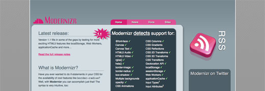
Modernizr is a JavaScript package that does two things. The first is that it provides HTML5 support to the Internet Explorer Browsers, which is a pretty handy skill in and of itself when you're talking about HTML5 site design. It goes even further though, and provides the capability to test browsers for support of multiple features. Depending on whether or not they are supported certain classes are added to the html element. This allows for fall-back functionality to be implemented by other means in the event that they aren't supported by the browser.
This page is one of two collections of HTML5 resources that I frequently reference when working with HTML5 and have problems or am looking to try something new.
This page is one of two collections of HTML5 resources that I frequently reference when working with HTML5 and have problems or am looking to try something new.
Promoting your site and Analysing Traffic
With my final Portfolio Design all but complete I have decided to turn my eye towards the parts of site management that occur after your site is launched. As the title above would suggest, there are two main elements to this post-design work: Promotion and Visitor Analyisis.
Site Promotion
There are all sorts of methods that a person can use to promote a new site. For some, it can be as simple as updating a site's domain to move from an older design to a new one, or updating details on a business card to reflect a new domain. These, however, aren't the only options available to promote a site that has just been launched onto the web.
Below are a few of the options that a user can make use of to promote their recently launched sites.
Web Galleries
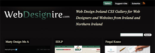
Web galleries are a hotly debated topic when it comes to promoting a site. Many galleries will accept almost any and all site designs which leads many designers to believe that using them has become a waste of time and effort. Me? I'm of a similar mindset, but I also believe that there are some galleries that break away from this and are actually beneficial to make use of. Web Design Ireland is one such place.
Web Design Ireland is a site dedicated to helping promote the best quality sites that have been produced throughout Ireland. As such it is a lot more specific in the content that it shows on the site, ensuring that only the best quality content makes it onto the site, not just anyone that submits it.
Social Media
Social Media is becoming increasingly a standard form of communication for people, with already popular sites allowing you to promote specific content from right inside their site itself.
There is, of course, a much wider range of Social Media available to people than those used by Smashing Magazine. Twitter is one of the most prevalent social media tools in existence and Facebook is, of course, highly popular but there are many more that a person can make use of. I mayself currently make use of tumblr and flickr as a place to show elements of myself off as well as promote my own work.
Site Monitoring and Analysis
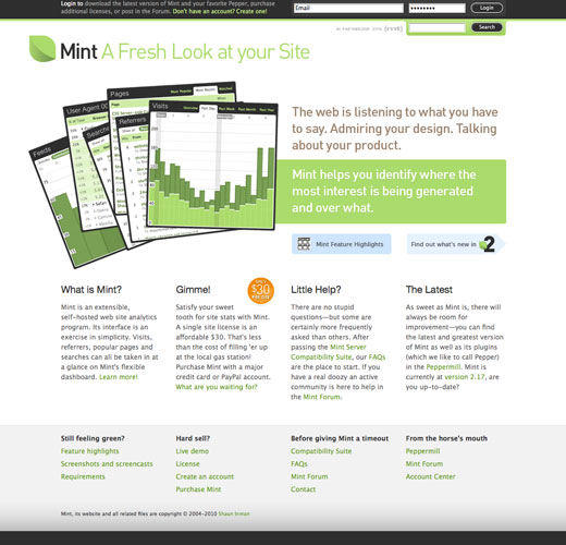
There are two major products (of which I am aware) that exist for monitoring a site's popularity. These are Google Analytics and Mint by Shaun Inman. One is developed by Google, a market leader in search providers so it is testament to the quality of Shaun Inman's product that it is able to compete as a viable alternative to the Google product.
Both allow for a highly detailed capabilities to view statistics of visitors to your site, allowing you to see how many people are visiting your site, for how long, and what they are looking at. By looking at these details it is possible to determine the effectiveness of your site and make decisions with regards to what may or may not need to be developed in the future.

