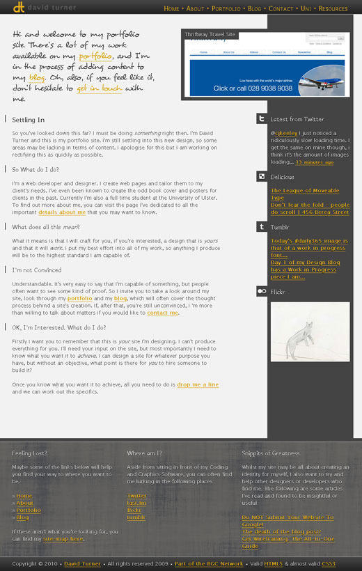
I have spent a lot of time over the last week working on a design for my Learning Log. My typical site designs have been fairly straightforward whilst looking appealing to the eye. The more I've worked on my site designs the more graphics intensive, or 'shiny', they have become. When it came to designing my learning log for this, and other, modules the trend originally continued.
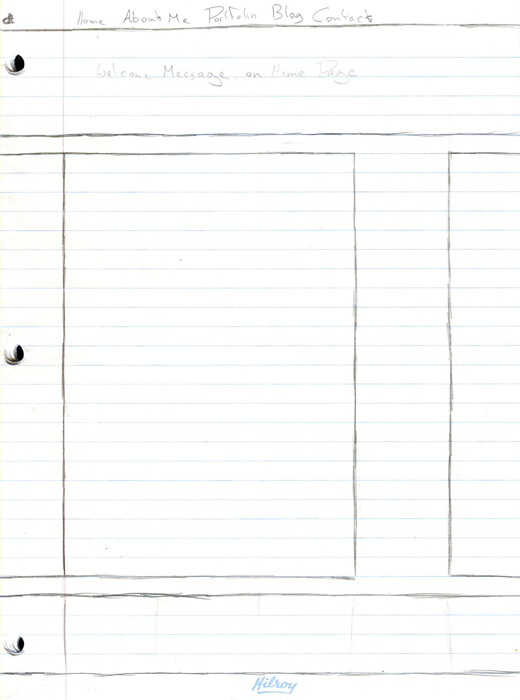
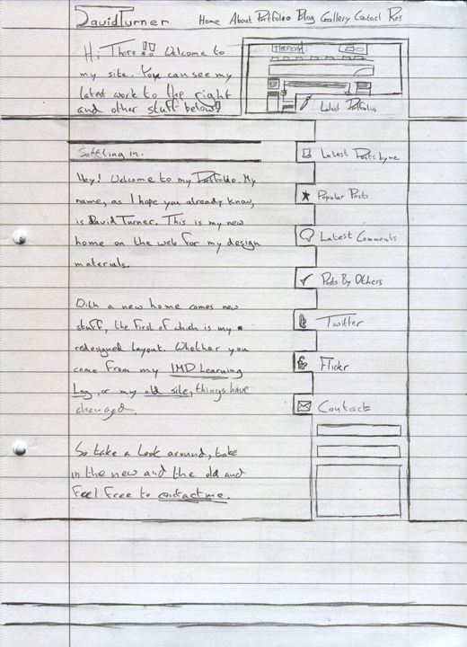
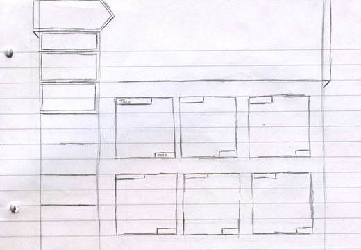
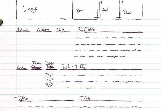
The original design I came up with was intended to make use of the popular trend of making a site appear to be made up of multiple 3D elements, also known as out of the box layouts (an example of which can be found here). Whilst many web designers that I know tend to dive straight into a Photoshop I have a tendency to pull out a notepad and paper and sketch out how I want the site to look, so that I know exactly what I want the site to look like when I start work on the design in Photoshop. The first sketch I came up with can be viewed below:
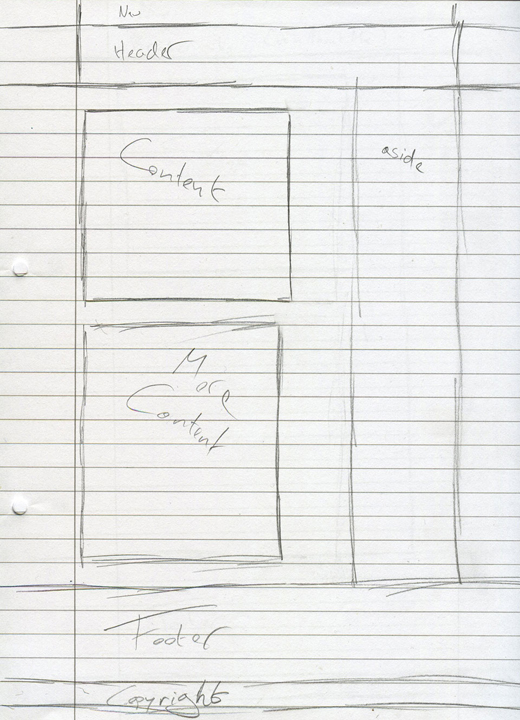
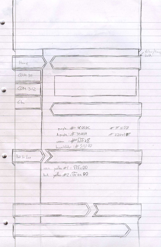
I liked the look of the different elements that I had put together, but there was something that felt wrong about how they were positioned. I couldn't put a finger on it, but with the help of a friend who looked over it I was able to figure out what it was that caused me to think that something was wrong. The positioning of the navigation menu looked strange taking up the entire side of the site. Having identified this I sketched out a new design, this time giving a dedicated space to a site header:
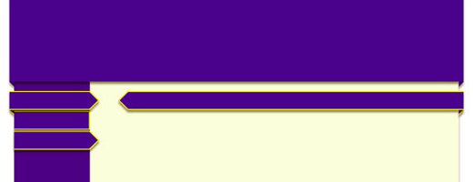
You can see in the above image that I started taking things a bit further than just sketching site designs, with the colour codes being noted down on the page. This is because I had begun creating the design in photoshop, and was using this sketch as somewhere related that I could note down colours that were being used. The piece in photoshop at this point looked like the below:
From here I began converting the Photoshopped image into a finished site design. At this point I began running into problems, as can often be the case when converting a solid image into a more flexible site design. I grew to increasingly dislike as I worked on the design. Eventually I decided I wouldn't be using the design. At this point the site coding looked like this.
By this point I had also decided that I wanted something much more simple to design. I had be greatly liked the design of the site for this unit and this probably shows through in the finished design that you can see before you.
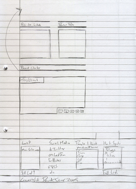
This design was strange for me, as I jumped straight into things and had a functioning site before I sketched a single thing. It's also the complete opposite of anything else I've ever produced, currently making use of no images in the design, CSS being used to produce every effect on the site. I did eventually sketch some pieces, a basic design and a more complete design that I will probably move towards over the following weeks, both of which can be viewed below:
Overall I'm really pleased with the site design I have produced for this learning log, and it has proven to be quite the experience for me, helping me break away from my normal design techniques. It's not fully finished yet, but the pieces that still need work won't impact upon the functionality of the site, merely enhance it upon implementation.
Typography on the Web
This week is something of a continuation of the previous week's research, expanding from the actual design of the site and moving into more specific areas, in this case Typography.
Typically I have a set of sans-serif fonts that I would make use of when coding a site, fonts along the lines of Tahoma, Verdana, Helvetica and other such fonts. As with every other aspect of the design I am working on I decided to take a slightly different approach. The more I looked at the design the more I felt it had in common with printed design, and for some reason I recall that printed media leans more towards making use of serif fonts than sans serif.
To this end I decided to take a more print-esque approach to the font-face used to design my site, ending up with times, Times New Roman, times-roman, georgia, serif as my font list.
On top of this I also wanted to add my own unique flair to the design. One thing I've enjoyed whilst sketching out this design was the look of how hand drawn content was looking. I've attempted to bring this into the design by adding hand drawn content and with changes to certain elements to make use of a hand-writing font, using a JavaScript Library called Cufón. It allows me to make use of unsupported fonts in a way that will let the majority of users view them as intended.
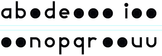
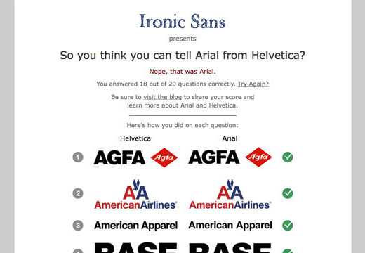
In addition, whilst I was working on this, Tim Potter posted up a link to a quiz (on Twitter) asking how well people could tell the difference between Helvetica and Arial. My results can be seen in the image below.
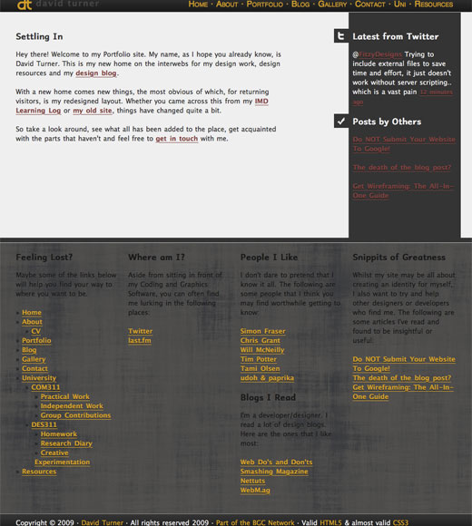
Takin' it easy
This week I've been rather overwhelmed with work that needed to be completed for my various modules. Between researching Tim Van Damme and looking into Web Accessibility I've not had a vast amount of time to spend on playing around with things to do with web design.
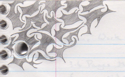
I do, however, find myself randomly doodling on pieces of paper when I'm stressed out. This typically takes the form of tribal-esque patterns and shapes, but can sometimes take other forms too. This is especially the case when I find myself without pencil and paper, and I resort to doodling with my phone, where I'll end up drawing random shapes at will.
As I've not produced anything design orientated except for these odd sketches, I figured I would throw them onto my learning log.
Typography and Javascript
A couple of weeks ago I covered typography on the web. I made reference to a JavaScript Library called Cufón, which has allowed me to make use of non-standard fonts on my site. Today I plan to cover that in a bit more detail.
OK, so what IS Cufón?
As mentioned briefly already, Cufón is a JavaScript Library that allows for an easy approach to using non-standard fonts on the web. The following excerpt, from their website, describes Cufón as the following:
Cufón aims to become a worthy alternative to sIFR, which despite its merits still remains painfully tricky to set up and use. To achieve this ambitious goal the following requirements were set:
No plug-ins required - it can only use features natively supported by the client
Compatibility - it has to work on every major browser on the market
Ease of use - no or near-zero configuration needed for standard use cases
Speed - it has to be fast, even for sufficiently large amounts of text
And now, after nearly a year of planning and research we believe that these requirements have been met.
So Cufón is intended to allow designers and developers to easily and widely use non-standard fonts on their website, safe in the knowledge that it will be viewable in the vast amount of modern web browsers, whilst degrading gracefully in those browsers that don't support the technology, all with a minimal impact on loading times. Not always the easiest of feats.
How does it work?
Cufón has two separate aspects to it. The first is a font generator, allowing for downloaded fonts to be converted into a format that is useable by the Cufón JavaScript package, which is used to render fonts.
Once you have those two things, it's remarkably easy to apply the font to any site elements you want. The following code example demonstrates how:
The above demonstrates the usage of the Cufón Library, first loading in the library itself, then loading in a font called Hand Of Sean that is to be used. Then there is a declaration specifying that this font should be used to replace certain elements of text throughout the site, in this case it focuses almost entirely upon headings, as well as a few classes manually defined within the site's code. At the very end of the page there is another piece of JavaScript that is there purely for Internet Explorer browsers to make sure that it runs the font replacement smoothly.
So what kind of difference does it make?
I've found that Cufón can make a rather vast amount of difference to the apperarance of a web site. Take for example this very page. I use Cufón to provide a more hand written font for my headings, more suitable to the design I have for my site. Compare the two halves of the following image and you'll see how much it can change the design.
Conclusions
Cufón is highly useful for the inclusion of certain fonts into websites. As with @font-face it's still a bit of a gray area as to which fonts you can and cannot use, and as such you may find yourself asked not to use certain fonts. Look into such things before you decide a certain font is necessary for your design.
Over the last few weeks I've been tweaking and developing the site you see before you, editing and adding to things, at times rethinking the layout of certain elements. One element I've not really developed just yet are various Icons that I want on the pages.
Web Site Icons
One thing I've really liked in my current site design is the hand-drawn aspect of the site. It's something that I've attempted to carry over in some other areas already would be my twitter background:
I'm sure that I've been inspired by some site I've seen whilst browsing online, but the idea really struck me when I was sketching out my original Learning Log Design. I loved the look of the sketches I was coming up with and, when I ended up scrapping the design, I decided that I would like to create a design that could make use of that "hand-drawn" element.
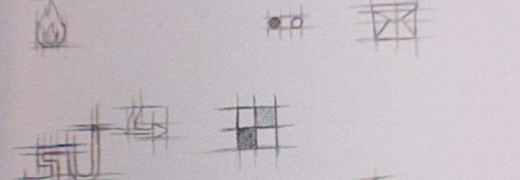
So far I've implemented that with my header and footer and the font used for my headings. One area I've wanted to implement it for, but haven't had the time to work on, is with my social media icons. I've done a few sketches for them, and have quite a few more than I will actually need or use.
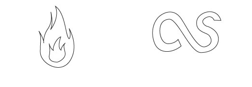
At this point I scanned in the sketches displayed above and began working on them in Illustrator, converting them from hand drawn sketches into vector based artwork. For now I'm only going to work on two of them, my Ember and last.fm icons, though I intend to add twitter and possibly a few more at a later date. At this point I've not added the tiny face to the Ember icon, though I hope to return to this at a later stage if possible. At this point the Icons loo like this:
At this stage they look rather... plain to look at. To fix this it's time to hop over to Photoshop and get to work using my graphics tablet, to add the "hand drawn" lines that you can see in the original sketched versions.
I quite like the look of the hand drawn designs I've seen online, and I quite like how my Learning Log looks. I'd like to say that I like the final Icons shown above, but they feel rushed. I think I may end up working on replacing them in the future...
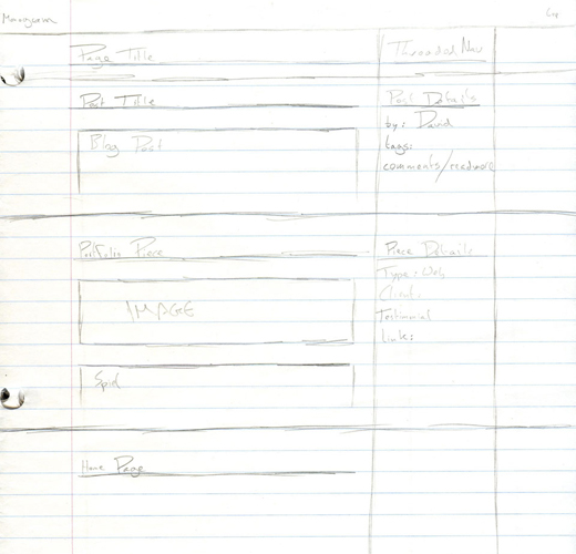
Monograms
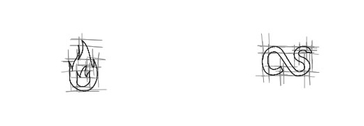
The practical work for the unit this week consists of creating a monogram using our initials. I covered the theory and history of monograms over in my Research Log and in this section I plan to cover the approach that I used in deisgning my own monogram. Typically they are made of two or three letters/initials overlapped. Looking at my own initials, D, R and T, I decided to only make use of the D and T, for the simple reason that I think I'll have a hard enough time creating a monogram of those two initials without throwing the R into the mix as well.
Designing a Monogram - Concept
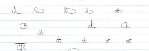
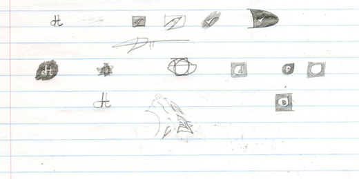
The first steps towards creating my monogram were actually undertaken on Friday's lecture, when we were told to spend a few minutes and just sketch out ideas for monograms. At first I struggled, holding onto the idea that intials should be capitalised when this isn't true of monograms.>
The more time I spent trying to create a capitalised monogram the more foolish I felt and, eventually, I decided to attempt using lower-case lettering. At this point I hit upon the idea of connecting the lower-case letters d and t together, to create a monogram with a single vertical line that formed the basic shape with the d to the left and the t on the right.
Originally I qas quite pleased with this but, as time passed by, I began thinking that it looked more like an o and a t, as opposed to the intended d and t. At this point I took inspiration from something that has a monogram of sorts in it, my signature. In it the D and the T of my first and surnames are connected with a curving around line from the D forming the horizontal line of the T.
I showed my sketches to a few of my friends to see what people made of them, and see what they preferred. You can actually see some of the feedback in the above image. Des Shearer liked the combined d and t, but suggested a change in how they were positioned, allowing for a space between the two letters, connected instead by the horizontal line of the t. I quite liked this idea and started experimenting with both that and possibly filling in elements with solid colour, to see what kind of effect it had on the overall look and feel of the monogram.
Decision Time - Which do I design?
I actually had a hard time deciding which of the sketches I had produced would be most appropriate for development as my monogram. I had to bear in mind the way it would be submitted, and that it had to be scalable to any site, thus designing it using Illustrator. In the end I decided upon the design that Des suggested, the slightly spaced out dt combo, connected by the horizontal stroke of the t.
Designing a Monogram - Design
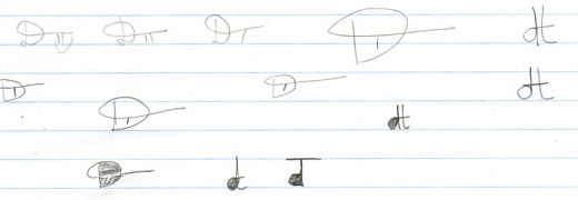
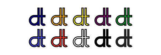
At this point it was time to switch from sketches and concepts to actually designing the monogram. For the assignment we had to produce our monogram as a vector image, using Adobe Illustrator. I figured that I'd try my monogram idea out first using a selection of fonts, using Helvetica (sans-serif font), Cambria (serif font), Myriad Pro (sans-serif font) and Vegur (sans-serif font). This produced the following results:
You probably noticed that there's only a single serif font in the above images, as opposed to three sans-serif fonts. This is because, when I created the monogram using the serif font I really didn't like how it was looking, whilst I quite like how clean the sans-serif designs looked. That said, none of the above images really felt quite right either. None of them really stood out to me, I just preferred how they looked in comparison to the serif font's appearance.
The next thing I decided that I'd try doing was throwing fonts out the window, instead creating my own monogram using the shape tools available in Illustrator itself.
I much preferred the look of these designs. In particular the first (idea given to me by Chris Grant when providing me with feedback on what I'd created so far) and the second designs really appealed to me. I wasn't overly keen upon the white in the middle, though I liked it when I first started work on it and I began to ponder colouring it in with a solid black colour.
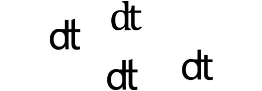
Fortunately I saw the silver lining to this that would allow me to turn this to my advantage, that part of the design brief was to include colour in the monogram. With an area that I thought needed something to fill it in, this seemed like a perfect match. So I followed through on this logic to experiment with colour in the design, filling in the white segment with various colours.
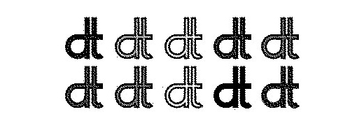
One factor that had to be taken into consideration was that the images had to work not just in colour, but also in pure black and white, primarily for the benefit of fax machines. To test how well my monogram would function if it were to be faxed I pulled up Photoshop and inserted my images into a 1bit BitMap image. This renders, rather well I think, the end result of the monogram being sent through a fax machine.
Of all the designs I sampled in the above image I liked the monochromatic two on the bottom right. Both display similarly regardless of the medium upon which they are displayed and look, at least to me, rather nice in their simplicity.
Conclusion
Monograms are not an easy thing to create. A great deal of thought and effort need to be put into just the conceptual stage, before you even consider putting one together. It's been quite the challenge to come up with a monogram that I thought was of a high enough quality that I could submit this week and whilst I imagine that at least a few people won't like what I've produced I quite like my final monogram.
Personal Identity - Typographic
Following on from last week's experimenting with creating a monogram based upon our initials, we are this week venturing into the field of creating a typographic representation of our names. I decided that I would keep mine in a similar design to that of my monogram, keeping things simple without overstating things.
Starting out - Sketching
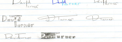
As with last week's lecture, we were presented with the opportunity to sketch out a few ideas for what we could come up with for our typographic representations of our names. I quite liked the look of one of Tim's designs that he had on the projector, where one of his names was on a dark background, whilst the second wasn't.
I quite liked the look of the one that had been inspired by Tim's design and have since decided that I would develop further.
A Problem? And a Moment of Madness
It was at this point that I had a thought hit me. The thought was that the writing I had used for my monogram was entirely custom, and consisted of a grand total of two letters, only one of which I would be able to be used in this piece.
The solution was a pretty simple one, I needed to create the additional letters for the piece. The problem with this is that I didn't have a clue where to even begin with such an idea. To compound matters further I then went from one end of the scale to the other, being stunned into inaction to scribbling down ideas for an entire font.
Carrying On
One advantage of my "Moment of Madness" was that I now had a rough idea of how I wanted several of the important letters in my design to look. From this I was able to put together a rouch concept of the typographic design.
Looking at it there are a few flaws in this concept that need to be resolved, namely the spacing and size of most of the letters. I decided to take a step back at this point, look at the bigger picture and decide upon how to resolve the problems I was identifying.
I decided upon taking a middle ground route between that of my "Moment of Madness" and the approach I had ended up taking of just diving in. It is probably what I have done from the beginning, but sometimes I have a tendency to just throw myself at a topic that is primarily for my own benefit with very little planning, especially when it's something new. I know a lot of people are the same when they purchase something new, so it's not an unheard of phenomenon.
In the end I settled upon creating something of a semi-font for the project, creating the letters for the Typographic Design as well as any additional characters I felt like. I didn't just dive into this though, I returned to the design principles I had used to create the letters for my monogram piece, and applied them to the design of the letters for the typographic piece.
From here it was a rather simple task of piecing together the design from the letters in this semi-font and combining them with the already completed work.
A Dash of Colour
I then decided to experiment with colour as part of the design of my typographic piece. I'll be honest, I really didn't like how any of the coloured designs looked and I experimented with them for a sense of completion.
Feedback and Revisions
At today's practical session I had a chance to chat with Tim about my work, and receive some feedback on my typographic piece. I found it to be quite insightful, as he pointed out a few things that I hadn't even considered, as well as voicing some concerns that others had brought up previously. His points were roughly:
Letter spacing was a bit too large
The design of the letter "i" in the word "David" looked a bit strange
The lining on the letter "T" may become obscured when the piece is scaled down.
The lettering of my surname looked slightly smaller than my forename.
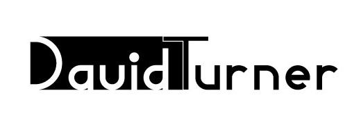
I had also, by this point, grown to rather dislike the shape of the "v" that I was using and I'd decided to replace it. Tim had suggested maybe a square or triangular shape. In the end I went with a quarter circle design as the dot for the I. I also replaced the "v" with a reflected "u" design. Finally I increased the stroke on the letter "T" and moved the letters closer together. After these revisions the final piece looks like the following.
Conclusions
I'm actually quite impressed with my final piece. I think I went around the whole thing in the wrong fashion, but things came together well in the end.
Personal Identity - Iconographic
This week is the final week of assignments relating to my personal identity and it deals with an iconographic representation of myself.
Concepting the Icon
As with everything, I started with sketches, firing ideas that I had onto a piece of paper that would allow me to decide which of them I liked most and would develop into my final iconographic piece.
I found it hard to come up with anything truly new, feeling that most of what I was sketching had already been developed in the previous stages, or that it looked like something for my Learning Log, which I would almost certainly be stepping away from in the next stages of this unit.
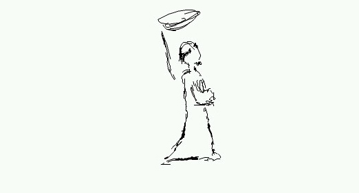
In the end an idea struck me with regards to what the icon could be. The entire way through my time on this course I have had the name David "Wulf" Turner at the top of my Learning Log. The nickname Wulf comes from my time as an online gamer and the nickname has carried over into a lot of other things. This includes many social media areas such as twitter, where I am known as HerrWulf.
The above sketches include a very rough tribal-esque wolf icon, and this is the icon I decided to develop. I feel that an Icon should be more than just text, or a re-iteration of work already completed, and every other design I was coming up with was pretty much one of other of those. So I decided to go with the only one that was unique.
Creating the Icon
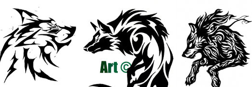
With the design in hand I fired up Adobe Illustrator to convert a very rough sketch into a not so rough piece of vector art. Before I actually started doing anything though, having learnt from previous experiences of rushing into things, I decided to take a look into tribal wolf images. DeviantArt is a fantastic resource of images and artwork and I found the following images to use as reference points in designing my own icon.
Combining the above artwork with the very rough sketches and my own form of tribal sketching (as seen in week 3) I quickly pieced together a rough shape for the Icon. Whilst I liked the rough design that I had created, I also felt that the design was a bit rough around the edges and that some of the paths I had created overlapped in an incorrect manner, leading to some sloppy elements existing in the design.
After going through the image, identifying and then fixing issues such as the above I had an icon design that I was quite pleased with. As with all of my work with regards to personal identity it has been undertaken in a very monochromatic colour palette, black and white, but I feel that it best suits the design work I've produced.
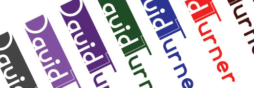
A Splash of colour
Whilst I prefer my designs in black and white or grayscale, I appreciate that such designs may not appeal to everyone who looks at my design. To this end I also experimented with coloured backgrounds for the icon itself.
Conclusions
I'm quite pleased with the iconography I have produced. I'm not entirely certain that it's what was expected of me, but the iconography does represent a facet of myself, whilst doing so in a way that doesn't, I hope, attempt to brand me as some kind of company.
Portfolio - Laying out a Groundwork
Over the next month I will be developing a complete Portfolio Site for myself, covering the steps from conceptualising the design through to it's completed state, live online. As will every other student on this course. I'm sure that at least a few of these people are in a similar situation to myself, in that they already have an existing portfolio site. This week covers my approach to handing this.
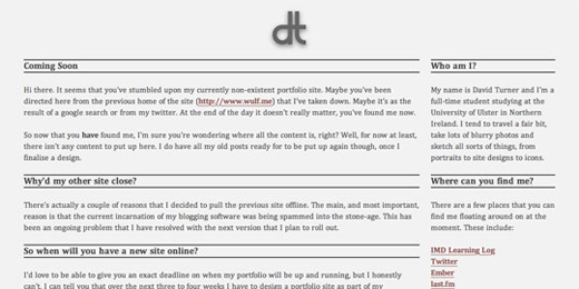
So how did I decide to handle things? Over the weekend I worked towards pulling down my old portfolio site, and putting a default landing page up in a colour scheme that compliments my branding, as it is something that I have put some thought into already. This was used to redirect them from my old domain (http://www.wulf.me/) to the new home for my portfolio site (http://david.turner.name). I chose the new domain in an attempt to get away from unintentionally branding myself as some kind of design studio, which was exactly what I had previously been doing, with the site name of Wulf Designs. Another influences that resulted in my pulling my site down so soon is a combination of poor maintenance on my part and a vast abundance of spam on my site's blog.
All in all there were just short of one thousand spam comments littered throughout my blog. It's a problem that I have encountered previously, and one that I intend to resolve in future incarnations of my blogging software. Everything pointed to taking my previous portfolio down. It also provides me with a clean slate to work with when designing my new portfolio design. As I said, the landing pages have been designed in such a way to be similar to the ideas that I have had for my portfolio design. The previous site design that I had been using is the following:
After spending some time thinking about the design and the information that I wanted to make available to any visitors to the sites, the final design I came up with for the site was very simple. The content displayed on both http://www.wulf.me/ and http://david.turner.name are similar but each takes a slightly different approach to presenting it, as each is looking at the move from one domain to another in a different light. The http://www.wulf.me/ design explains why the site is no longer there, and where it's moving to.
The http://david.turner.name design welcomes people to the site, and explains why there isn't any actual content and when there should be a fully fledged design online.
Both sites provide a certain amount of information about who I am and provide locations as to where you can get to know me a bit better, including social media sites, such as twitter, as well as providing a link to my work here, so that people can see that I am actually doing work, and not just slacking off.
I'm trying to decide whether or not I'll update the sites periodically to update users on the progress of my site or not. I think I'll decide that over the coming weeks.
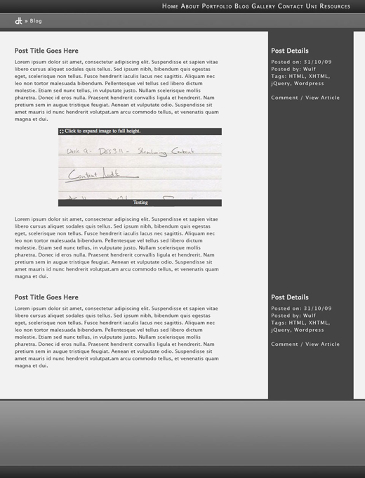
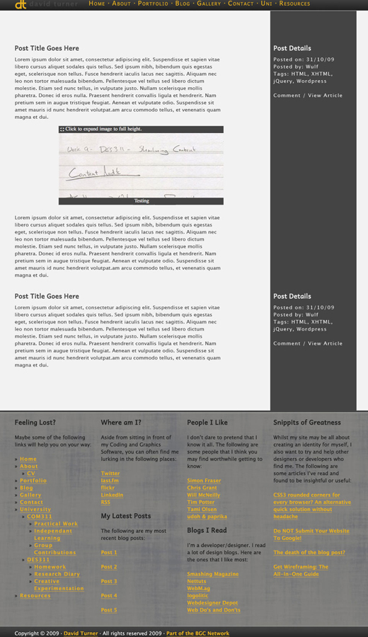
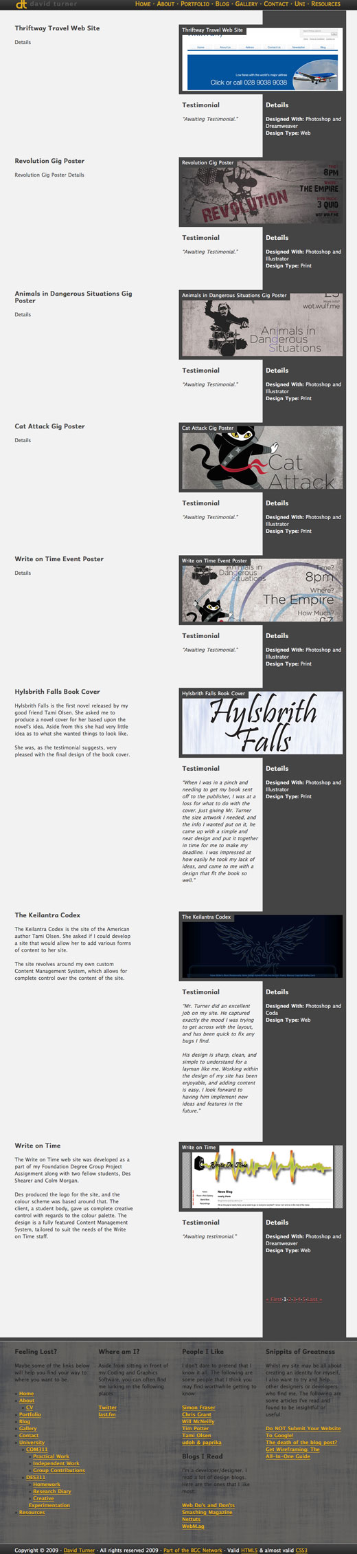
Content Auditing, Sitemap and Navigation Structure
This week I have rather a lot to accomplish for the homework. I have to audit the content that I wish to place on my site, then organise it into a sensible fashion and then, finally, decide upon a structure for the navigation of my site.
Beginnings - Content Audit
I've been maintaining a portfolio for several months now (see last week's Creative Experimentation for some more information) and have amassed a rather large amount of content that I can add to my new portfolio design. As such, I wanted to try and include as much of my already existing content as possible in the new design.
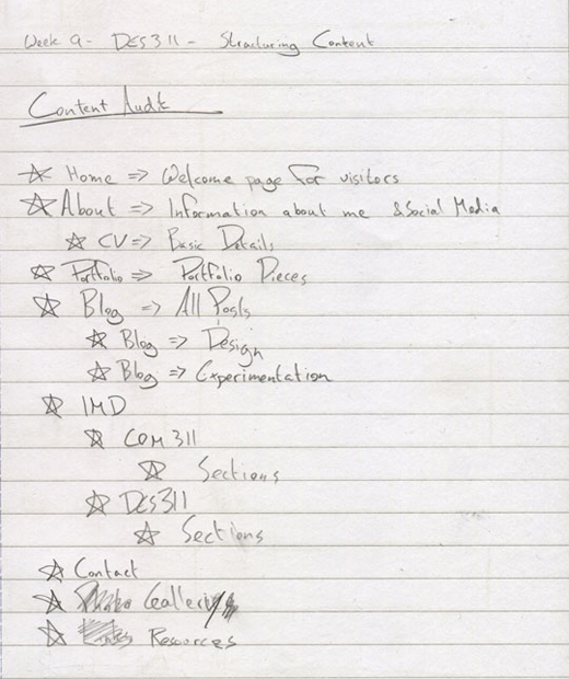
Whilst I was thinking about all of the content that I have and all of the content that I felt would be appropriate for a design of my site I came up with quite a list. As I was doing so I, without thinking, broke things down into sections that I thought would be natural sub-elements of the above elements. The original content audit that I came up with is made up of the following:
Home » Welcome Page for visitors
About » Information about me/Social Media Links
CV » Web Based/Downloadable CV containing basic information
Portfolio » Best pieces of work from Foundation Degree, Degree and Freelancing
Blog » All Posts
Design Blog » Contains posts only regarding Design
Playground Blog » Contains posts only regarding me experimenting. Not to be mistaken with work from my IMD course.
IMD
COM311
Practial Work
Group Work
Independent Learning
DES311
Homework
Research Diary
Creative Experimentation
Contact » Various Methods available to contact me
Gallery » All Gallery Pieces
Panoramic Gallery » Gallery of Panoramic Images
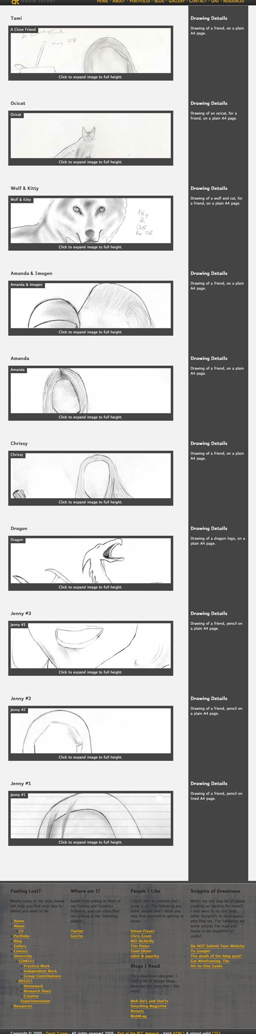
Drawings Gallery » Gallery of Drawings
Resources » Links to the various resources that I made or that I am making use of.
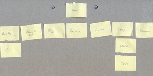
The above is taken, and expanded upon, from the following list that I put together in my lecture on Friday. Due to the nature of the image I am not really able to crop it to show only the content relevant so I'll be breaking from my normal, more manageable, image sizes for this particular piece.
As already shown above my final Content Audit has been modified somewhat from the scanned in material I expanded upon my original piece somewhat. I also changed some of the names. You can make out that my gallery was originally going to be a photo gallery, but then I changed it to be more generic. You can also see that the resources section was also penciled in as links. I changed it to resources as that way I can use it to provide links to other people as well as providing free downloads of content I release.
Site-map
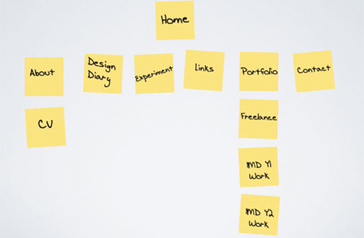
Having audited the content for my site I then needed to come up with a site-map for the layout of my site. Our lecturers actually suggested a method for approaching this that seemed quite interesting and, whilst I know it isn't, unique. They suggested using post-it notes to allow for an easily changeable method of quickly laying out site-map concepts.
With this in mind I set about creating a basic post-it site-map. The first version i created was based off of the scanned in image above, though regardless of which you compare it to there are certain aspects of the content audit missing.
The first things that stand out as missing, when compared to either list, are that some sub-categories that I had listed are missing. It strikes me that, looking back at what I was doing, I was trying to rehash what I had already done with my previous content too much and that I didn't need so many dedicated pages to show (and possibly confuse) users.
As a result of this I decided that my site-map would be better served if I didn't include extra elements in it such as the sub-categories of my blog and my gallery. Instead I would provide these as extra functionality to users who were only interested in very specific elements of my site.
The majority of the content that I am likely to post into either of these sections is going to be rather similar in nature, so it seems rather over the top to provide individual sections for each of them. To balance that out, however, I will provide a functionality to allow users to filter content to a specific topic. These will essentially take the form of pre-built search functions so that a user interested only in coding can click on a link and see only those posts. This is something that I have implemented in the site of my friend, Tami Olsen, so that she could set up specificblogcategories as well as an all encompassing one.
I also left out the specific elements of the two units that need to be included, COM311 and DES311. That was primarily due to not being able to remember the titles of the sections that each had. Each of them have a total of three sub-headings. It is one of a couple of problems that I am discovering as a side effect of my content audit. This problem is a case of too much nested content, as there are simply too many elements to each uni to provide them with space on any navigation. As such they are nested, with even more nested elements beneath this.
The other problem that comes with this site-map is that there are a very large amount of content to try and fit into a navigation structure. I feel that five or six navigation elements for a site, unless it is a very large site, is an acceptable number. Currently my structure has a total of eight. Whilst this may turn out to be fine, without having a physical design to test it in, it leaves me wary about what mine will look like.
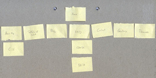
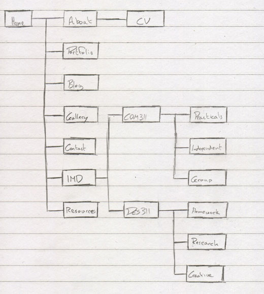
Site-map: Part 2
At this stage I moved on to sketching the site-map properly on a piece of paper. Whilst I was doing this I had a thought enter my head with regards to the layout of my site-map. Originally I had placed my IMD work in front of things like my Contact Page.
This went unnoticed until I was sketching it down in paper form. As I was doing that I thought it odd that something so important should be so far down the string of navigation, and I feel that my contact details will be more important to most visitors that what work I have undertaken as a student on this course. All my best pieces will already be viewable in the Portfolio area. To this end I changed the layout of my post-it site-map structure.
Structured Site-map
As mentioned above, I was sketching out the rough site-map layout into a more refined sketch with an indication of structure when a thought hit me with regards to the placement of some of my content. I documented above the changed made, and the following better illustrates the structure behind it.
I understand that site-maps are more typically displayed in a horizontal manner, but I feel that this layout better shows the relationship between the navigation in a way that makes better use of the space I am presenting it in.
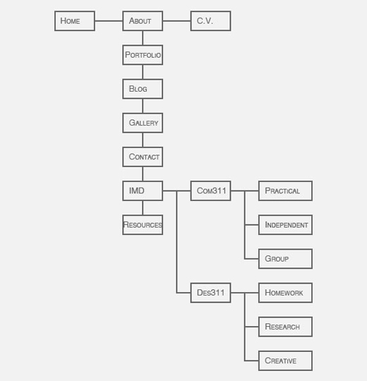
I then opened up Photoshop to structure my site-map in a more presentable fashion. Again I decided to use a vertical tiering of the site-map for the same reasons as before, though I am now beginning to ponder how feasible, and how suitable, it would be to implement this as a style for a site-map. Something for me to consider in the future for sure.
Navigation Structure
The final matter that I have to deal with this week is deciding on what kind of navigational structure I am going to use. I must confess that I am a big fan of the horizontal navigation menu design that is so widely used in websites these days.
I do, however, realise that such a navigation structure is not going to work by itself. With the structure that some aspects of my site make use of, particularly my IMD Section, it wouldn't be possible to make use of just horizontal navigation. Which leaves me with the question "What else do I use?".
There are a few options, even alternatives, available to me for a navigation structure. The alternative is to switch to a vertical navigation structure. I've used them a great deal in the past and have started to step away from them. The main reason for this is that I don't like how much space they take up or how often the navigation pulls attention away from the content of the site itself.
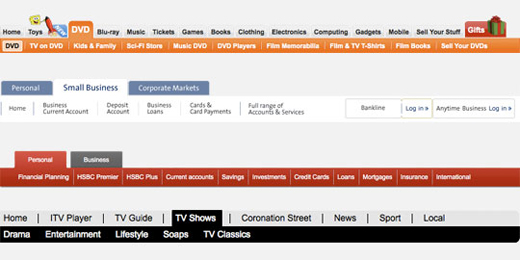
This leaves me with a few options that I can use to work alongside the horizontal structure that I want to make use of. Of the different navigation types available there are two that stand out as being the most suitable: tiered and drop-down.
Tiered Navigation
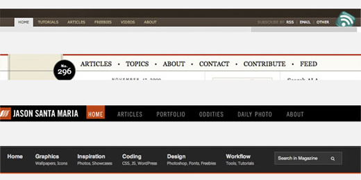
Tiered navigation is a rather perfect compliment for horizontal navigation. As you can see in the image above there aren't any examples of a vertically tiered navigation. This isn't sure to my interest in horizontal navigation, it is because I was unable to even find an example where it was used with a vertical navigation structure.
Tiered navigation is suitable for a two-tiered site structure, as it allows for all the links to be displayed within a very limited amount of space. It's usefulness decreases dramatically, in my opinion, past this point. This is largely due to the amount of space required for any additional tiers. Too many levels of navigation would start to push the actual content of the site out of view and whilst I am aware that the fold created by monitor size is becoming less of an issue (view The myth of the page fold: evidence from user testing article by cxpartners for more information on this) it doesn't seem logical to push content down for what would become an increasingly difficult, and awkward, navigation structure which often wouldn't make use of the space provided.
Bearing this in mind I can't help but feel that my own navigation structure wouldn't fit with this method of navigation. Which brings us, quite well, to the second option that I have available.
Drop-down navigation
Drop-down navigation provides an alternative to tiered navigation, allowing for multiple levels of navigation to be displayed in a fashion that doesn't take up a specific amount of space. When it's not in use it's not visible. Upon clicking on the relevant areas, or in some cases just mouse-over can trigger them, the drop-down menu will appear. Additionally drop-down navigation can handle multiple levels in a more dynamic fashion.
It is for this reason that I'll be using a horizontal navigation with drop-down navigation as a part of the design, in appropriate situations. I imagine that this will be done primarily using CSS to manage the appearance with some form of Javascript, probably Jquery, used to enhance the usefulness of it.
Wireframing and Compositions
As I mentioned over in my Research Diary I am getting closer and closer to having a finished design for my new portfolio design. This, in fact, will be the last entry for this unit that makes use of the current design. With that in mind, and the decisions I have made with regards to my new portfolio's design, I will be paying slightly less attention to detail with regards to the layout of certain elements of my page, particularly images, as they will be getting modified for next week's submission.
With that said, this week I get to look at the final aspects before designing my final portfolio, creating a wireframe for my site and then creating compositions of what the final design will look like. Before I can produce wireframes, however, I need to decide how I want my design to look.
Site Concepts
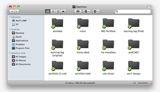
I believe I have previously mentioned that I tend to sketch a lot. Most often this takes the form of web site layouts. Lately I have taken to scanning these sketches in so that I have a collection of possible designs that I can look at and adapt to suit a purpose, if my Site Audit will allow for their use.
You can see in the folder that there are a few folders relatng to my learning log designs that I have referenced in previous Creative Experimentation posts. There is, however, another folder relating to my IMD work, and that is the one I will be looking into today.
The third folder is my IMD portfolio, and contains the sketches I have produced with regards to my final portfolio piece. Whilst some may dislike this, some of the drawings are a few weeks old. I know that may not shine the greatest of lights upon my work, but I feel that it is more important to store an idea where it can be later referenced than to let it slip away. This has happened with other concepts that I will be making use of in my final design, which have been documented elsewhere in preparation for inclusion in my final portfolio.
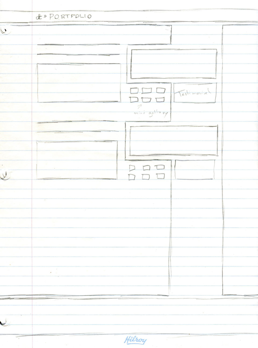
So how do my sketches look? The following are a small selection of my site sketches. I apologise in advance for the scrollbar that they will produce, but this will be resolved for my final portfolio design, in which I will have to adjust all of my log's images.
The first sketches that I produced were based, somewhat loosely, upon the design of Will McNeilly's site, though I didn't really think of it as such. Where he has gone for a left aligned column that splits his secondary navigation from the page content, mine will be used to mark the edge of my site design.
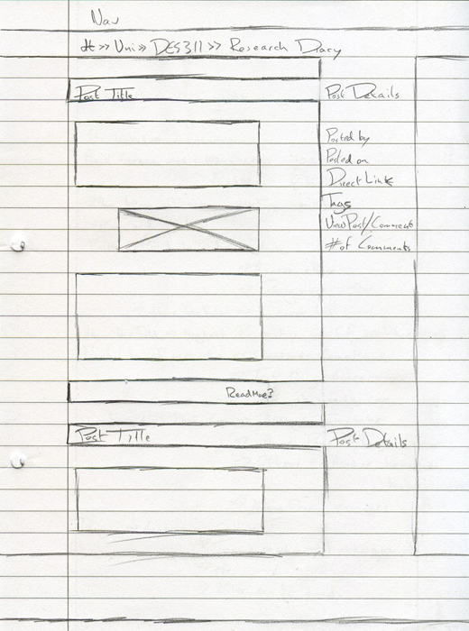
After this I started to put some thought into how the content of my site would be positioned. One thing I have plenty of are blog posts. I have all of my learning log to put into my portfolio design, as well as all of my online posts I have made in the past year on my old portfolio site. Naturally, I wanted to ensure that I could provide an apropriate layout for this aspect of my site, which resulted in the next sketch.
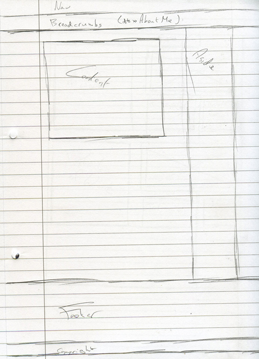
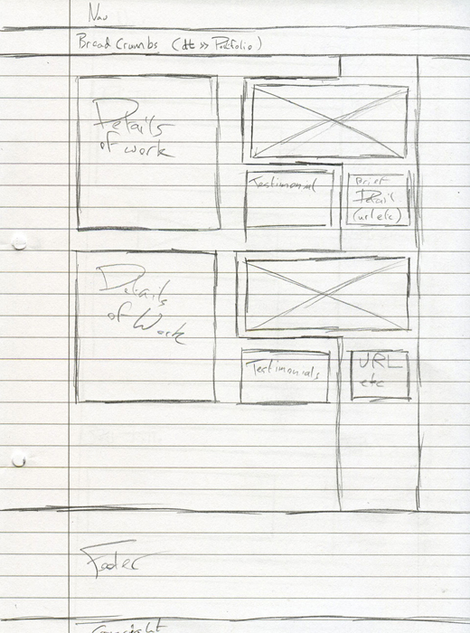
I then, in a display of my usual inability to focus for too long on one topic, turned my attention to the header element of my site. I had, in the first few sketches, decided that I wanted a large header element on my home page, but I doubt that I would need such a large element on any subsequent pages. It was, at this point, that I thought a supporting form of navigation might be of some benefit to the design of my site. In particular my thoughts turned to the idea of a breadcrumb navigation, allowing users to trace their way back through the path from the home page to where they are currently viewing my content. This became my fourth sketch
From here I once again turned my attention to the content aspect of things, this time to my portfolio layout. I already had in mind a rough layout for my site in terms of a grid layout, but I also knew that I didn't want to be limited to the shapes it defined, and this resulted in my portfolio images breaking out from the sidebar that I had defined in my first drawing.
This shape of my Portfolio prompted me to reassess how I wanted the content of my other pages to be presented. As I had only worked on one other page layout, that of my blog pages, I returned to the design of them, and chose to create a little breathing space between the content and the sidebar. I normally try to fill an area as much as possible, but have been trying to prevent this of late, as it generally makes a page appear cluttered and can, in some cases, make the content of the page difficult to read. I also defined, at this point, the way that images would be laid out on the page.
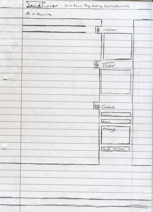
At this point I started thinking about the sidebar. Whilst I had two pages that had an actual reason to make use of the sidebar, I am aware that there are pages that won't have a specific use for the space that it takes up. So I turned my attention to the various things that I would want to show to visitors to my site. The first things that sprung to mind are some of the social medias that I make use of, in particular Twitter, but also flickr. In addition to this I also thought it would be nice to provide visitors to the site the ability to contact me.
I then turned my attention to the content aspect of my home page, what I would like it to look like. Aspects such as the site's header, and the content. I also made use of the sidebar to list many of the various things I would like to include on the sidebar. Some of them are unlikely to be viable on an HTML site, and will require some form of Server Side Scripting to implement them fully.
From there, I decided I could start to mark the sketch up qith various HTML tags. I'm hoping that I can use the new HTML5 standard to code my site, but I'm currently still awaiting an answer from Tim on whether or not that is allowed. As such, I've been laying out the code for XHTML but using ID tags that match HTML5 elements.
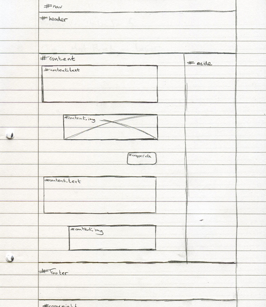
At this point I decided that it was time to work towards a wireframe based upon the sketches I had produced.
Wireframing
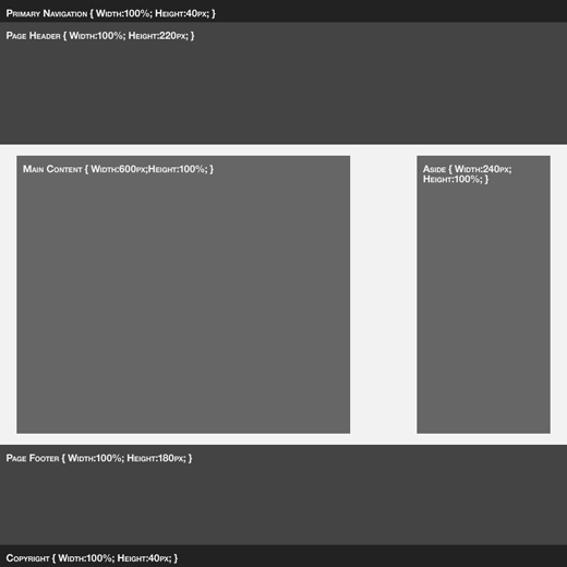
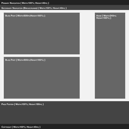
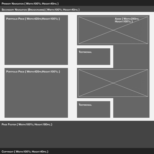
Having produced a rather vast wealth of sketches from which to work form in the development of my portfolio site design I figured that it was time for me to approach converting them into some form of wire frame. For this my tool of choice is Adobe Photoshop CS4. This is, primarily, due to my understanding of the software. I'm much more comfortable with it for work that has set dimensions.
To Create my grid patterns I made use of the templates available from 960.gs. With my sketches already covering most of the detail of my site, I quickly Produced the following wireframes.
Compositions
Finally I jumped into the actual design process of the compositions of my site. Over the course of the creating of the compositions my site design changed somewhat. I'm going to try and cover the process in a step by step process
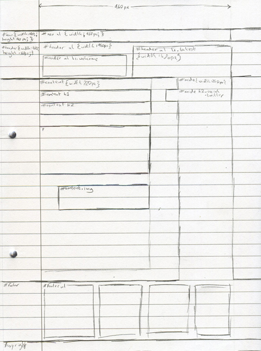
Wireframe to Composition
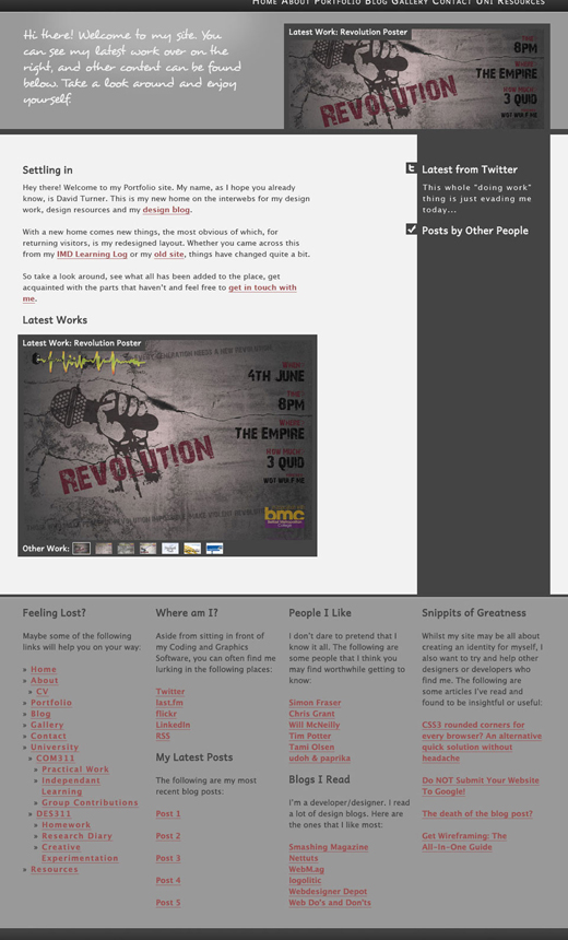
The first step I took was to create a design based on the shape of the wireframes. I already had a rough idea of the colours that I wanted to use in my design. I find that colour doesn't work well with my designs for myself. I think it shows through beyond my design work, typically I wear very dark clothing as well. I wanted to offset this with a red, as I know that it compliments the colour scheme very well. Before long I had the following designs, making use of resources saved in my portfolio for certain elements.
I quite liked the shape of the site, but some elements of it were really throwing me off. In particular I liked the design of the footer, but I didn't like how it looked. I also found the site to be very bland and lacking in colour. I do lean towards a very monochromatic design, but even at that I tend to have some form of colour in the design. Here, it just didn't seem to be happening.
My Portfolio - Laila Edition
I sought out feedback on my design, from people I know. One person in particular, Laila, took an interest in the design, and produced a version of my design to try and address the aspects of the site that I didn't quite like.
There are some aspects of the site that I really don't like. In particular I dislike the hazard tape on the sidebar. I also didn't especially like how the background of the footer looked, but did like the idea of it. I also loved the colour of the navigation of the site.
Final Compositions
Whilst I liked quite a bit of what Laila had done with my site design there was a fair amount that I wasn't too happy with. I played around with my own design and finally managed to produce a design that I am happy with. It makes use of the yellow from the design Laila showed me, but I redesigned some aspects to fit. I also added my monogram into the Navigation menu along with my name. Overall I am very pleased with this finished design and cannot wait to begin working on the coding aspect of the design.
Creative Experimentation Week 11
Well, this has certainly been a busy week for everyone on the course, or it has been for me. Finishing my COM312 work, submitting the COM311 Group Project and getting my DES311 work done? Good thing the course only accepts the most fantastic students... oh, and me.
So what have I been doing with regards to my DES311 work? There's been a lot of panicking with some form of master plan going on in the background, which I feel I am only partially privy to. Irrespective of this, I have somehow found the time to produce a piece of work that I am all sorts of pleased with. This week I shall be documenting the important parts of this work.
Comps to Code
Last week left off with me having some rather pretty looking concepts for my final portfolio design. This week I get to convert them into a fully coded design. In terms of code my weapons of choice will not be the typical combo of XHTML Strict and CSS 2.1. Instead I'm going to be making use of HTML5 and CSS3. Why? To be honest, I have this horrible tendency to attack shiny and new things, and HTML5 is proving to be both of these with many web designers. In terms of CSS3, this is so that I can make use of the addition features offered in the CSS3 specification.
Getting Started
Everything has to start somewhere, and coding an HTML5 site is no different. I have documented on my research diary the necessities of coding an HTML5 site, which allow for an easier time of setting up the template for editing. No longer do I need to worry about declaring the correct doctype or, for that matter, any of the principles of XHTML if I so chose. I prefer the coding style of XHTML however, so it's reassuring to know that I can still make use of the coding practices that I am accustomed to.
One of the advantages of the 960 Grid System I brought up in last week's experimentation is that it is universal to all the mediums that I wish to make use of. Photoshop and HTML/CSS. This allowed me to very quickly produce a working design into which I could implement content.
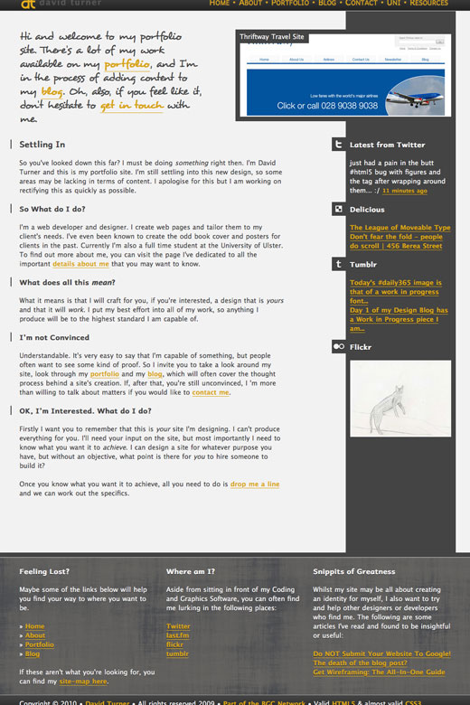
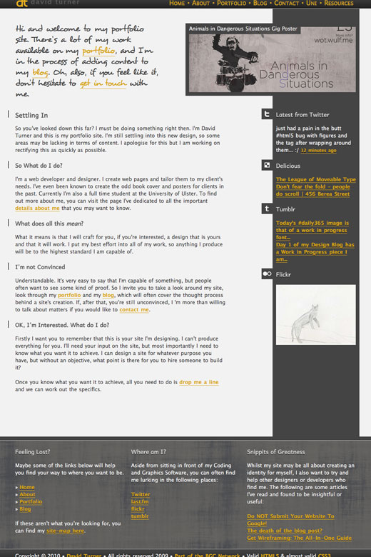
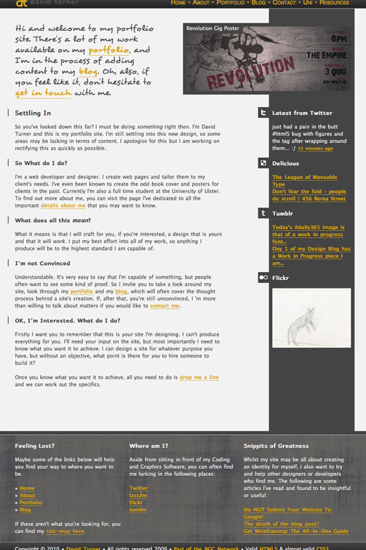
From this base I was able to quickly begin implementing layouts for the various other pages of my design, modifying the layout slightly depending on which page tpye I was using. The main differences in my site designs are with regards to my Portfolio and Gallery pages in which I wanted to put greater emphasis upon non-text elements of the page. This is especially the case with the Gallery Page which is entirely image based, with additional information being displayed in the sidebar.
Over the past several weeks I have become quite adept at making use of the jquery library. You can, in fact, see the effects of it throughout my portfolio now in many subtle ways. One example of this is the images above, an effect that is used throughout my portfolio to ensure that no image is too overwhelming to the end user without their interaction, or without any JavaScript. It does this by changing the wrapping element's height and seeing the overflow to hidden, so that the excess content is hidden from view. In addition to this a label is added to the image in the top left corner and a message is displayed beneath informing the user that the image is larger and that it can be expanded. In the event that the image isn't too big the label is still added, but nothing else.
That's what I view JavaScript at being best for. Usage in a fashion that is in no way necessary, but that provides additional functionality. None of the JavaScript I have implemented, with the exception of fixes for Internet Explorer, are truely vital to the design of my site, but instead enhance the design I am using.
CSS
My site makes a great deal of usage of CSS and, as I mentioned at the beginning of this entry, I am keeping the option of CSS3 available to me. The main differences between CSS 2.1 and CSS3 come in terms of graphical enhancements and additions to the options available with regards to layout.
You will see at the bottom of my page I have the declaration "almost valid CSS3" and you may wonder why it isn't valid. Understandably so in a world where valid site structure is the norm and often what is expected. That doesn't mean that it's always correct to use only valid code. In the case of my CSS3 I make use of a browser specific statement to ensure that the Apple OS X version of Firefox displays input elements in a consistent fashion with other browsers across all systems. Unfortunately, this renders my CSS invalid but I view it as a more important concern to ensure that my design is pixel perfect than to be able to put a small tick next to my design.
I'm not ashamed to have a slightly invalid code to increase the usability of the site. There are other aspects of my site design that make use of CSS3 to enhance the display of text upon my site. In particular this is done by making use of the text shadow effect to enhance my typography. It's the first time I've made use of the effect after having seen it on multiple other site designs.
Piecing it Together
After crafting the design and layout of my site I then added the content to my site. Some of the images above were taken after the content was added. The content currently available is only a sample of content to be added to the final design for the start of January.
Crit Session Feedback and Site Developments
Week 12 brought with it our Crit Session, which provides students the opportunity to get their work critiqued as well as receive feedback. It also brought the end of the term, which is why this update is so late in coming. Every other Crit Session I put my own work to be critiqued by our lecturers, Tim and Ian. This time I was no different.
So what all did I get as feedback? I got quite a bit of feedback regarding the refinement of my design, that covered a great many areas of my site. Whilst I didn't necessarily agree with some of the points that were made, I could see that what they were saying was valid. I found some of it particularly useful with regards to elements of the site that I wasn't happy with, particularly the Drop Down Navigation I had implemented in the site. The complete list of feedback i received (through my own work and looking at other students work) ended up looking like this:
» Comment my code
» Refine Portfolio Page
» Consider making Branding more prominent
» Consider importance of the size of elements
» Shrink down Sidebar headings
» Change red link colours
» Bear the fold in mind
» Change latest work at the top to a gallery
» Consider using Javascript effects to enhance the gallery
» Remove lower gallery
» Craft my greeting text
» Footer is too large
» Move sitemap to a dedicated page
» Ensure fonts are readable in smaller sizes
» Rethnk Dropdown
» Craft my text
» Fix JavaScript so that some aspects of it run after all images have loaded
Over the last few weeks I have taken most of the above on board and adjusted my site design based on the feedback I received and observations that I've made. The only exception to this is the advice to make my branding more prominent. Whilst it is true that my branding isn't exceptionally large, it is also constantly on the screen. As such I didn't want to overwhelm the user by having a logo that is too big.
Changes to the site
In addition to making tweaks to the site I have also made a few drastic changes too. I thought I'd go into a bit of a break down of the individual pages instead of trying to round them up in a single paragraph.
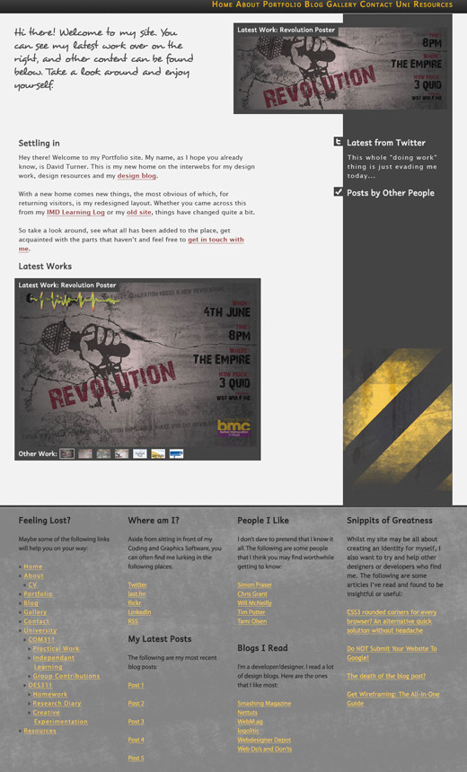
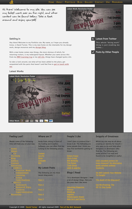
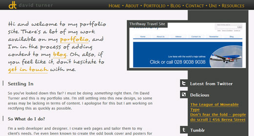
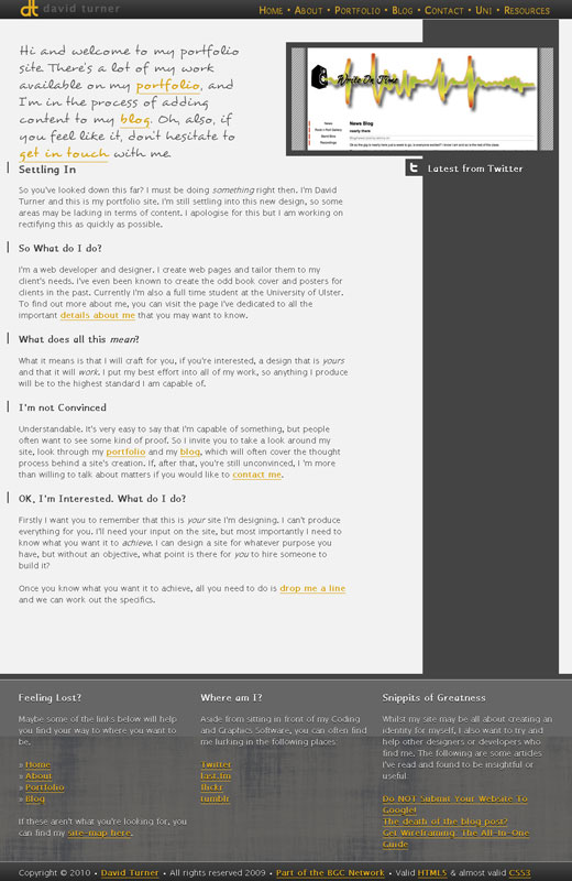
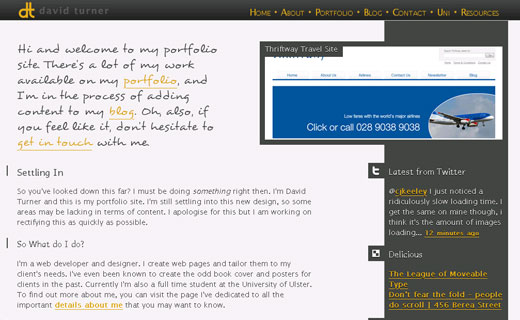
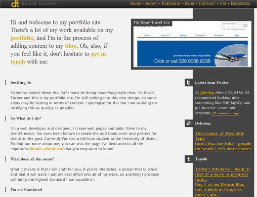
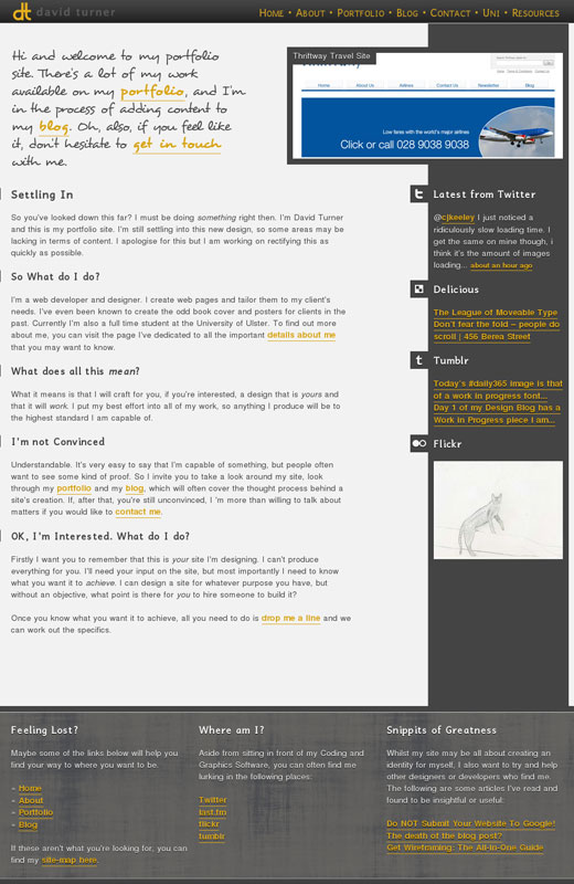
Home Page
I've changed all the written content of the site, to provide a bit more information and to be more friendly to the user. I've also included more of my personality into the writing. I'm not entirely sure how well my somewhat sarcastic personality is suited to the internet, only time will tell.
I also adjusted the latest work section to make use of a custom javascript gallery that displays my latest work, rolling images one over another. It's a rather simple piece of code, even I was able to code it. I'm sure there are more effective ways to manage such an effect, but my knowledge of Jquery is very much limited.
About Me Page
This page now has more information about me, as well as an actual photo so people can identify me. Again I've got some of my sarcastic nature showing through.
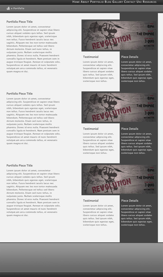
Portfolio
My portfolio page has had some of the content of removed. This comes in the form of the testimonials and additional information about each project. I've also tried to keep the description of each piece to a length that roughly matches the height of the portfolio images.
Blog Pages
I've tweaked the blog design very little. One problem that I had when I first coded the page was that it seemed to be one continious wall of text. To change this I included a background at the bottom of each article to help define the end of it.
Contact Page
The contact page provides a simple form that allows the user to get in touch with me. It makes use of some fancy jquery to insert data into the form to provide extra little details to empty fields. It's a stripped down version of a contact form I've used in a great many web pages but is, unfortunately, dependent upon PHP to handle the actual mail being sent, which doesn't work on my portfolio.
To handle this I have another piece of jquery that displays a message explaining why the mail hasn't been sent and provides an email link they can click on that has all of the data they just entered prepopulated into the email.
Uni pages
By and large the Uni pages haven't been touched in any way other than through updates that have come in via editing other pages. This is the case with the blog pages, picking up the changes made in the site's blog.
Resources
The resources page previously made use of CSS3 to provide multiple columns of data. As I added more content to this page I came to realise that this caused more problems that it was worth and removed it. I have also added more content to this page.
Page Removed - Gallery
Whilst I intend to cover this in more detail later on, I am mentioning it here for completeness's sake. The Galley page has been removed due to my decision to make use of social media in my site. One in particular, flickr, has allowed me to remove the gallery page from my portfolio.
Overall Changes
I have made quite a few changes to the CSS for the site. My headings now have a border to help them stand out from the body of the page in addition to everything else that was changed in the process of tweaking my site. I have also completly replaced the previous dropdown navigation, replacing it with a Jquery powered dropdown, which breaks in a fashion that makes navigating the site still possible.
I have also managed to resolve an issue I was having with my image handling script, which didn't wait until the page was fully loaded before running. This has been changed and enhanced by making use of some supplemental CSS that created a cleaner experience overall.
Social Media
As mentioned above, I've scrapped my gallery to allow for the use of flickr for my images. This isn't the only place where I have found social media to be useful. I've always had twitter featured on my site but I have added in social media for sharing design related links, my tumblr blog and finally my flickr images. I make use of their RSS feeds to pull the data I want into the site. How do I manage this? Skynet Google provices an API for converting RSS feeds into HTML that can be displayed in a site.
Google Code
Google provide an API for converting RSS feeds into usable content for a site. This proved to be highly useful to me because I wanted to implement so many different Social Medias on my site, but each API that they provide works differently and would require more and more code as I added new elements. RSS, by contrast, is a lot more standardised.
Using this I was able to include, entirely through JavaScript and Jquery, an RSS parser that would display text and images from the Social media Tools that I use. It then applies relevant CSS styles to each element to ensure they are styled correctly. In the event that no JavaScript is running the feeds simply don't show up and the user isn't aware that they are missing bonus content.
Using this I, with the help of my good friend Chris Grant, have been able to add all social media that I am interested in. In theory I can scale it to include any content I want with just a few extra lines of code to implement them.
State of the Code
One of the things I have to discuss about my site, is the importance of validation. I'm a huge fan of ensuring that code validates.That doesn't mean that it is always a good idea to be a zealot in terms of site validation. If you look down to my footer you will see that it is valid HTML5 and almost valid CSS3. Feel free to go and test, this text isn't going anywhere.
So why isn't it valid? The simple answer is that there's a piece of invalid CSS in there. Don't worry, I'm not going to leave it at that. To do that though, I need to talk a little bit about Vendor Specific Extensions.
Browser Specific Extensions... what?
Browser specific extensions are elements of CSS that are only supported in a specific type of browser. The two most common are -moz and -webkit, which provide support for the Mozilla Firefox browser and any browser based off of the webkit rendering engine.
These specific extensions allow for designers to implement browser specific designs. Such an example would be to provide rounded corners in Firefox, Safari and Chrome, whilst browsers who don't support such features, like Opera and Internet Explorer, will get squared off corners.
Whilst these extensions allow for a lot more flexibility in terms of making a site look pretty, they now cause the CSS3 validator to break down and cry, throwing an error and rendering the stylesheet invalid.
Where's this Going?
Now that I've explained things somewhat, I can explain the "Why?" behind my site's CSS being invalid. When I was developing my site I discovered a bug in Firefox's rendering of it. More specifically, it was in OS X's Firefox rendering. This caused my contact page to appear out of alignment. It took me a long time to figure out what was going on. I had some friend look at it, but it rendered exactly how I wanted on their Windpows machines. In the end, I discovered that it was the box model that Firefox uses for the inputs in forms, but there was a -moz element I could use to fix things.
To boil things down to their most simple. There is a single entry in my CSS, to make Firefox on the Mac run happily, that renders my CSS invalid.
Site Testing
Site testing is never something I'm especially keen on performing. It's tedious and time consuming, but necessary. I've developed this site using Apple's OS X, but I cannot limit myself to just one Operating System, needing to test it in Windows, Mac and Linux. To be safe, with Windows, I'm going to be testing in both Windows XP and Windows 7.
Windows XP
It is ironic, to me anyway, that the oldest operating system is also the one with the most browsers needing tested. The list I've got to test for this Operating System is:
Firefox
Internet Explorer 6
Internet Explorer 7
Internet Explorer 8
Opera
Safari
Firefox
Firefox is my primary browser, regardless of Operating System. As such, I'm really not shocked a whole lot that it renders the site exactly how I intended it.
Internet Explorer 6
Internet Explorer 6 is the only reason that I still test on Windows XP as opposed to a more modern Operating System. It is notorious for it's ability to cause even the best developer headaches. I am rather pleased, however, that it renders the site as well as it does. It doesn't pick up on some of the finer details of the site, due to negative margins that I use. The site is, however, fully functional.
Internet Explorer 7
Internet Explorer 7 is the next generation of browser and, in Windows Vista, is the default in Windows Vista. It is also losing market share, quite rapidly, to the next browser I will be testing, Internet Explorer 8. For now, though, it is still a widely used browser that needs to be tested to ensure the site works.
So what does testing reveal? As with Internet Explorer 6 the site renders very well and, as would be expected with a more modern browser, it displays the elements with negative margins perfectly.
Internet Explorer 8
Internet Explorer 8 is the most recent incarnation of Microsoft's browser. As with Internet Explorer 7 it rendered the site very well.
Opera
Opera is a browser with a very small market share, but it is widely reputed as the browser with the best HTML5 support. How, when developing a site using HTML5, could I ignore such a browser?
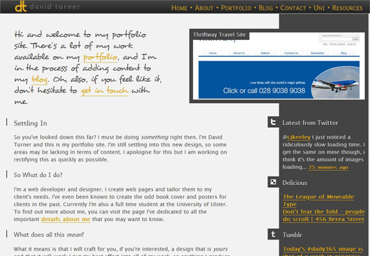
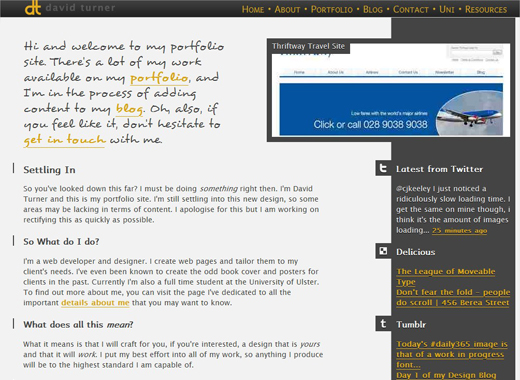
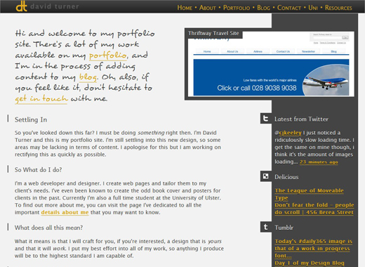
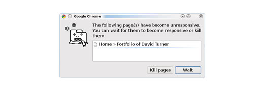
So how does it handle my site? As the image above shows, very well. There is a slight glitch in the graphics, but that is caused by the browsershots engine taking the screenshot rather than a bug in the site.
Safari
Safari it Apple's browser, based on the webkit rendering engine. It's well known for it's support of the CSS3 spec, and renders the site very well.
Windows 7
Windows 7 is the latest in the line of Windows Operating Systems, and it's my personal choice for all my Windows Machines. Today, however, I'm not here to write about how good operating systems are, I'm here to test browsers with it. The list for Windows 7 consists of:
Chrome
Firefox
Internet Explorer 8
Opera
Safari
The list is nearly identical to that I tested in Windows XP. It's not that much of a shock is it? Same Operating System, same browsers. There is the addition of Google's Chrome browser. This is added in because I wanted to show how things looked into it, but didn't remember to test it in Windows XP.
Chrome
Google's Chrome is one of the newest browsers out and has, quite impressively, managed to surpass Safari in terms of popularity, even though it is based upon the same rendering engine. It's also, by and large (and in typical Google Style), not much more than a beta.
As we saw with Safari in Windows XP the webkit rendering engine handles the site fantastically.
Firefox
There's not much to really say here. As with Firefox in Windows XP the site renders things exactly as expected.
Internet Explorer 8
As with Windows XP, the Windows 7 version of Internet Explorer 8 renders the site perfectly.
Opera
As with Windows XP Opera the site displays very well.
Safari
As with Windows XP Safari renders the site very well.
Linux
Linux is an open sourced series of Operating Systems that are freely available for people to download. There are a myriad of browsers available to it but, for my testing, I shall be sticking to the most common browsers that people use:
Chrome
Firefox
Opera
Chrome
Off to such a fantastic start with the Linux testing, aren't I? Chrome for both Mac and Linux is still very much in the testing stages, so not everything will work as expected... my site certainly didn't.
Firefox
There's not much to really say here. As with Firefox on Windows the site renders things exactly as expected.
Opera
As with Windows Opera the site displays very well.
Mac OS X
I thought that I would leave my primary Operating System till last. So here we are, with the Apple Operating System. For this particular series of tests I get to use the following browsers:
Chrome
Firefox
Opera
Safari
Chrome
As mentioned in the Linux section above, Chrome is still little more than an alpha and should be used with caution. In this case it is a bug with the @font-face I use for various areas of my site that causes problems.
Firefox
As with Firefox on Windows the site renders things exactly as expected.
Opera
As with Windows Opera the site displays very well.
Safari
As with Safari for Windows the site displays very well.
BONUS! Mobile
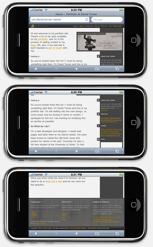
As an added bonus I was provided with the iPhone SDK recently which has, built in, an application to allow me to emulate an iPhone for testing purposes. So I'm going to show off my site in the iPhone's Safari Browser as well.
iPhone
The iPhone uses a mobile version of Safari to render pages, so it comes as little surprise that my site works very well in this browser.
Conclusions
I am a big fan of always finishing off a report with a section that sums up my own opinions of what I liked and didn't like about the project, what I could do better now and what I would consider building upon in the future. So this is it people, a section dedicated to what I think about the work I've produced.
Likes
I really liked how the aim of this module was to produce work that was useable. Very often I'm forced to do silly, inconsequential, designs that benefit me in no way.
I'm also a big fan of the scope we were given in terms of producing the work. We were told we had to code things, but we were allowed to choose what we used to present the site. This allowed me to mess about with HTML5 in great detail which is both refreshing and stupidly fun.
Dislikes
Lack of server scripting really felt like a handicap to me. I can understand that it may not be suitable to everyone, but it severely hampered my ability to produce code, changing the footer for example required changing numerous files, which is not fun and can take a lot of time.
Dealines. So many deadlines. Combines with the other modules I was working on I often had to lose out on quality in my work in order to simply get things done.
Opinions on my Work
I'm always very critical of people's work, especially my own. I'm actually rather pleased with the work I've produced. It's not as visually pleasing as the work some of the other student's will produce. It is, however, scaleable to fit anything that I would care to show in it.
I will, no doubt, change my opinion the second I submit my work, but I can always change my design for my own means. For now I'm quite content with it, though I have already identified some areas for improvement.
Areas of Improvement?
Yes, there's always room for improvement in designs. In this case there is an area in the footer that could do with being replaced. It's the section with recent links, that has been rendered obsolete by the intoduction of social media into my site. I think, given more time, I would instead dedicate this area to displaying a random testimonial each time the page loaded.
With that, I'm all done with concluding things about my site. I've enjoyed working on my site's design and cannot wait to get started on producing more work in the future.
