Making Things GROW
After my last couple of posts, in which I covered our Design Brief and showed off some of the research I've done I've taken some time to sit down and sketch out a series of ideas, for both the logo and site design.
I've been somewhat fortunate in that my ideas for things have come together quite swiftly, which is a first for me.
Disclaimer: I'm going to be up front here and state two things:
- I am currently without Adobe software in any form, due to my mac being in for repairs at the moment, so don't expect perfect vector graphics in this post.
- I am really not all that great at logo design. It's why I do web design/development.
With that out of the way, I'm quite happy with the direction my ideas have taken, I'm just throwing out the disclaimer because I know my strengths and weaknesses... Logo design isn't one of my strengths.
Getting Ideas on Paper
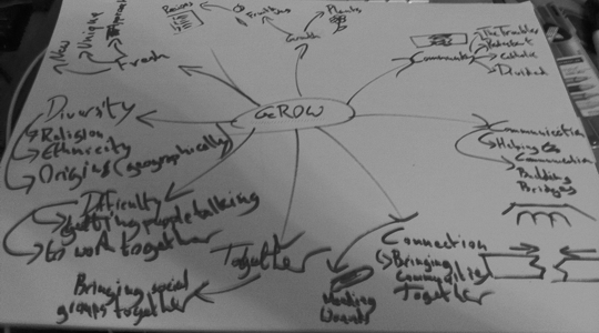
First thing that I wanted to do was get some kind of idea of what GROW was. We'd been given a list of things that GROW is and is not about, but I wanted to sort my own thoughts out. I did this by getting a nice big (A3) piece of paper, a marker and writing thoughts down as they struck me. I ended up with the following:

After sketching these ideas down I picked up on the growth aspect of things. GROW, as the name suggests, is all about growth. Plants, of both the consumable and non-consumable variety, but more importantly the growth of communities, helping to bring them together.
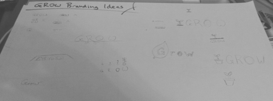
The more I thought about it the more I got to thinking that GROW essentially plant the seeds to bring communities that would otherwise avoid one another together. This is the kind of imagery that came to my mind when I started sketching out logo ideas.

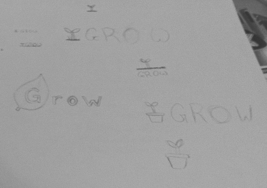
Unfortunately the photo above doesn't really display much, but you can see (on the right) that I started to focus on a particular type of imagery, that kept things simple whilst remaining tied to the idea of planting seeds, and growth.

Because of the face that there are two clearly defined aspects to these sketches I was also able to define potential icon type logos, that could be used at smaller resolutions, e.g. favicons. Unfortunately, due to my Mac with the majority of my software is currently being repaired, I have not been able to develop the logo any further than sketches. Fortunately this is all that we had to do this week, and I should have my Mac back in time to convert my sketches into a full vector design for next week.
With my inability to convert the logo from sketch to full logo, I instead turned my attentions to generating ideas for the GROW web site. Whilst I, in my own opinion, suck at creating logos, I think that I'm quite good at sketching out web site layouts. I have whole notepads, and a folder on dropbox, filled with different site layouts I've cooked up in the last two years.
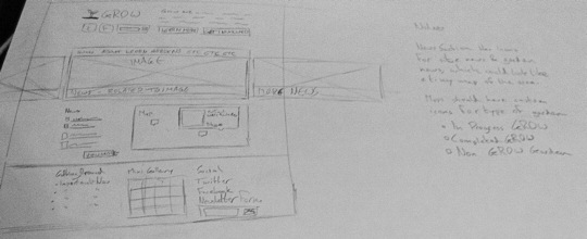
So I found sketching out layouts to be much more enjoyable than logo idea generation. I quickly pieced together a rough sketched out wireframe/doodle site idea that probably needs a lot of work over the next few weeks, but that I quite like.

This kind of layout, I feel, helps portray the things that will interest visitors to the site, with a combination of what they're about, what they're doing and showing how much of an impact they have.
This is achieved by having an area at the top of the site dedicated to stating their message, complete with call to actions for visitors to learn more about what they do or, if they want, how they can get involved. Directly beneath that there is an area dedicated to showing off images from the various gardens, possibly along related news.
Beneath this area there is a section for news, along with a map of the various gardens, both associated with GROW and others that have no ties to GROW, letting people where gardens are, with the option to see more information about them and, if appropriate, links to their respective sites/blogs.
Finally there is a footer that helps put everything a user might be looking for in one easy to find place. This means that, if a user happens to get lost, that they can easily find their way to the area they are looking for. This is in addition to the navigation at the top of the site, and exists to provide an additional method for users to help find their feet whilst also providing access to some elements which aren't part of the navigation, such as social media and possible a mini gallery of garden related photos.
Moving Forward
Obviously, at this point, everything is still very much rough around the edges, and I will be taking time over the coming weeks to refine and develop the ideas presented in this post. For now, though, I'm quite happy with the direction that things are headed in.