GROW - Project Research
Following on from my previous post I'm going to take be doing some research into sites that are in a similar area as GROW, as well as some sites from other areas to help me identify what, in my opinion, GROW's branding would benefit from.
This research will help me identify a good starting point for creating the branding for the charity, as opposed to creating something with no substance.
Taking What We're Given
In our meeting with our Client, Siobhan Craig, we were given a series of sites that she both liked and didn't like, which gives us all a great starting point in terms of research, as it helps us to identify things that are, and aren't, liked. This will help us tailor both further research and our designs & concepts to better meet the tastes of the client.
Starting Point - GROW's Blog
Before I go over the different sites that Siobhan mentioned to us, I'm going to take a look at something a little bit closer to home - GROW's blog.
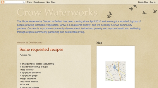
To be honest, there are bits about the blog that I both like and dislike about the site:
Likes
- Clean, Simple Design
- Nice application of colour - colours compliment one another
- Emphasis on Content
- Mission Statement is one of the first things you see when the site loads
Dislikes
- Very bland design - nothing makes it stand out
- Poor layout/use of the sidebar
- Styling used for some posts is quite poor, it could be much better
There's quite a lot that makes this a pretty good site, but attention to some of the aspects of it really let the site down. There is also a general lack of flexibility in the site, as it cannot expand to fit more areas into it. This is more an issue with the platform being used than of the design, but it still worthy of note as it means the site isn't capable of meeting the requirements that the client has.
Taking a Look Around
Siobhan was also, as mentioned above, provided a list o sites that she both liked and disliked, covering some of the aspects of each design that she liked and disliked, allowing us to get a feel for the kinds of things that she would and wouldn't want in a design of the GROW Site. Let's take a look at them shall we?
ACGA - Liked
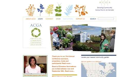
On the whole Siobhan liked the design of the ACGA site, stating that the the only thing she disliked was the navigation of the site. I'm not too keen on the way that it has ultimately been implemented but I do quite like the idea behind the site's navigation, colour coding graphics and links to help tie them together.
I'm not a big fan of the design of the rest of the site though. The header area, in particular, feels sloppy to me... there's an idea behind it but it hasn't been implemented well at all. As a result the header area feels cluttered and messy and, as an added negative, I find my eye continually pulled to the header graphic even when I'm trying to read the content on the site.
Once I removed the graphic element from the site (Chrome Developer Tools are handy like that) I found the content of the site to be good, if poorly structured. I also noticed that, whilst the content is good, the only attempt that is made to involve site visitors is so bland that I didn't actually realise it was a Call To Action until I tried to find it. I can see why it could be liked but I can also see how it could be improved.
Parkrun - Liked
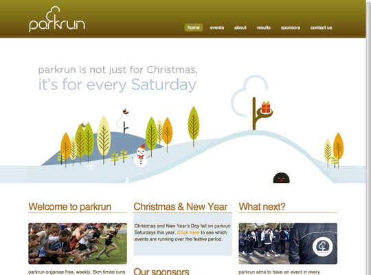
Parkrun's site is actually quite nicely laid out. Content is nearly laid out and good use of space is used. I'm not a big fan of Flash being used in site designs but the flash used here works, though I'm sure there are other approaches that could be used that would work in more areas. The big issue that I had with this site is that the animated section of the site takes up so much space without actually achieving anything, and pushes the content of the the site further down.
On the whole I really like the design of this site, which delivers it's message in a very eye-pleasing manner. I feel that the banner section of the site could stand to improve by providing way for visitors to the site to actually get involved, as opposed to making them scroll down the site to find out how. Having something that is eye-catching is pointless unless you do something once you have caught their eye.
Federation of City Farms & Community Gardens - Disliked
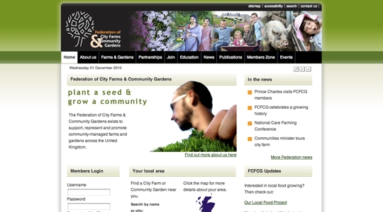
Siobhan doesn't like black header areas at all. In all honesty, neither do I. Which is, in my opinion, the only weak point that stands out with the Federation of City Farms & Community Gardens site. The actual content of the site is quite nearly laid out, making good use of space to lay out the content as well as making good use of imagery to support the content of the site.
Grow it Yourself Ireland - Disliked
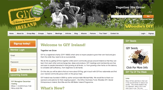
Grow it Yourself Ireland wasn't a popular site with Siobhan either. In the meeting she said that it was 'clunky' and had areas with no content. In my own exploration of the site I found the opposite to be true, with every section being populated with content with a mix of recent and older content.
I also don't think the site is clunky, though it does feel quite claustrophobic to me... a lot of elements in the site don't seem to have room to breathe, which might be what Siobhan had meant when she said clunky.
Siobhan also didn't like that the site was trying to be it's own social network. I feel that, from what I've seen, it does this quite well but that it isn't the kind of thing that GROW need for themselves, as their goal is to help bring communities together, not to create a social network.
Thrive - Disliked
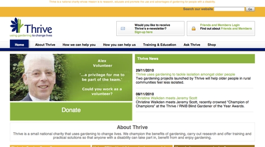
Siobhan didn't like the logo this site uses. To be quite honest, I don't like much of this site's design at all. I feel that it makes very poor use of the space that it has, prioritising the wrong elements of the site, and pushing the important elements further from where they will be seen.
Other Sites
As helpful as it is to have a client provide sites that they do or don't like, I find that it's always a good idea to look beyond the sites they give you as well as beyond the sector their site is aimed at. Sometimes you can get fantastic ideas from other sites that have nothing to do with the project you're working on.
With that in mind I went searching for other sites that appealed to me. I also wanted the sites to have a more illustrative slant to them, as this was one of the first things that struck me when Siobhan was talking to us. The following are a selection of sites that I quite liked and will may refer to for inspiration with branding and site design.
RedBrick Health
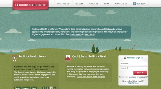
RedBrick Health is a site I stumbled on during a google search for nature based site design. This site has a really nice illustrative feel to it, though i do feel that it's a bit heavy on the noise on the skyline.
The site's header area clearly and immediately identifies who they are and what they stand for. They then provide important information on the site and make it easy to navigate to other areas of the site. There is no clutter to confuse their users... everything serves a purpose.
indiqo.media
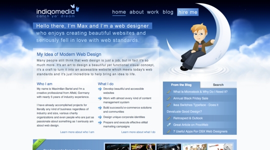
Indiqo.media is the web site of a Maximilian Bartel and demonstrates how a nice grid combined with beautiful illustration and artistic skills can produce a really visually powerful site.
Wrapping Up
Having taken a look at a great many sites I have a much stronger feel for what I want to produce for GROW with regards to branding and site layout. I'll be sketching out ideas over the next several days before I settle onto any particular design.