Getting to Grips with the Grid
This week the Standardistas covered several aspects that are important when it comes to design in general, be it in print or the web. Those three aspects are:
- Careful usage of a grid
- Typography
- Colour Palette
Today I'm going to focus on the first of these three, looking at various grid systems that are available out there, and sharing some of the little things I've taken a look at and worked on myself.
Importance of a Grid
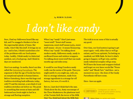
For a long time grids have been a staple of the printed media world and are increasingly making their way onto the web. Magazines make use of grids to help make the most of the space available on the page, whilst making the content as readable and appealing as possible:

As I've mentioned, grids have been making the transition from paper to the screen. Khoi Vinh is one of the examples of designers that make use of grids, and examples of this would include his own site, the New York Times Site Design, and his grid-based WordPress Template, Basic Maths.
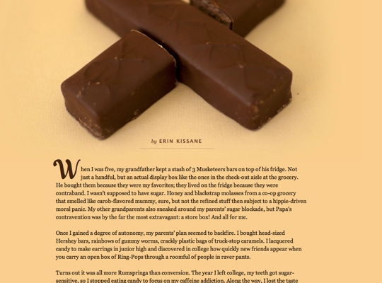
Another example of grids on the web would be the work of Jason Santa Maria. Jason has a fantastic blogazine editorial style blog. What this means is that each and every article posted of the site is laid out uniquely in a fashion that relates to the topic at hand.


The above images demonstrate how using a grid can help the site layout and display content in beautiful ways even when the content has different styles. Some of these sites also help demonstrate other vital aspects of design, in particular that of good typography, which I will probably cover in another blog post (and which the wondrous Will McNeilly will almost undoubtedly cover in better detail than me).
CSS Frameworks with Grids
As you can see, there are numerous advantages to using a grid in design. If you haven't already found your own way of implementing grids, there are a wealth of resources out there for you to experiment with, including:
Each of these frameworks provides a grid that people can use. I'll be honest, I've always been a big fan of the 960 Grid Framework. I wrote a blog post about making use of this particular Grid System last year as part of my Learning Logs for the DES module.
Simon Fraser seems to quite like the Blueprint framework and covered it in a recent post on his blog. If you're wanting to see other opinions on grid systems he provides a bit more information about Blueprint than myself.
Expanding Beyond CSS
There's one frustrating issue with CSS Frameworks, you almost always end up with a lot of superfluous code that only serves to bloat your files - having code you don't use negatively affects your site loading times which isn't a good thing.

LESS CSS - http://lesscss.org
LESS CSS is one of many ways available to extend CSS with all sorts of nice little pieces of functionality. Two of these that prove to be highly useful in this particular instance are the ability to define variables and the ability to use mixins (essentially functions for css). We can use these to dynamically create our own grid with no excess code and without reliance on CSS classes. To provide an example the following is below:
@def_grid:12; // Defining a Variable
@width:960px; // Defining a Variable

// Let's try out a function for a container shall we?
.container(){
  margin:0 auto;
  width:@width;
}

// And here we have a function for creating grid elements
// We also have to pass some specific numbers to this mixin
// with some additional, optional, variables that are pre-defined
.grid(@grid:@def_grid,@cols:'',@float:left,@display:inline){
  display:@display;
  float:@float;
  margin:0 10px;
  width:(@width/@grid * @cols)-20;
}
A little bit confused? If you've never encountered things like LESS, or SASS or COMPASS then that's understandable. Let's provide a little bit more of an example shall we? Here's a demonstration of how we can use this in our code.
@def_grid:12; // Defining a Variable
@width:960px; // Defining a Variable

// Let's try out a function for a container shall we?
.container(){
  margin:0 auto;
  width:@width;
}

// And here we have a function for creating grid elements
// We also have to pass some specific numbers to this mixin
// with some additional, optional, variables that are pre-defined
.grid(@grid:@def_grid,@cols:'',@float:left,@display:inline){
  display:@display;
  float:@float;
  margin:0 10px;
  width:(@width/@grid * @cols)-20;
}

#container{
  .container();
}
header, footer{
  .grid(16,16,none,block);
}
#content{
  .grid(@def_grid,4,right);
}
aside{
  .grid(@def_grid,12);
}
Pretty Simple so far? We define a couple of mixins and then we use those in specific bits of CSS. The outputted code that we get looks like the following:
#container {
  margin: 0 auto;
  width: 960px;
}
header, footer {
  display: block;
  float: none;
  margin: 0 10px;
  width: 940px;
}
#content {
  display: inline;
  float: right;
  margin: 0 10px;
  width: 300px;
}
aside {
  display: inline;
  float: left;
  margin: 0 10px;
  width: 940px;
}
The really nice thing about this is that we can make use of lots of mixins and they won't make it through to the finished CSS code. Another nice little perk of this approach is that you are no longer limited to the pre-defined classes, or the predefined widths. This can be very useful, especially with the increasing popularity of Responsive Web Design.
If you are interested in using LESS to create your own CSS Grid I have already put together my own adaptation of the 960 Grid System on my GitHub Repository, which you can freely acquire. Of course this is just the tip of the iceberg when it comes to what LESS (and it's alternatives) are capable of. If what you've seen above has piqued your interest then you should definitely take a look at what else it's capable of.
Summing Up
There are plenty of different ways in which you can piece together your own grid system, and a vast selection of tools available to help you get there. Take a look at all the options available and figure out what works for you. When you do that then all that's left for you to do it go with it.