Creative Experimentation - Week #1
So another semester of university work, and I've gone and put together a new look for my Learning Log. Can you guess what I'm going to be talking about this week? Learning Log Daily Design Blog!
Were you expecting me to go for the easy route? I figured I'd be a bit different and talk about another of my insane schemes this week, as it seems appropriate. During the Christmas break I was reading a Smashing Magazine article about designing something every day for a year. Now, normally, I have enough sanity to realise that I'm not really suited to designing something. Normally. Then I went and started attending some kind of Interactive Multimedia Design course which has, crazy I know, resulted in my competency in terms of design improving.
One thing led to another, and before I knew what was going on I was producing something every day and posting it up over on my tumblr blog. It covers a myriad of things that I have been working on, or just random stuff I have been throwing together. There has been, of late, a rather heavy leaning on my Learning Log Redesign, though the stuff changes daily, based on what I've been doing or I need to do. I'd quite like to try and focus on web designs, with maybe the odd poster design.
What's the idea?
My aim is somewhat different from the basic idea that Smashing Magazine seemed to be highlighting. I have a strong background in code and development and I'm seeking to enhance my design skills. So sometimes I find it difficult to actually produce something shiny and new each day. It's why you can, over the past week, see a development of a project. This lets me focus on finer details more, which helps to truly fill out a design. It's something that this one is still, to a degree, lacking. So you may see it appearing again in the future.
Creative Experimentation - Week #2
In future weeks I'm planning to focus my Creative Experimentation on whatever it is that I've been doing. Unfortunately, at this early stage of the semester and group project, there's not exactly a whole lot for me to write about in terms of Creative Experimentation, at least not with regards to our ongoing project.
So what shall I write about? I could run back to my Daily Design Blog, as one friend has already suggested, but I'd really rather not go down that path. I want to ensure that the work I put on here is separate from what I post over there. Unfortunately, this leaves me with rather little to talk about at this early stage in the group project.
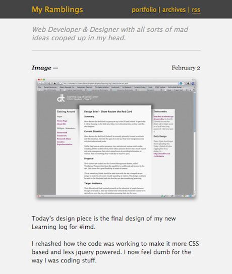
So, for this week, I shall be playing covering a piece of work related to this module, which I also used on my design blog last week. So what is it?
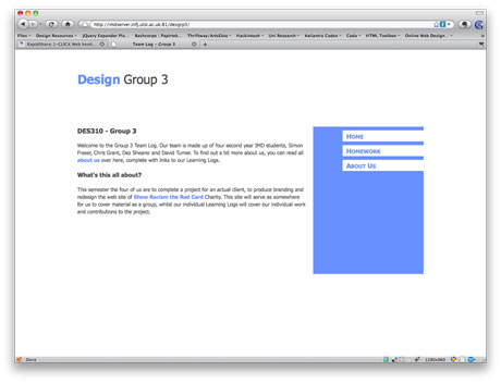
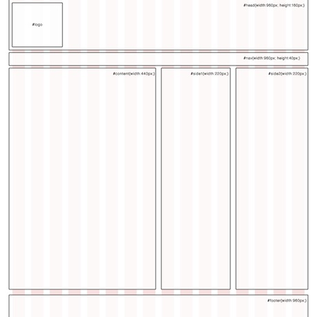
The above is a design for my group's space on the IMD servers to show our work off. It was something that I threw together to let us put our group work in one place. It's made using the 960 Grid System, to which I am rather partial.
I cannot claim that this is an original piece of code, or rather an original piece of design. Taking a look through the list of sites that use the Grid System and you will quickly notice a very similar design, in the form of Ten Seven Interactive:
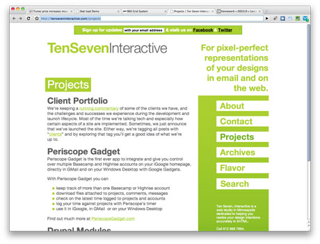
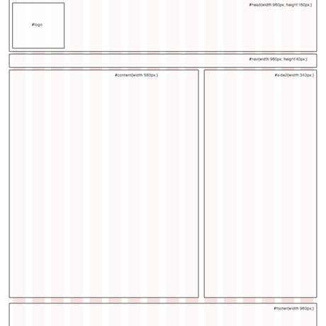
Notice any similarities? I liked the shape and layout of the page, as did the members of my group. It's simple but eye-catching and interesting to boot. It was fun to code something to look like something else. I spend so much time doing stuff to try and be different, recreating something provides a unique challenge.
It still needs refinements and additional detail added to it, but it provided a nice base for the team site.
Creative Experimentation - Week #3 - Brand Identity
Brand Identity - Mascot
I've been having a very difficult time of keeping on top of all the work that this module has required of late. I'm not the only one and it has, to some extent, caused me to step away from the whole designing in front of a computer. Fortunately, this has led to me spending more time with a notebook and paper, sketching away.
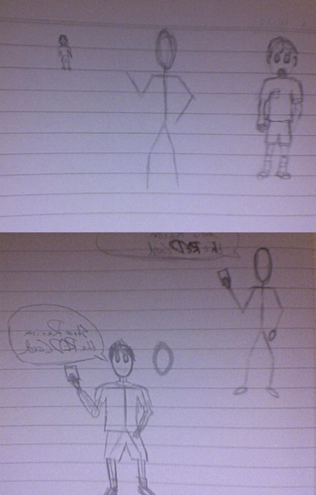
So what have I been sketching then? Stickmen, lots and lots of stickmen. I wanted to create a somewhat cartoony, yet still broadly appealing, design in with regards to the brand for Show Racism the Red Card. I naturally leant quite heavily towards a referee as the aim for the character, it's very stereotypical with regards to showing a red card in sports. This has lead to my Daily Design Blog being somewhat overloaded with sketches of stickmen and referees:
- Daily Design Blog - 11/02/10
- Daily Design Blog - 12/02/10
- Daily Design Blog - 13/02/10
- Daily Design Blog - 14/02/10
It's also led to quite a selection in terms of ideas that I've had as a consequence:
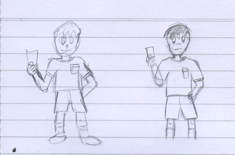
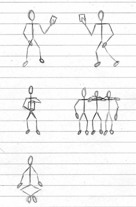
As you can see, I produced just a few sketches of shapes and ideas that I had in terms of shape and composition of the "referee" character. Ultimately after seeing Simon, a fellow member of my group, working on his own DES310 sketches I felt inspired by his work to deviate slightly from my original concept, in that I ended up using the sketch least resembled a referee, instead choosing to go with a more generic character.
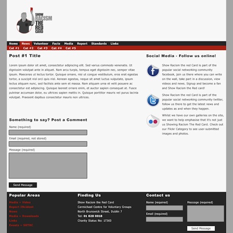
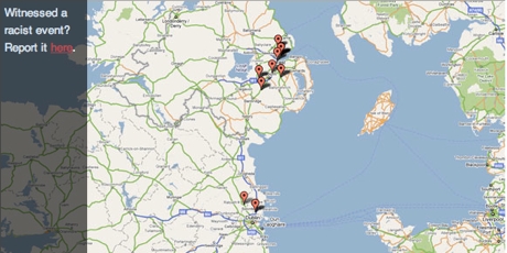
Whilst Show Racism the Red Card is about using sport to combat racism, I realised that it may be more effective to suggest that it isn't just people involved in sports but those who are even remotely interested, that average every day people, can have an impact, that they can show racism the red card themselves.
I also seem to have stepped away from making the characters appear to be an individual person, with defining features, as you will see further on in my experimentation. This is, in part, because I'm not very confident with my ability to draw facial features and, whilst some of my sketches have done a passable job of things, I believe that the transition to digital would not make any positive changes to my graphics. I am rather proud of my sketches though so, if my work does become the design being forwarded, I may have another team member attempt to produce better digital work.
There is, however, a benefit of sorts to removing the facial features from the design. It prevents the character from being identifiable as any one person, or any one ethnicity. It means that the character can represent everyone, of all creeds, colours and backgrounds, excluding nobody and including everyone.
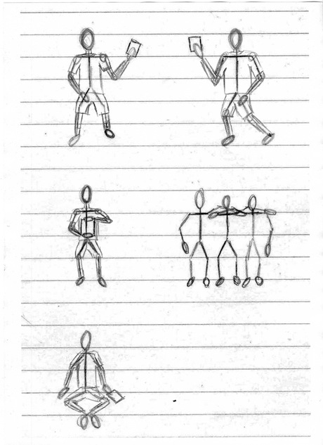
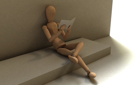
In the end, I went with a style very similar to a wooden mannequin which, in retrospect, would have been very useful to have had from the outset of my sketching bonanza, to help ensure my scale and poses were accurate.
After having decided upon this further change in direction, I then opened up Illustrator and recorded converting one of my sketches into a basic vector image of the character.
I'll be honest, at this point I'm not sure that it is truly worthwhile taking the character any further without getting a decision from my team members with regards to using my concepts. With time in very short supply, I think that it would be better to put effort into pushing forward with the design that the members of the group decide are best. Everything above gives enough of an idea as to the design of the character, without going overboard in terms of detail. If we do decide to use my design, it can also be quite easily developed further.
Brand Identity - Logo
After creating something of a mascot, I thought it might be a good idea to create some alternative way to display the logo, without a motto, and possibly by making use of the large space made available in out primary medium.
To do this I, once again, returned to my trusty pencil and paper... with added red pen. The following are the sketches I produced.
I then took my favourite of these, along with the character I put together in Illustrator, and worked on them to complete my homework for the week.
Week #4 Creative Experimentation
This week saw our first CRIT Session with the client being able to provide feedback to the majority of the groups that had produced content. This was an important meeting for us as we had managed to narrow our design work for the client down to two options but had been unable to make a final decision as to which we should make use of.
Fortunately, after a lengthy wait, we did manage to get feedback on the design. Of the two we submitted the design i had helped influence was chosen. We received additional feedback that the typography needed work, something that we had stated when presenting the designs to our client.
So, for this week's creative experimentation, I have been toying with the font-face used in the logo, to attempt to produce something more visually appealing. Some of the results have already been posted up on my Daily Design Blog but I have played about with additional fonts since then:
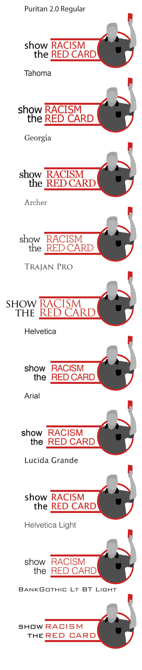
After completing these I showed them to the team to try and come to a decision with regards to what we would use for the final logo. Whilst I was producing logos, other members of the team were working on their own iterations of the design. Of particular note, and the design we'll be using for the branding guidelines due in Week 5, is the design by Dez Shearer, pictured below.
Week #5 Creative Experimentation
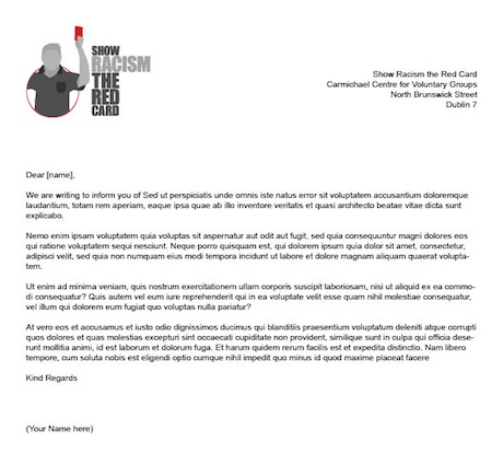
For Week #5 of the unit each group had to produce branding guidelines for the Show Racism The Red Card brand. I opted to provide some kind of guideline for the more corporate side of things, providing them with templates to use for the majority of things:
In addition to this I also put together a basic PowerPoint Template that the could use, to help tie things in with the brand that we are creating for them, and to save staff from having to decide on which design to use for which presentation, something that could result in an inconsistency across presentations.
Finally I also decided to produce something for their Twitter Design. They have previously stated that they have both Twitter and Facebook Profiles, but are unsure as to how to use them. This design will help tie in the appearance of their Twitter Account with other forms of media they will be using. I will also, along with my team, put together a set of guidelines on how best to make use of the social media they have.

Whilst we have finished our Branding Standards Document, we are spending a little extra time to ensure that the Branding Standards Document meets with the high quality we want the Show Racism The Red Card to have, be it on the web, in print or with their Branding Standards Documentation.
Week #6 Creative Experimentation
This week the group had to handle a lot of prep work with regards to the Show Racism The Red Card web site. The requirements for this week are as follows:
- Team Work Breakdown
- Content Audit
- Navigation Structure
- Technical Specification
Simon took on the task of Content Auditing the current Show Racism The Red Card and his individual contributions can be found on his Learning Log. This provided a perfect lead in to the work that we decided I would complete, that of the Navigation Structure.
Navigation Structure
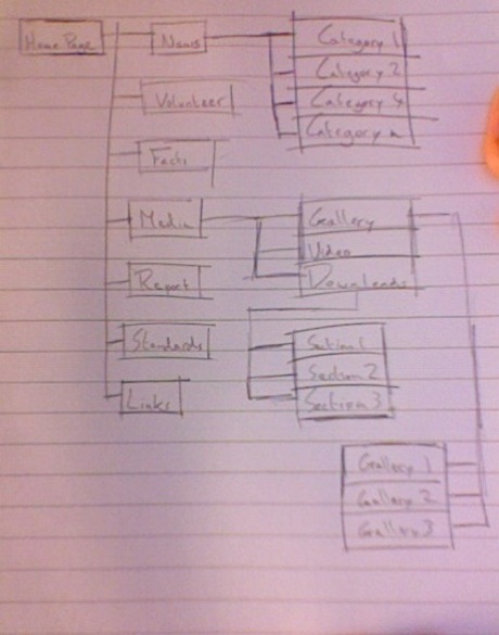
As mentioned on my Research Log for the week, having a good idea of the content of the site is very important to helping decide how to sort and display the content as a navigation menu.
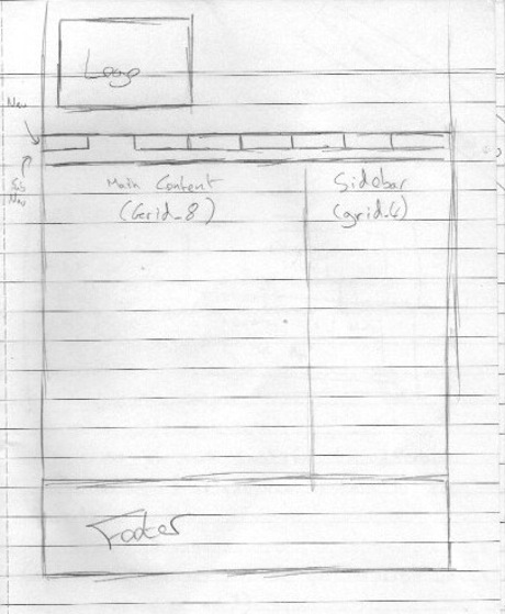
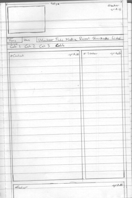
Following on from this is creating a sitemap. Normally I would do this with post-it notes or something similar but, as a consequence of having been in class at the time, I didn't have post-its available to me or anywhere to put them so that I could organise them in any usable fashion.
So, instead of post-its, I turned to one of my common tools when I start any design work, pencil & paper. The following images are the sketch I produces as well as a neatened up version of the sketch, produced using Photoshop.
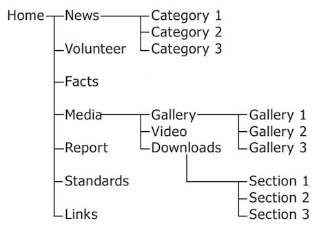
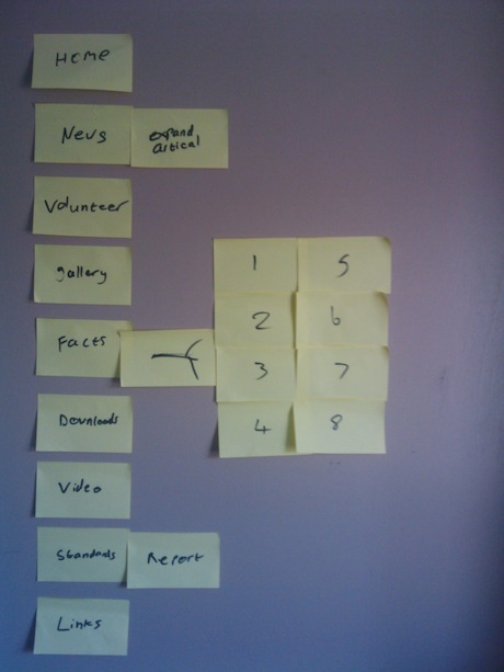
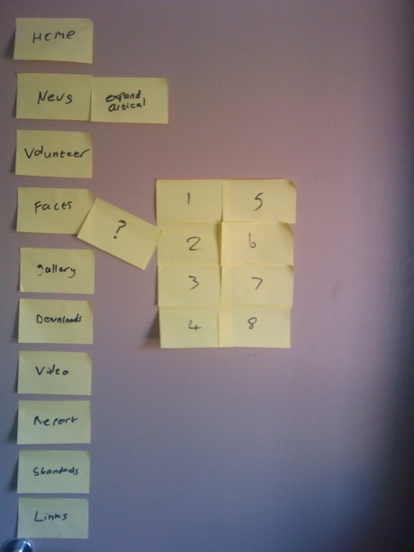
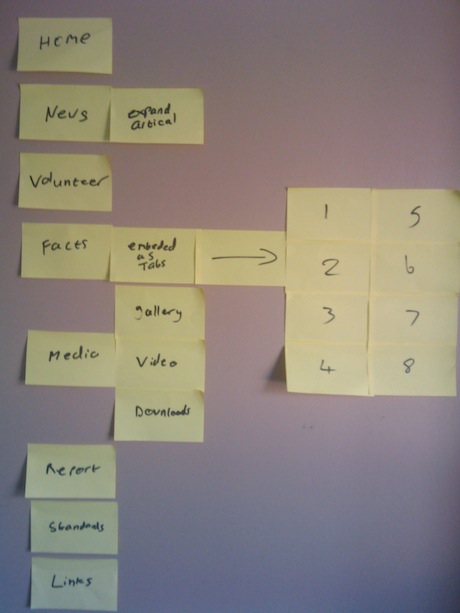
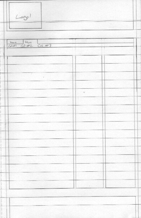
Simon also put together post-it note versions of the site-map which can be viewed below:
Week #7 Creative Experimentation
This Week the individual members of the group were putting together a series of concepts for the client to choose from for the Show Racism The Red Card Web Site. Chris, Dez, Simon and myself each put together our own concepts, from sketches, through wireframes and finishing with Visual Compositions to display this Friday.
So, for this week's Creative Experimentation, I'm going to cover the process of producing sketches, turning them into wireframes and finishing things up with a Visual Composition produced in Photoshop. This coincides with the material I've reposted over on my Research Log for the week.
Sketches
Before I put any great amount of consideration into the visual appearance of content, I first produce sketches of for the layout of the site. This allows me to focus on how the content is to be displayed, without having to be concerned about how it will impact upon a design. After all, the content is what is important, so it stands to reason that the site's design should work around the content and not the other way around.
The following are the sketches that I produced with regards to the Show Racism The Red Card site. The first is a 2 column layout, followed by some neatened up sketches I was considering for the site design.
Wireframes
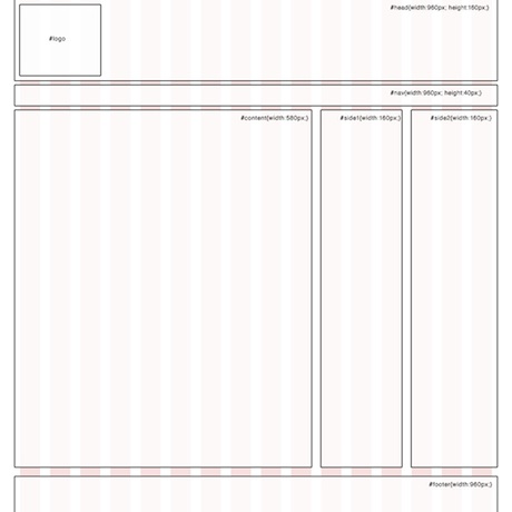
After taking a look at the Branding Standards we had produced, as well as considering the sketches I had produced, I thought it would be best to develop towards a two columned design, based around a 16 columned grid we specified in the Branding Standards. The following are the wireframes I produced.
Visual Comps
Finally, I took time to produce Visual Compositions for a selection of pages. You can see them below.
Week #8 Creative Experimentation
This week my Creative Experimentation follows on from my Research Diary and focuses upon typography based wallpapers.
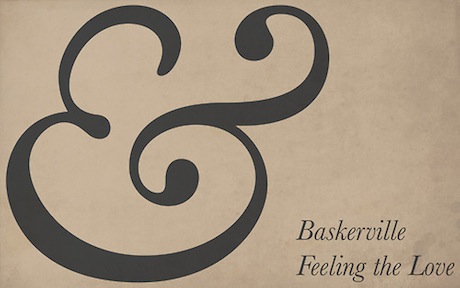
Baskerville Ampersand Wallpaper
This was intended to poke fun at the vast amount of sites that are making use of the Italic Ampersand from Baskerville. Whilst it is a very nice character, it is used excessively in web sites currently and not always appropriately.
DT Typographic Wallpaper
This was my first attempt at a typographic wallpaper using a logo, so naturally I decided to use my own logo for it.
Show Racism The Red Card Typographic Wallpaper
Week #9 Creative Experimentation
I've been spending a lot of time of late working on various projects, all of which have something in common. What's that then? WordPress.
WordPress is a Blogging System that can be used as a Content Management System. Of these systems it is by far the most popular, with millions of downloads. It is of particular interest in this module because the client we have for our group project, Show Racism The Red Card, currently use WordPress to power their site.
Whilst some people have said that this isn't important, that the client can learn to use a new CMS, it is my belief that we should work to the client's needs and, in this case, this requires bearing in mind that they do know how to use this particular package.
This works out quite well for me, as I have a reasonable amount of experience in designing using WordPress, having helped produce a site last year and working on several projects currently for clients and myself.
These projects take the form of themes that a user can switch between freely. which allows for a great deal of flexibility when it comes to updating a site design, as you can simply switch between designs.
The following are some examples of WordPress Themes I have helped create or that I am currently working on.
Week #10 Creative Experimentation
This week continues the trend, of late, of working on WordPress. This week has had me dealing with various aspects of WordPress, in particular with regards to the following aspects:
- WordPress Theming
- WordPress Functions
- WordPress Custom Fields
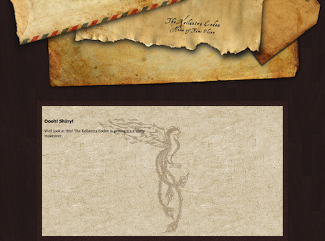
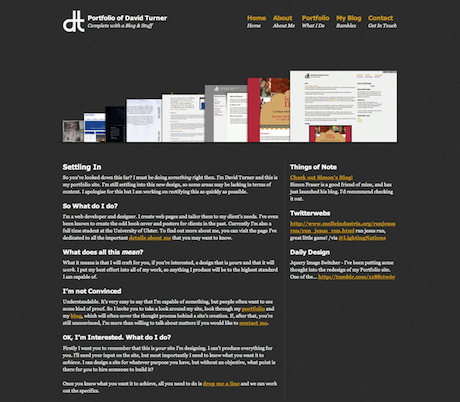
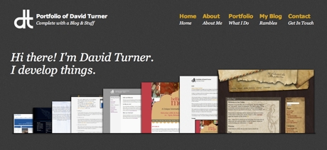
I've been dealing with these with regards to the ongoing redesign of my Portfolio, which I have been developing in my spare time, many pieces of which show up pretty regularly at the moment on my 365 Design Blog.
As I mentioned in my last Creative Experimentation, WordPress is a blogging platform that I have used recently to produce work for various clients. I also showed, in my screenshots of themes I've worked on, my own portfolio that I am currently developing for my site in my own time. I thought I would highlight some of the aspects of it that fall under Theming, Functions and Custom Fields.
WordPress Theming
WordPress Themes are as flexible or rigid as the person developing them wants them to be. They can range from a simple index.php and style.css through to a complex pattern of php, javascript and CSS files. My own portfolio leans more towards the latter, with a reasonable amount of complexity designed to ensure that I have as much control as I want without going overboard in terms of complexity.
Defining Your Theme
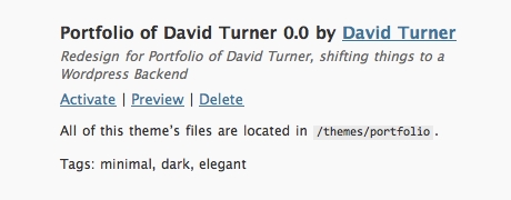
As mentioned above there are only two files that are essential to a WordPress Theme, the index.php and the style.css files. The style.css file is used to make certain declarations with regards to a WordPress theme. The following is an excerpt of the CSS I use in my own Portfolio, and how it translates into the WordPress Themes page:
/*
Theme Name: Portfolio of David Turner
Theme URI: http://davidturner.name
Description: Redesign for Portfolio of David Turner, shifting things to a Wordpress Backend
Version: 0.0
Author: David Turner
Author URI: http://davidturner.name
Tags: minimal, dark, elegant
*/
In the WordPress Themes Panel, the above information translates into:
The rest of dealing with WordPress theming and styling, it is very similar to dealing with HTML and CSS Styling that is typical of webpage development, though there is a rather vast amount of PHP thrown in for good measure too. I've gone to great lengths to ensure that my site loads as quickly as possible, going so far as to make use of advanced CSS3 to ensure quicker loading times, with elegant fall-backs for less capable browsers. As a result of this, my site currently makes use of a total of 4 images in my stylesheet, all of which are compressed as much as possible without sacrificing detail.
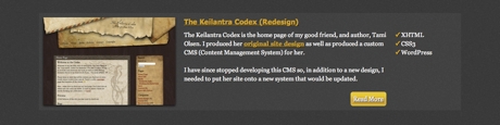
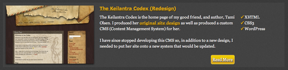
The following are a few sections of the site that I am most pleased with currently, given the effort I have put into making sure that there minimal image usage in the design.
This is a section of my home page, covering my Site Navigation as well as a section dedicated to my latest work. I've seen many different ways used by people to display content online, from lists to fancy jquery rotators and sliders but, for some reason, none of these especially appealed to me for my home page. I, in the end, found inspiration on the Symphony CMS, liking how they displayed their application.
I, however, wanted to make my version a bit more dynamic than a static image. I did this by using a bit of a PHP query combined with a custom WordPress field.
This is a Work In Progress concept for my Portfolio Entries. It's one of the areas I mentioned above that makes use of some advanced CSS3 options, in this particular instance making use of the following CSS Gradients (for Webkit and Firefox only):
background:-webkit-gradient(
    linear,
    left top,
    left bottom,
    color-stop(0.2, rgb(237,205,0)),
    color-stop(0.6, rgb(216,165,24))
);
background:-moz-linear-gradient(
    center top,
    rgb(237,205,0) 20%,
    rgb(216,165,24) 60%
);
This provides a simple, CSS only, gradient effect. It also degrades nicely, for other browsers that support neither of these settings, to a solid coloured background.
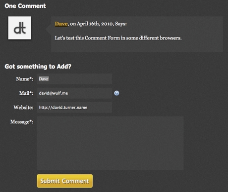
Of all the sections I've produced as a part of this redesign, I must admit I am currently most proud of the comments that I have styled for my blog posts. Aside from the avatar images, generated using Gravatar, everything in the comments is styled using pure CSS.
The same is true of the comment form below, with the exception of the help icon next to the email field.
WordPress Functions
In PHP it is possible to set up functions, pieces of PHP code designed to do stuff when called. WordPress builds upon this somewhat, allowing for a file that you can store these functions in a single place, calling them as and when they are needed. In particular there is a single function that I make use of, that I found online:
add_action('comment_post', 'wdp_ajaxcomments_stop_for_ajax',20, 2);
function wdp_ajaxcomments_stop_for_ajax($comment_ID, $comment_status){
	if(!empty($_SERVER['HTTP_X_REQUESTED_WITH']) && strtolower($_SERVER['HTTP_X_REQUESTED_WITH']) == 'xmlhttprequest'){
	//If AJAX Request Then
		switch($comment_status){
			case '0':
				//notify moderator of unapproved comment
				wp_notify_moderator($comment_ID);
			case '1': //Approved comment
				echo "success";
				$commentdata = &get_comment($comment_ID, ARRAY_A);
				$post = &get_post($commentdata['comment_post_ID']); //Notify post author of comment
				if ( get_option('comments_notify') && $commentdata['comment_approved'] && $post->post_author != $commentdata['user_ID'] )
					wp_notify_postauthor($comment_ID, $commentdata['comment_type']);
				break;
			default:
				echo "error";
		}
		exit;
	}
}
This allows for additional functionality to be added to both my comment forms and my contact form, adding AJAX functionality to my forms, so that the pages never have to reload to submit messages in response to a post on my blog, or to contact me directly using my contact page.
WordPress Custom Fields
WordPress Custom Fields allow users to define additional content for a post, by defining a name and values for fields. This is done using an area of each post dedicated to entering custom data. Fields you have previously created are remembered for easy use again in the future.
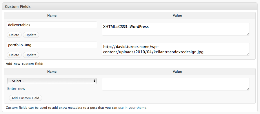
So how does this translate into data on a screen? Using some simple PHP code it is quite easy to pull content from these custom fields and use it in any manner I decide. The following is how I display portfolio posts, currently, making use of the custom fields shown above, followed by code snippets that show how I did so.
And to display the custom field that lists the deliverables, I used the following code:
<?php
	$deliverables = get_post_meta($post->ID, 'delieverables', true);
	$toprint = explode("::", $deliverables);
?>
-
<?php
for($i = 0; $i < count($toprint); $i++){
echo '
- ✓ '.$toprint[$i].' '; } ?>
This allows for a vast amount of flexibility in terms of content control. This will be enhanced even further with the upcoming release of WordPress 3.0 in May.
Week #11 Creative Experimentation
In preparation for the final week's video presentation I have been playing about with some video recording of my own. I've made use of the software ScreenFlow, which I have mentioned over on my Research Log, to produce several videos over on my 365 Design Blog but for this week I wanted to highlight two videos as they both relate to aspects of out Web Site Development.
Week #12 Creative Experimentation
For the final week's Creative Experimentation my group and I have developed our design further, based upon the feedback we received from our lecturers during the CRIT Session. Unfortunately Garrett seemed to be distracted by something in his bag during our presentation and seemed to miss the first half of our presentation. The list of changes needed consisted of the following:
- Additional Imagery
- Social Icons
As a group we worked on adding more imagery to the site. In particular I worked on an image rotator for the front page that can be viewed on my personal server, where we hosted the WordPress version of the site.
In addition to this I have also been making use of a piece of software available for the mac called ImageOptim, an image compression tool.
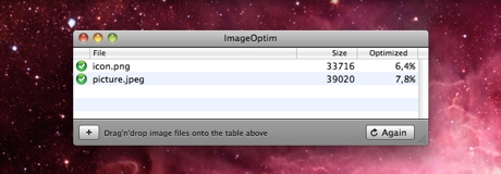
Essentially it's a piece of software to purge all the little bits of data images contain that aren't needed for the image to work. The end result is a smaller, sleeker image which loads faster in the browser.