Week #1 - Design Brief
Whilst I have produced work for various clients, the majority of my work has been done either on placement or freely for close friends. As such, I have never actually had to write out a Design Brief. So, where do I turn when I'm unsure where to go?
Google!
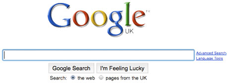
Google is my first port of call when it's something I'm unsure about. It's one of the most powerful search engines in operation, and is remarkably fast. As such, I frequently make use of it to find resources and materials for projects.
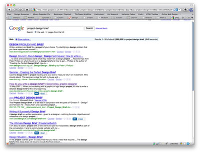
After perusing through several sites, I found David Airey's document to be quite insightful. Upon consulting the list that Ian emailed us, I found that this document was one of those that he linked us to.
With the resources available I put together a list of headings that I wanted to use for my design brief. I also made use of some of them to create a list of information I was looking for, which I got, in part, during the Q&A session we held last Wednesday.
Unfortunately, some questions that I would like to have asked weren't answers. I have a weird tendency to dislike asking questions in front of other people. It's not that I don't want people to hear my ideas, it's more that I dislike being the focus of attention of a large group of people.
By the time I had decided to ask a question our time was up. This is something I'll have to deal with for future Q&A sessions, if they present themselves.
References
- David Airey. 2007. How do you write a design brief? [ONLINE] Available at: http://www.davidairey.com/how-do-you-write-a-graphic-design-brief/ [Accessed 26 January 2010].
Week #2 - Collaborative Tools
One of the topics of the lecture this week was the topic of collaboration, and came complete with a great list of tools for people to make use of. This week I have, as a result, decided to focus my research on collaboration tools, and what they're capable of doing.
So I'll be covering many of the resources that Tim and Ian had both conducted research into (though we missed out on Ian's half), and mentioning one or two applications of my own that might be of use. This list will consist of:
- Dropbox
- Google Docs
- Google Wave
- Skype
- Evernote
- Subversion
Email (Hotmail, Yahoo Mail, Google Mail etc.)
Everyone who has ever been online has at least one email address that they use, be it from their ISP or through another provider. It provides a way for people to communicate with one another, sending text, images and other attachments as necessary.
Is it suitable for collaboration?
To a limited extent it is. For a group of two people it can be used to send files back and forth. Past that, however, things get much messier, and quickly. Three people emailing back and forth would result in a massive amount of email and, even if your email provider doesn't start flagging it as spam, finding the contents you are after becomes increasingly more difficult to achieve.
It can work, but there are a vast selection of tools available, for free, that you can make use of for collaboration, which function in a much more effective approach to collaboration.
Dropbox
Dropbox is a tool used to synchronise files between multiple computers. It has both free and premium packages, with the free package providing a minimum of 2GB of space, up to a maximum of a whopping 5.25GB of storage. This is achieved via inviting people as well as completing the usage guide available on their website.
So what's so great about Dropbox?
Dropbox is focused primarily upon syncing files between computers, which is fantastic for keeping files accessible regardless of which machine you're using, but it is capable of so much more. In addition to syncing files across machines, all of the contents of your Dropbox are available via a web based interface, just in case you're on a computer you don't own, such as a work machine or a university computer.
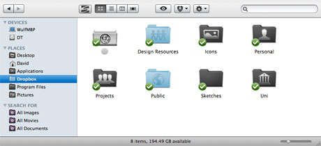
But wait, there's MORE! This is the part that applies a great deal with regards to collaboration. Dropbox also allows you to create shared folders. These, as the name would suggest, allows you to share files and folders in your Dropbox with other users of Dropbox, via invites. So you can, in the case of collaboration, share a project over dropbox with other members of your team.
There are some drawbacks with this however. The first/main one is that problems arise when multiple users edit files. It can be avoided by a decent amount of communication between members, as our team worked out last semester during another group project we had to complete.
Popularity of Dropbox
Dropbox is a very popular tool amongst designers. March's issue of .net Magazine (issue 199) has a section dedicated to tools that can be used to improve your sites. In it, it covers a total of 60 popular applications. In it, they have a list of the top five applications recommended by the readers of the magazine. I'll let the results speak for themselves:
(As recommended by everyone)
Craig Grannell. (2010). 60 tools to improve your sites. .net Magazine. 199, 49-53.
- Dropbox (cross-platform)
- TextMate (Mac)
- Photoshop (cross-platform)
- Firebug (cross-platform)
- Coda (Mac)
What does it say to the popularity of an app that is is more popular, amongst designers, than the industry-standard image editor?
What do I think of Dropbox?
I must confess that I simply love the features available as a part of Dropbox. It's proven very useful over several projects, both by myself and whilst collaborating with other people. The one downside I see with it, and this is purely petty, is that the desktop application no longer likes me using custom icons for my shared folder, as you can see in the screenshot up above.
Google Docs
Is there anything Google can't turn their skills to? They're responsible for one of the most powerful search platforms ever, one of the most popular web-based email systems today, and are even entering into the mobile phone and Operating System markets. So it should come as no surprise that Google have tools that can be used for collaboration too. Google Docs is one of the two of these that I shall be discussing.
Google Docs is a web based app that can be used to store files and documents online, but it is so much more as well. It allows for editing of documents online, in the browser. It also doesn't suffer from one of the flaws of Dropbox, in that multiple users are able to edit the same document simultaneously. To help highlight this, I thought I would show you a video that caught my eye over a year ago, that shows just how much a group of people can manage when making use of Google Docs.
It's not exactly a common usage of collaboration software, but it helps to highlight just how flexible Google Docs can be.
What do I think?
Google Docs is something I've not used in a very long time. After having looked at it again for this write-up I think I might make an increased effort to make more use of this versatile tool.
Google Wave
Moving from one piece of work by our Google Overlords to another, I am going to switch to talking about Google Wave.
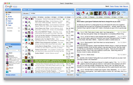
Google Wave is something of a new tool from Google, and is still in the early Beta phase. There's been all sorts of things posted online about Google Wave.
Google Wave is a tool to allow for easy communication with other people. I've used it alongside other people on this course to facilitate communication with regard to COM311's group work last semester. But a collaboration tool is only so good as it's ability to bring in collaborators and this is, to me, the biggest fault that Google Wave has had.
Last semester we were working in groups of five. We would like to have used Google Wave to help in terms of collaboration between our members but, due to the wait in invites being sent out, we only had three of our team members on Google Wave for the majority of our project. When you can't get a full team of people on board, you can't really make use of Google Wave to collaborate.
So what does Google Wave do?
Google Wave is, for the most part, a live chat client. It's similar to the likes of Google Talk, MSN or Yahoo Chat, but not identical. Google Wave updates on the fly, so you can actually see what people are typing ?as they are typing it. This can allow for multiple people so simultaneously be typing responses to one another, facilitating for a quicker flow of ideas and information. It also allows for a limited usage of other online tools. Images can be added from online tools, and maps can be generate from Google Maps. All conversations are stored in waves so you can actually read up on what you've missed out on.
All in all it's a rather handy little tool, if limited in terms of adding in new people. I think that the rate at which invites are now sent out has been really stepped up, which would help fix one of the main issues of Google Wave. Aside from this, I think that it could stand to better integrate Google Chat and Google Mail, possible merging them into the Google Wave experience in some way. Maybe that'll happen further down the project's road.
Skype
Skype is an application to allow people to communicate with one another online. It allows for a vast wealth of options in terms of communication, allowing for text based chat, online voice chat and even providing the capability to make and receive phone calls with people.
It's a rather powerful tool in terms of communications with other people, but how does it enable collaboration?It allows for group chats and calls, which can be very useful when a group of people cannot always manage to meet in person. This allows for a vocal communication to be made between all members regardless of distance.
As such it provides for a useful communications platform, freeing people from having to always be typing away into a chat window, especially handy if you are part of a coding team, as you can work and discuss things with others at the same time.
Evernote
Evernote is an application that is used to store notes, sketches and snippits that you find useful. It's a very impressive little program, being able to translate some of the most horrible scrawls on a piece of paper into perfectly legible text. But that's not all it can do.
Evernote allows you to sync these notes, sketches and images between computers, similarly to how Dropbox allows you to sync files. This can be useful for important information, or just for making sure you have all your most important notes with you anywhere. This can be useful, in terms of collaboration, for providing examples of ideas you've had, regardless of where you may happen to be, though I view this application as better suited to personal storage of materials and ideas.
Subversion
Subversion is a Version Control method made use of by multiple developers. For an example of this, take a look at any of the projects hosted on http://code.google.com/ to see that they have the ability to automatically downloat the latest version via Subversion, or SVN.
So what's Subversion about then?
Subversion allows for a great deal of power over version control. Developers can work on projects on their own machine, and then submit their changes to a master copy. This helps to ensure that people aren't working on things at the same time, as work is all submitted for inclusion to a central location.
This allows developers to work on a project as and when they are capable, submitting changes, complete with notes about what has changed, to a central area where updates are added into what already exists. Whilst it does add slightly to the administrative task of things, it typically results in less problems occurring.
Sounds like fun!
Subversion sounds quite good, and can be very useful. It doesn't mean that everything works perfectly however. My own personal experience, all one of them, has caused me to dislike using Subversion. I like being able to produce a piece of code, and be able to immediately test it in the environment that I have designed it for. With the Subversion set up I use, I end up not seeing how my code is working until the next time I am in work, which is a week later. By which time the code is out of my head, and problems are much more difficult to deal with.
I think subversion can be much better than this though, and it's popularity amongst developers elsewhere seems to suggest that this is the case. It certainly seems to be very powerful when used correctly, but can be very frustrating if not used effectively.
References
- Craig Grannell. (2010). 60 tools to improve your sites. .net Magazine. 199, 49-53.
Week #3 - Bad Design ≠ Bad Service?
There's a saying "Don't judge a book by its cover." Yet every day that is exactly what people do in terms of web sites. People very regularly make judgement of the capability of a company within seconds of visiting a site, based entirely upon the design of a site. As an example of this, here are a few sites that I view as either reliable or unreliable, based entirely upon the look of their web presence.
I thought this web site kept things simple and highlighted the important parts quite well, the products.
I thought that this site was elegant and to the point.
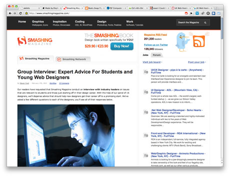
I think that the design and layout of the Smashing Magazine site puts the user's focus on the content of the site.
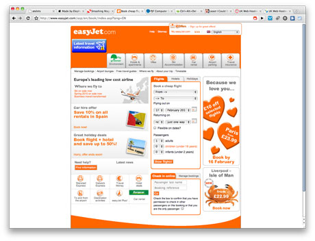
I'm not a big fan of the EasyJet site design, but I know that it works.
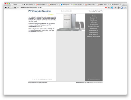
I really don't like the look of this site at all.
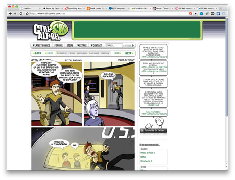
I find this site well designed and executed.
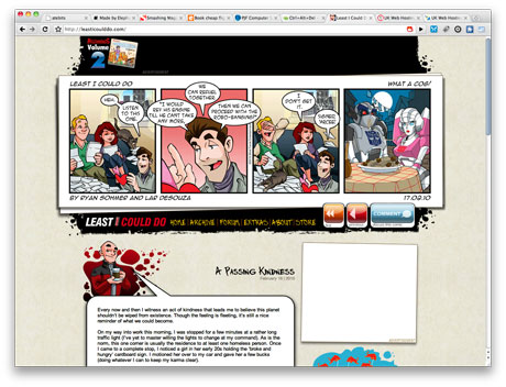
I find this site well designed and executed.
I'll let the image speak for itself
I'll let the image speak for itself
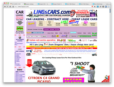
I find the design of Ling's Cars to, being quite honest, hurtful to my eyes. Would I use it? No. Is it a ridiculously successful website/company? Yes.
Wait... what?
That's right, Ling's Cars is actually a ridiculously successful company. Web Designer Magazine describes them as:
I think the person behind this business has been on the popular Dragons' Den and this is not a website one would like to represent. Because of too many different colours and way too many ads, it is really hard to distinguish particular elements of the site. Multiple fonts only add to the inconsistency.
A lot of information on the very first page along with a lot of empty space in between the content guarantee the majority of visitors will just close it down after a few seconds. This site would benefit on decreasing the amount of ads, maintaining one colour scheme and spreading the information over a few of its sub-pages.
Lubos Buracinsky. (2009). World's Worst Websites. Web Designer Magazine. 163, p32.
A few issues later they published the following:
Ling when you're Winning
Eccentric entrepreneur scoops business accolade and industry praise for supposed 'Worst Websit' lingscars.com
Dragons' Dens viewers will already recognise Gateshead's Ling Valentine after she pitched her slightly oddball approach to success on the popular BBC show. Similarly, Web Designer readers will know that her fairly chaotic website (www.lingscars.com) was featured in our 'World's Worst Websites' feature from issue 163. However, an unconventional method often garners great results arid Ling has in fact been celebrated for her efforts in the 2009 NatWest everywoman awards held in December.
Scooping the IrisAward sponsored by Kr, the website boasts 100,000 unique users and leases £3.5 million worth of vehicles every month. In addition LINGsCARS.com has been praised by US internet marketing expert Seth Godin for employing Internet marketing best practice.We think it just goes to show that you can't judge a book by its cover and congratulate Ling on her continued success. Now where was that humble pie we had saved for emergencies?
Web Designer Mag Staff. (2009). Ling When You're Winning. Web Designer Magazine. 166, p86.
Personally, I already knew that Ling's site was doing very well. I've seen contests, in the form of spec work, being undertaken to possibly redesign her site, in which she has explained the logic behind her site, and posted statistics to back up her claims that her site is a success.
Does a good design equal good service? Usually. If you look back to the sites that I rated as good, most of them will be recognisable to many people within the design/mac community. They have reputations... GOOD reputations. People who are proud of themselves or their products will tend to put the effort into their web presence to ensure that their product is as well received as possible. Typically.
The same is true of poorly designed sites. Typically they aren't sites you will have heard about and, if you have, it is usually in the form comments about the site. But, just as with well designed sites, there are those rare occasions where a poorly designed site provides an amazing product, as with Ling's Cars.
References
- Lubos Buracinsky. (2009). World's Worst Websites. Web Designer Magazine. 163, p32.
- Web Designer Mag Staff. (2009). Ling When You're Winning. Web Designer Magazine. 166, p86.
Week #4 - Designing the Mobile Web
Whilst the primary focus of the module is to ensure that we produce a high quality web site, as a part of one of our other modules we are developing a web based app to go hand in hand with the Show Racism The Red Card brand. As a part of this we have looked briefly into how web media is handled by mobile devices, with a heavy focus on the iPhone, the platform we are developing for. The reason for this can be seen in the graph below.
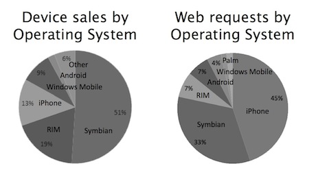
This graph shows a skew in results. Apple's iPhone isn't the most popular in terms of purchases, but it is the most commonly used mobile to access the web.
iPhone, Most Popular Mobile Browsing Device
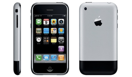
The iPhone is the most popular mobile device for accessing the web. To my knowledge it included the first mobile version of a standards compliant browser, Safari, as part of a mobile OS. This provides it with the capability to render full websites to a mobile user, and have them displaying the way they were designed to be seen. There are some areas where the mobile doesn't match up with the capabilities of a regular machine. You can't hover over a link, you can only click. Some elements also need to be bigger to ensure that they are clickable by users of mobile devices.
iPhone, the be all and end all?
It is widely accepted that the iPhone is top dog in terms of mobile platforms, but it isn't the only mobile device out there. Microsoft, Palm and even Google provide competition to try and knock the iPhone from it's position as the king of the mobile hill.
Windows Mobile
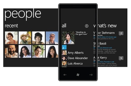
Microsoft have their own Mobile OS, called Windows Mobile. Currently on it's way into version 7, some people are already looking at it with very hopeful eyes. Some people even think it has "out-appled apple" in terms of design, whilst holding reservations about how usable the device will be:
I'm sorry, Cupertino, but Microsoft has nailed it. Windows Phone 7 feels like an iPhone from the future. The UI has the simplicity and elegance of Apple's industrial design, while the iPhone's UI still feels like a colorized Palm Pilot.
That doesn't mean that the Windows Phone 7's user experience would be better than Apple's. The two user interface concepts - data-centric vs function-centric - are very different, and the former is quite a radical departure from what people are used to.
Jesus Diaz. 2010. Windows Phone 7 Interface: Microsoft Has Out-Appled Apple. [ONLINE] Available at: http://gizmodo.com/5472010/windows-phone-7-interface-microsoft-has-out+appled-apple. [Accessed 24 February 10].
Palm Pre
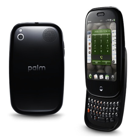
The Palm Pre is the latest phone produced by Palm. Unlike the vast majority of Mobile Devices, Palm is orientated more towards the Web. It started off with strong sales upon launch. Unfortunately, this hasn't continued and it isn't proving to be an overly popular platform, and has recently taken a heavy hit in terms of stock:
Palm's stock tumbled more than 19 percent Thursday after the handset maker decreased its forecast for third-quarter sales dramatically, citing lower-than-expected demand for its smartphones.
Palm said it expects its sales to be between $285 million and $310 million, well below its previous forecast of $1.6 billion to $1.8 billion. Palm chief Jon Rubinstein said that "broad consumer adoption of Palm products is taking longer" than he and his company had anticipated.
Katie Marsal. 2010. AppleInsider | Palm stock plummets after poor sales force company to lower guidance. [ONLINE] Available at: http://www.appleinsider.com/articles/10/02/25/palm_stock_plummets_after_poor_sales_force_company_to_lower_guidance.html. [Accessed 24 February 10].
Android
Google are the new kids on the block, being largely responsible for the Android Mobile Platform which is available on several mobiles worldwide. It hasn't, as yet, proven itself to be be an "iPhone killer", though the first actual Google Phone, the Nexus One, has been referred to as such.
The Android approach to the market seems, to me, to be a hybrid of the approaches that Apple and Microsoft have taken, in that it is usable across multiple phones, in the style of Windows Mobile, but is also organised in a much better way, in a style similar to Apple's tight control over their Mobile Platform. In addition to this, Google also offers many incentives to those who make use of their online tools, in that the Android OS makes use of content attached to an attached Google Account, such as contact information and email. This is a rather nice incentive to those who have been won over by Google Online, as it will make life easier for them on a mobile platform.
Common Ground
Most of the mobile platforms mentioned above have remarkably high quality browsers built in. With the exception of Windows Mobile, all the devices above make use of a webkit powered browser for their online interactions. This means that almost all mobile platforms will render websites in a consistent and predictable fashion, which is ideal for those of us who wish to develop for this medium.
References
- Jesus Diaz. 2010. Windows Phone 7 Interface: Microsoft Has Out-Appled Apple. [ONLINE] Available at: http://gizmodo.com/5472010/windows-phone-7-interface-microsoft-has-out+appled-apple. [Accessed 24 February 10].
- Katie Marsal. 2010. AppleInsider | Palm stock plummets after poor sales force company to lower guidance. [ONLINE] Available at: http://www.appleinsider.com/articles/10/02/25/palm_stock_plummets_after_poor_sales_force_company_to_lower_guidance.html. [Accessed 24 February 10].
Week #5 - Branding Standards
This week we were focusing on Branding Standards for the client Show Racism The Red Card. As a part of this I focused on Print, Screen and Social Media. Of these I am going to focus on my Social Media Research, as it is the one that most interested me.
Social Media Branding - Twitter
Twitter is becoming an increasingly popular Social Media tool. Be it for students on a course, the latest information on LOST or discussion of racism, Twitter has people talking about it. Many companies even offer customer support via Twitter, acting as a rapid response to people who complain on Twitter, providing them a speedy outcome to their queries or complaints/problems.
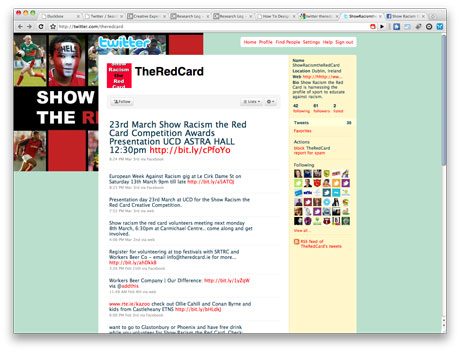
One of the things people most often notice about people on Twitter is how they present themselves. Leaving everything as the simple basic designs is an immediate turn-off to visitors, as is a poorly laid out design. As an example of this, I can provide the following sample, Show Racism The Red Card's current Twitter Design:
This strikes me as poorly laid out, and I did some research into how to create a visually appealing layout. A main focus of this was to ensure that the logo would always be viewable. After some searching I found a template by Chad Engle. He even explains why he did this:
Well I have had tons of people ask how I design my twitter backgrounds and get everything to look right. So, instead of telling everyone- I took 5 minutes and made a twitter template. Inside of the template I made guides that match up with different resolutions.
Chad Engle. 2009. Free PSD Twitter Background Template. [ONLINE] Available at:http://www.fuelyourcreativity.com/free-psd-twitter-background-template/. [Accessed 02 March 10].
Using this template I was able to provide a design that should provide a constantly viewable logo on the Twitter Page whilst tiling across the page in a stylish fashion. To see the design please check out my Creative Experimentation for the week.
References
- Chad Engle. 2009. Free PSD Twitter Background Template. [ONLINE] Available at:http://www.fuelyourcreativity.com/free-psd-twitter-background-template/. [Accessed 02 March 10].
Week #6 - Navigation Structure
For my Week #6 Research I will be taking a look into Navigation Structures. This co-incides with my Creative Experimentation for this week, which will be dealing, more directly, with the Navigation Structure of Show Racism The Red Card.
Starting Block - Content Audit
Before anyone can attempt to determine the appropriate Navigation Structure for a site, it is important to know what there will be on the website. Whilst you can decide on a layout and then work the content around it, this is a very poor practice and will usually show in any finished design.
So how does one go about determining what will be on a website? Content Auditing. This is done by taking a look at the content that a site will have, or that the site already has. It can be somewhat easier to accomplish this if you are looking to use content from an already existing source instead of creating a new site, purely because then the content is easy to find, instead of trying to determine it in advance. Of course there are ways to accomplish either.
OK, Content Audit DONE! What's next?
Content Auditing is only the first step towards being able to decide upon a suitable Navigation Structure. The next step is to determine a site-map for the content.
Why?
Site-maps allow you to determine, visually and without the need of code, the way that a site's navigation will work. If you have a blog, you'll be able to plot out what sub-categories there are and how you would get to them. All of this carries over into your final decision as to which Navigation Structure is most suitable to the content of the site.
Finally... Navigation Structure
Only once these have been worked out should one determine the navigation structure(s) are appropriate to the sites design, considering the following options:
- Horizontal Navigation
- Tiered Navigation
- Dropdown Navigation
More information on how I have conducted Content Audits in the past (for my own portfolio design last semester) and navigation structures, please take a look at my notes from last semester.
Week #7 - Site Layouts (Revisited)
Due to the time limits for the Show Racism The Red Card, this week's research is going to be a repeat of work I put together for my COM311 module from last semester. They cover sketching, wireframes and grid systems, which is why I'm reusing these particular articles, as they tie in very well with the subject matter for this week.
Site Layouts Part 1
Picking up from last week's Independent Learning is a bit of insight into my Group Project work. As I've mentioned over in that section of my Learning Log we have already worked out is what each member of the team is responsible for. One thing I have a horrible tendency to do a lot of these days is to sketch out web design concepts, something my team members are well aware of, which I think is at least partially responsible for my being given the task of designing the look and feel of the site, with feedback from other members.
The actual sketches I produced for this group project can be seen in the Group Contributions section linked at the top of this page. I intend this area to be more about the process involved with creating a site concept starting, this week, with the sketches and progressing over the following weeks, as the site progresses, covering the process.
Site Layouts - Sketching

The above image is taken from a recent article published in .net Magazine entitled "How to create your best layouts" and was written by Elliot Jay Stocks, a well known web designer that I very nearly researched as part of my DES311 research work. I will almost certainly refer to it, and possibly other articles, in the coming weeks to support my approach to developing the look and feel of the Group Project site.
Elliot suggests keeping away from the computer for the initial stages of conceptualising a site. Creativity is a very difficult thing to express at times, even more so when trying to use a computer interface. This makes Elliot lean more to a traditional method of pen and paper being used, it allows for him to quickly sketch out a design as it comes to him. He explains it rather more elegantly though:
There are a number of ways to approach this stage. Some like to jump straight into Photoshop (or their layout tool of choice), but personally I try to stay 'analogue' for a while and work with good ol' paper and pens.
Such tools are far more freeing than using a mouse and computer screen. They enable us to throw down ideas as soon as they come into our heads and be as expressive as possible, having absolutely no concern for things like neatness, which - at this stage, at least - just get in the way of creativity. If you haven't worked this way before, give it a try: it's extremely liberating.
Elliot Jay Stocks. (2009). How to create your best layouts. .net magazine. 194, 38-42.
This is actually a lesson I learned last year as part of the Foundation Degree Course I attended, whilst on placement. I had never really bothered to "concept" a web site before this, instead jumping straight into the design phase. Looking back at my work now it really shows through.
Now, however, I find myself sketching ideas as they pop into my head, whenever they pop into my head. I carry around a few file blocks with me at all times for just this purpose, so I'll have somewhere to sketch down ideas as I have them. I also carry a blank book for me to transfer anything that I really like the designs of. Currently this consists of multiple icon designs and a single web page sketch but I feel that, over time, this will become a much more useful resource to me, providing me with a handy resource of site designs I can take inspiration from.
That about sums up this week's Independent Learning. The site concepts for the group project can be found in the Group Contributions section of the Learning Log.
Site Layouts Part 2
Last week I covered the basic concept of one way to approach the concept of a web site design. This week I will discuss what many view as the next logical step from a rough sketch, cleaning it up as a wireframe.
Wireframes?
Wireframes cover a vast range of possibilities and can often vary in definition from project to project. Some people go into a great amount of detail in their wireframes, working out in great detail where everything will be positioned. Others view it as a neatened up version of their finalised sketches. Personally I use this as a chance to decide on how my design will look, making use of a grid system to help create a solid design ready to be converted into code at a later date.
What are Grid Systems?
Grid Systems are used to provide a flexible, yet useable, layout for web site designs. My grid system of choice, 960.gs, describes their system as the following:
The 960 Grid System is an effort to streamline web development workflow by providing commonly used dimensions, based on a width of 960 pixels. There are two variants: 12 and 16 columns, which can be used separately or in tandem.
Bryan Veloso. (2008). 960 Grid System. Available: http://960.gs. Last accessed 12 October 2009.
960.gs is but one of several different grid systems available. I use it because it provides material not just for use in web design, but also for use in various software packages that are used to create concepts for finished pieces. This is particularly useful as it gives a constant standard that can be used throughout, making creating the site from the graphic much easier.
This concludes my experimentation for the week. Next week's experimentation will pick up where this week leaves off, going into detail with regards to converting a graphical piece into an actual site, as well as some ideas to consider when designing a site.
References
- Elliot Jay Stocks. (2009). How to create your best layouts. .net magazine. 194, 38-42.
- Bryan Veloso. (2008). 960 Grid System. Available: http://960.gs. Last accessed 12 November 2009.
Week #8 - Typography
Typography is one of the areas of web design that I feel I have made rather a vast of amount of improvement in over the last year and a half. I still haven't gotten it perfect but, as with all elements of design, there's always something more to learn. For this week's research I will be looking at uses of typography that isn't tied to a browser or, necessarily, to print.
Video
Typography can be used in video to provide a different, and eye-catching, visual element that helps keep the viewer's attention. Below are a selection of videos I have found that I find to be quite visually appealing:
Wallpapers
Type can be used to create visually appealing wallpapers, that are different from the more typical graphical based wallpapers. You can see some examples of this over on my Creative Experimentation for this week, as I created a few different wallpapers using text and typography this week.
One example that I found whilst researching this topic is a tutorial that I used was posted on the Abduzeedo Blog and covers the process of turning a logo into a wallpaper using typography.
Promotions
The final subject that I am going to cover in my research this week is using typography in promotional materials. As with video typography can be used here to make a promotion more eye-catching, as the following images should help illustrate.
References
- Marco Kuiper. 2008. 15 stunning motion typography videos. [ONLINE] Available at: http://www.marcofolio.net/video/15_stunning_motion_typography_videos.html. [Accessed 18 March 10].
- Jonathan Connolly. 2008. Reader Tutorial: Typography Wallpaper in Photoshop. [ONLINE] Available at: http://abduzeedo.com/reader-tutorial-typography-wallpaper-photoshop. [Accessed 20 March 10].
Week #9 - Usability
The lecture for week #9 covered website usability and, as we are developing a site for a client I thought that I would look into both good and bad usability. This has an additional benefit for myself as I can also use this research to help with my undergoing redesign of my Portfolio of Work, a Work in Progress screenshot of which can be viewed in this week's Creative Experimentation.
In addition to the lecture itself, Tim and Ian also provided links to useful sites and articles that I could make use of with regards to my research. Naturally I ignoredpaid attention to these resources and looked through them.
I'll be honest though, and admit that I didn't spend a great deal of time on Jakob Nielsen's Site. Some websites I find to be very difficult to look at, and I've found this to be true with his site in the past. As his site hasn't changed in terms of appearance, this remains the case. Whilst I understand he is a living legend of usability, the design of his site makes it very difficult to access this knowledge.
10 Usability Crimes You Really Shouldn't Commit - Line25
For the rest of my research this week I will be using Line25's article on Usability Crimes that shouldn't be committed. I will be using this with reference to my very much work in progress Portfolio redesign, to see what I am doing right and what I need to change as I develop the site.
Crime 1: Form labels that aren't associated to form input fields
Using the 'for' attribute allows the user to click the label to select the appropriate input fields within a form. This is especially important for checkboxes and radio fields to give a larger clickable area, but it's good practice all round.
Chris Spooner. 2009. 10 Usability Crimes You Really Shouldn't Commit. [ONLINE] Available at: http://line25.com/articles/10-usability-crimes-you-really-shouldnt-commit. [Accessed 01 April 10].
This is something that I pay close attention to, as I try to maintain a high quality of work. Making use of the 'for' attribute makes forms much more usable to site visitors, which is always a good thing.
Crime 2: A logo that doesn't link to the homepage
Linking the logo of a website to the homepage has become common practice and is now second nature for (most) web surfers to expect the logo to head back home. It's also worth mentioning the logo should appear in the top left.
Chris Spooner. 2009. 10 Usability Crimes You Really Shouldn't Commit. [ONLINE] Available at: http://line25.com/articles/10-usability-crimes-you-really-shouldnt-commit. [Accessed 01 April 10].
This is actually a crime that I am guilty of with regards to my Learning Log. Hover your mouse over the logo and... nothing happens. I knew when I was coding this in my Learning Log that this was a bad thing and it is something that I have ensured works in the redesign of my Portfolio.
Crime 3: Not specifying a visited link state
Visited link states do exactly as they say on the tin. It's not the most advanced CSS selector, but it's one that is often overlooked. Give users a visual clue as to which link has already been clicked.
Chris Spooner. 2009. 10 Usability Crimes You Really Shouldn't Commit. [ONLINE] Available at: http://line25.com/articles/10-usability-crimes-you-really-shouldnt-commit. [Accessed 01 April 10].
This is something that I am currently guilty of. I'm not 100% convinced that it is truly necessary with the way that the web is these days, but I will probably implement a visited link colour in my body text for when a link has been visited, using a darker golden colour than the main links.
Crime 4: Not indicating an active form field
You can use the ':focus' selector on lots of elements, but it's super handy when used on inputs and textareas to indicate that the field is active. Add CSS styling such as a highlighted border, or a subtle change to the background color.
Chris Spooner. 2009. 10 Usability Crimes You Really Shouldn't Commit. [ONLINE] Available at: http://line25.com/articles/10-usability-crimes-you-really-shouldnt-commit. [Accessed 01 April 10].
This is another crime I am guilty of. Currently the forms of my site have not been overly developed, so this is definitely something that I will be changing before the final site launch.
Crime 5: An image without an alt description
This is straying a little into the realm of accessibility, but it's still an important consideration! Remember to always add a descriptive alt attribute to your images, unless of course they are used for decorative purposes, then the ALT attribute can be left empty (but should still exist!). When using an image as a link, enter a description of where the link goes.
Chris Spooner. 2009. 10 Usability Crimes You Really Shouldn't Commit. [ONLINE] Available at: http://line25.com/articles/10-usability-crimes-you-really-shouldnt-commit. [Accessed 01 April 10].
I think that some areas of my site are currently lacking this. Namely the latest work section which is under development. I know that this is an important thing for sites to have, both in terms of usability and accessibility. Whilst I haven't quite implemented it yet in this one, experimental, aspect of the redesign you can be sure that it will be included by the time that I have completed the site.
Crime 6: A background image without a background color
It's common to use background images behind passages of text, but it's worth remembering that if background images are disabled by the user, there needs to be a similar tone in the form of a background colour to avoid the text becoming unreadable.
Chris Spooner. 2009. 10 Usability Crimes You Really Shouldn't Commit. [ONLINE] Available at: http://line25.com/articles/10-usability-crimes-you-really-shouldnt-commit. [Accessed 01 April 10].
I am quietly confident that everything I have used a background on is designed in such a way as to work without the background image in place.
Crime 7: Using long boring passages of content
There's nothing more off-putting than landing on a webpage that's laid out as a continuous passage of text. Break up your content with images, headings and clear sections to make it easier to scan, read and digest
Chris Spooner. 2009. 10 Usability Crimes You Really Shouldn't Commit. [ONLINE] Available at: http://line25.com/articles/10-usability-crimes-you-really-shouldnt-commit. [Accessed 01 April 10].
This is something that currently happens with my site's home page. Once you get past the latest work is is entirely text based. I'll have to look into this, though I already intend to cut down on the amount of text there, so this may not be an issue.
Crime 8: Underlining stuff that isn't a link
Everyone knows that text that's underlined, or is a different colour is likely to be a link. Don't go confusing people by throwing in underlined text elsewhere! To draw attention to a certain word, try using the strong or emphasize tags instead.
Chris Spooner. 2009. 10 Usability Crimes You Really Shouldn't Commit. [ONLINE] Available at: http://line25.com/articles/10-usability-crimes-you-really-shouldnt-commit. [Accessed 01 April 10].
No. Just no. If I ever do this, please let me know so I can kill myself. Did I mention no yet?
Crime 9: Telling people to click here
The words click here have been around since the dawn of the Internet, but have been shunned aside in favour of more usable options. Using the words click here requires the user to read the whole sentence to find out what's going to happen. Instead, describe what's going to happen in the actual anchor link text.
Chris Spooner. 2009. 10 Usability Crimes You Really Shouldn't Commit. [ONLINE] Available at: http://line25.com/articles/10-usability-crimes-you-really-shouldnt-commit. [Accessed 01 April 10].
Fairly certain that I haven't done this anywhere on my site. I don't like "click here" text, so I tend to avoid it as much as possible.
Crime 10: Using justified text
This is another tip that's heading a little deeper into accessibility but is also an important point to consider. Justified text might look at neat and square to the eye, but it can generate some real readability problems, particularly for Dyslexic users who can find it troublesome to identify words due to the uneven spacing of justified paragraphs.
Chris Spooner. 2009. 10 Usability Crimes You Really Shouldn't Commit. [ONLINE] Available at: http://line25.com/articles/10-usability-crimes-you-really-shouldnt-commit. [Accessed 01 April 10].
This is something that I have been guilty of in the past. I personally quite like how it can look at times. Quite often, however, it provides some horrible visual effects and I have stopped using it in almost every instance, though there are occasionally times when I will make use of it.
References
- Jakob Nielsen. 1995. useit.com: Jakob Nielsen's Website. [ONLINE] Available at: http://www.useit.com/. [Accessed 01 April 10].
- Chris Spooner. 2009. 10 Usability Crimes You Really Shouldn't Commit. [ONLINE] Available at: http://line25.com/articles/10-usability-crimes-you-really-shouldnt-commit. [Accessed 01 April 10].
Week #10 - Accessibility
This week we received a brief, but rather in-depth, lecture on why it is so important to ensure that we understood both the importance, and requirements, regarding Website Accessibility. Some of what I saw was expected, but I was quite shocked at just how many sites provide problems to internet users.
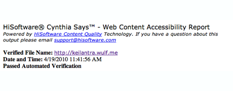
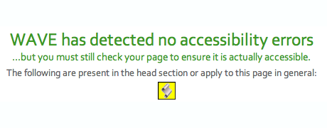
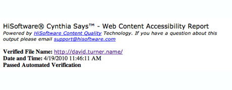
As a result of this I decided to look into how usable my own designs are in their current forms. To do this I took a look at three different pages I have produced, or that I am currently working on. These are:
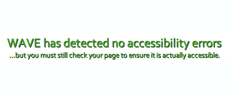
Well, how did each of these sites fare? I am quite pleased to say that two of the three pages ran into no problems passing the highest levels of scrutiny on Ask Cynthia, as well as the validation WAVE uses as the following show for both the Keilantra Codex and my Portfolio.
This leaves my Creative Experimentation Blog. So what went wrong there then? The page passed every text except for one. This was because of the embed scripts that most videos make use of. They lack a corresponding noembed tag to inform other users, who use browsers that don't support embedding of videos, that there was a video that they are unable to see. Aside from this failing the site continues to pass every other aspect of the accessibility testing.
Week #11 - Screencasting
The assignment we had this week was to produce a two minute long video, or screencast, to provide an overview of the site's functionality and capabilities. We were also provided with a tutorial on how to produce a screencast, which can be found on the DES Module site here.
I've been making rather a few videos demonstrating various little things, over on my 365 Design Site. These were recorded using a fantastic little piece of software called ScreenFlow.

ScreenFlow is a video and audio recording software package. In addition to being able to record video of your screen and audio input, it can also make use of your Mac's iSight Camera to record the user. Obviously not something that is not useful in every scenario, but a feature that might be of use to some people.
In addition to being able to record video, it is also able to provide some basic editing features. It's not as powerful as tools like Adobe's After Effects but it does very well in terms of providing some basic video editing functionality. These features include:
- Cutting up Video - remove unneeded video footage quickly and easily
- Change video speed - speed up or slow down footage
- Video Transitions - special effects between video clips
- Multiple Videos - import additional videos
- Layers - Layer different videos and images on top of one another
Week #12 - WordPress Resources
My group put a lot of time and thought into ensuring that our idea of the Show Racism The Red Card would be, as much as possible, entirely compatible with their current Content Management System, WordPress.
Why do this? We wanted to make it as easy as possible for the people managing the site to be able to use our design, if our design was chosen. To do this we bore in mind what Garrett said during the first meeting the groups had with him, that he knew WordPress.
With the end of the semester fast approaching I have very little that is suitable to research I have decided to share some of the resources that I referred to over the course of designing the Show Racism The Red Card site. Normally I would provide additional information about each of the links, but I'll be skipping that this time around.
- Create a Custom WordPress Plugin From Scratch
- Category Hacks for WordPress Theme Designers
- So you want to create WordPress themes huh?
- Optimize Your Wordpress Blog For Search Engines
- Digging into WordPress
- Perishable Press
- WordPress SEO
- How To: AJAXify WordPress Comment Posting
- WordPress on Microsoft
Hope that some of these links prove to be of use to those of you who are looking to develop and work with WordPress.