Playing with Paper
Producing a site takes more than just a mass of images and code put together in a browser. There are processes that people use to get from an idea to a finished product. None of them are wrong, and I can guarantee you that almost everyone has their own approach to getting from A to B. Today I'm going to take a look at what I've come up with.
Idea Generation
A little while back I covered idea generation for my Major Project. Today I'm going to share some of the visual side of things that I've found/been sent relating to paper, referencing and some of the visual feel I might want to use in the site.
As I mentioned in that post I quite like the idea of paper and notes... the idea of producing a rich user interface really appeals to me. Unfortunately, due to time restraints I haven't been able to hunt down many photographs of the kind of imagery that relates to what I'm after. Fortunately, having friends is awesome and one of my friends in the US, Tami Olsen1 indulged my madness and snapped a wealth of images from her collection of books:
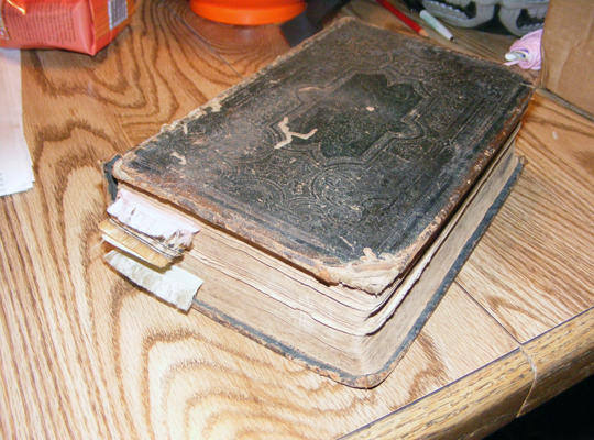
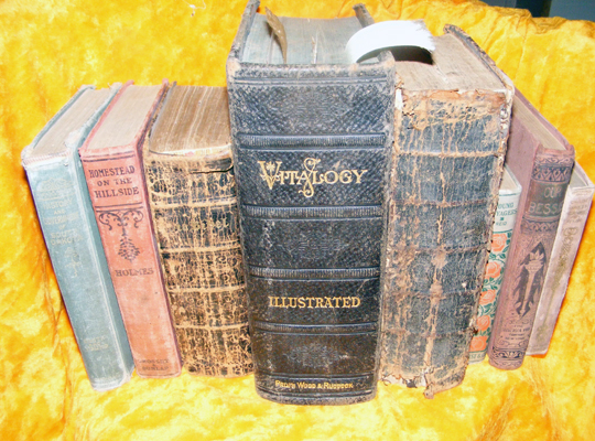
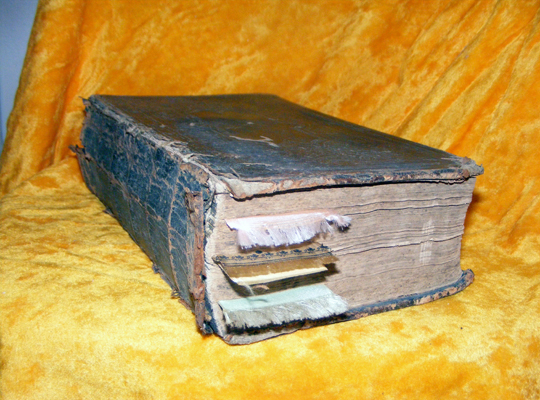
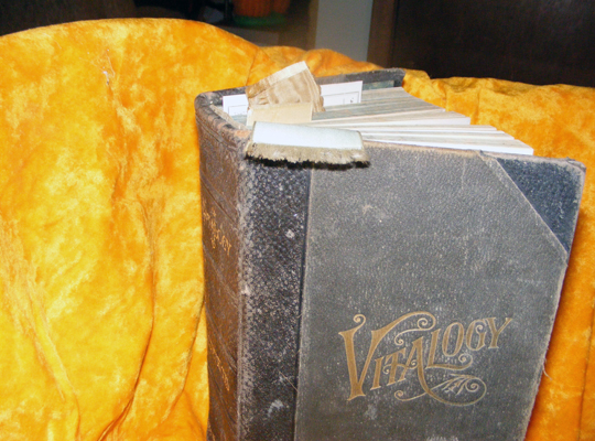
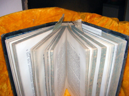
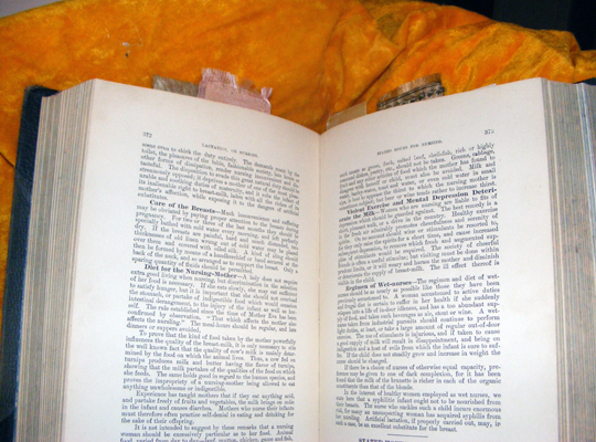
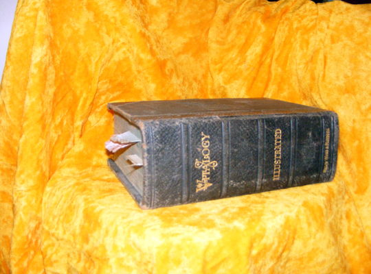
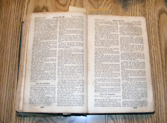
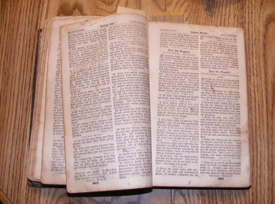
On the whole this is a really nice little collection of books, but it's a bit older than what I'm really looking for in terms of a visual design for my site. There are some beautiful little pieces to take away from these books though, in terms of typography, cover design elements and layout of the text. Fortunately for me, Tami has all sorts of books in her collection, so she was able to snap shots of more recent books. Whilst I was waiting on her to snap the photos for me, I started to play around with some pens, pencils and a load of paper to get some of the visual ideas I was generating already onto paper.
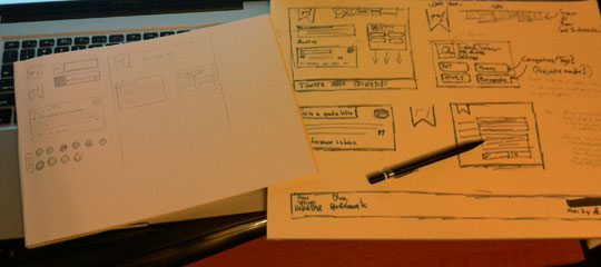
As you can see I took some time to play around with a more generalised shapes and layouts on the larger page using markers, with additional images being produced on the A4 sheet using pencils. Some bits don't really feel right though and it wasn't until Tami sent me through some additional photos.
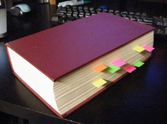
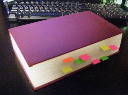
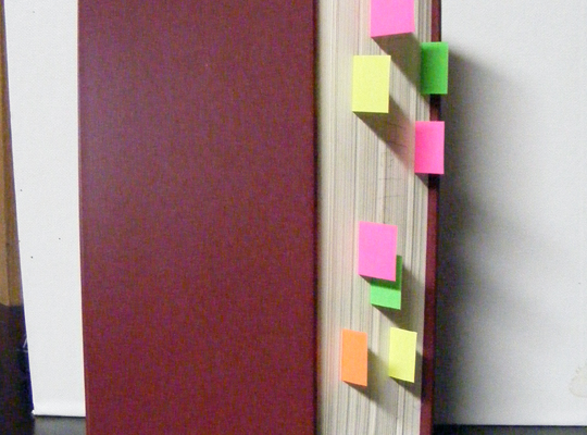
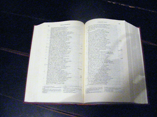
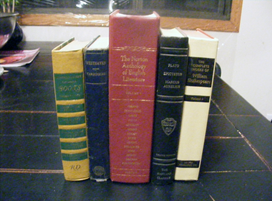
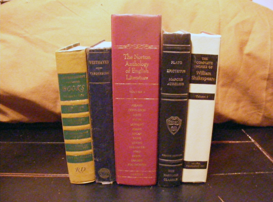
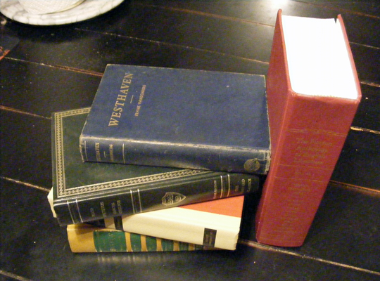
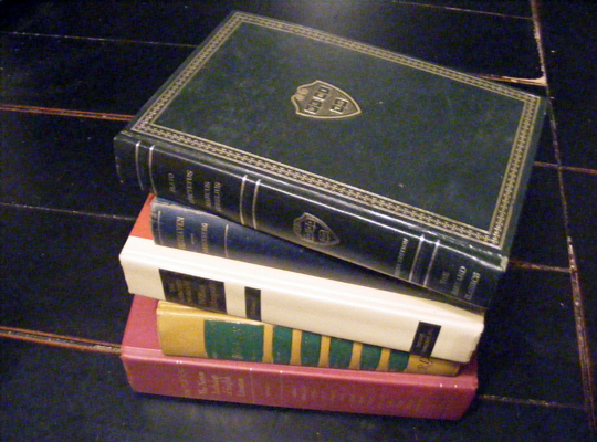
These images helped me get a better feel for how I wanted the visual of my site to feel. It is also helpful to get a feel of the kind of things that other people associate with the image I'm trying to convey, as opposed to relying on my on input entirely. I want to ensure that the site is both functional and elegant and, as was discovered at a recent workshop I attended, different people will turn up different imagery which can often times improve upon what one person could find alone.
The images also helped me identify the reason that things didn't feel right to me. The navigation hanging down from the top, on pieces of paper, doesn't really fit with the visual of little stickies sticking out from a book. This is something I'll need to address at a later date, when I get closer to producing visuals and when I have more time to sit down and work out the full details of how I want the site to look.